
SVG Three-Dot Loading Indicator with Staggered Delays
 (opens full-size image in a new tab)
Introduction
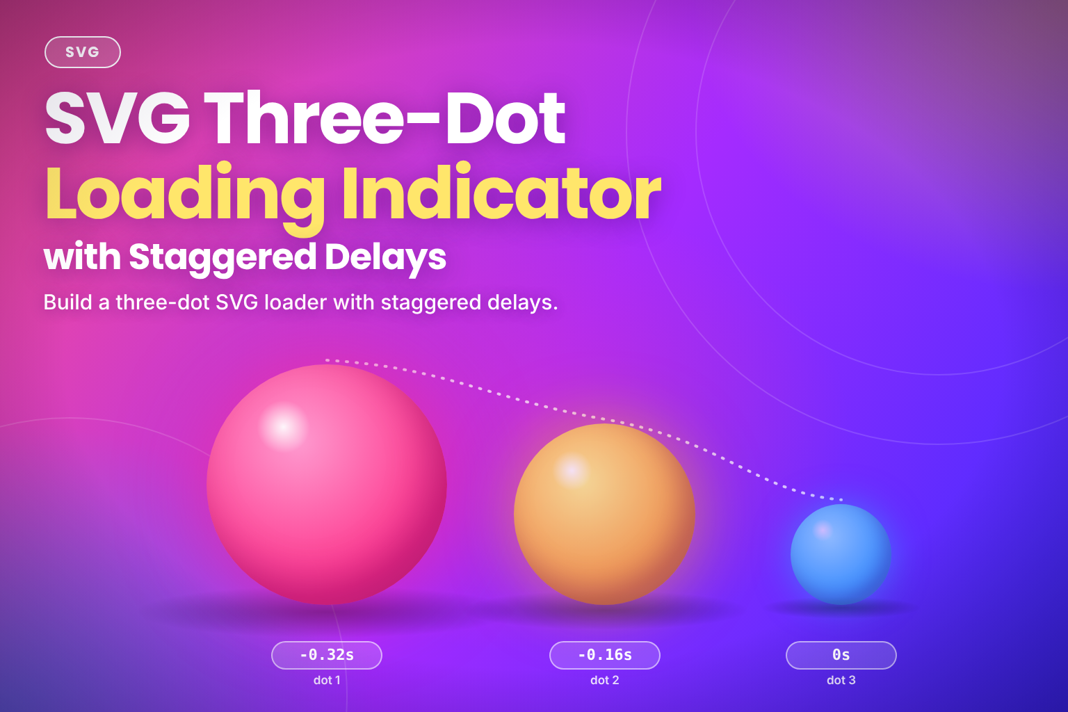
The three-dot loader is the "someone is typing" indicator: three dots that pulse one after another. In SVG it's three <circle>s and one @keyframes rule. Each dot runs the same animation, and a different animation-delay on each one turns three identical pulses into a wave.
It pairs well with the spinning SVG loader: the spinner suits "loading a page", the dots suit "waiting for a reply". Like the spinner, it takes its colour from currentColor and stays sharp at any size.
The Code
<svg class="svg-dots" viewBox="0 0 60 20" width="60" height="20" role="img" aria-label="Loading">
  <style>
    .svg-dots circle {
      fill: currentColor;
      transform-box: fill-box;
      transform-origin: center;
      animation: svg-dots-pulse 1.2s ease-in-out infinite;
    }

    .svg-dots circle:nth-of-type(1) {
      animation-delay: -0.32s;
    }

    .svg-dots circle:nth-of-type(2) {
      animation-delay: -0.16s;
    }

    @keyframes svg-dots-pulse {
      0%,
      80%,
      100% {
        transform: scale(0.4);
        opacity: 0.4;
      }

      40% {
        transform: scale(1);
        opacity: 1;
      }
    }

    @keyframes svg-dots-fade {
      0%,
      80%,
      100% {
        opacity: 0.3;
      }

      40% {
        opacity: 1;
      }
    }

    @media (prefers-reduced-motion: reduce) {
      .svg-dots circle {
        animation-name: svg-dots-fade;
        animation-duration: 2.4s;
      }

      .svg-dots circle:nth-of-type(1) {
        animation-delay: -0.64s;
      }

      .svg-dots circle:nth-of-type(2) {
        animation-delay: -0.32s;
      }
    }
  </style>
  <circle cx="10" cy="10" r="6" />
  <circle cx="30" cy="10" r="6" />
  <circle cx="50" cy="10" r="6" />
</svg>
How It Works
- The three circles sit on one row, 20 units apart, in a
60 × 20viewBox. Each has a radius of6, so there's an 8-unit gap between them at full size. svg-dots-pulsekeeps each dot small and faint (scale(0.4),opacity: 0.4) for most of the cycle, and grows it to full size and full opacity at40%. Listing0%, 80%, 100%together gives each dot a rest between pulses.transform-box: fill-boxandtransform-origin: centermake each circle scale around its own centre. Without them, an SVG element's transform origin is the top-left corner of theviewBox, so the dots would shrink towards0, 0and drift out of line.- The delays are negative. A negative
animation-delaystarts the animation as if it had already been running for that long. The first dot is0.32sinto its cycle, the second0.16s, and the third starts at the beginning, so the first dot peaks first and the pulse travels left to right. - Negative delays also avoid a bad first frame. With positive delays, the second and third dots would sit at their un-animated state (full size, full opacity) until their delay ran out, and the loader would look broken for a moment. With negative delays, every dot is mid-cycle from the very first frame.
nth-of-type()picks the circles rather thannth-child(), because the<style>element is the SVG's first child and would throw the count off.
Variant: An Opacity Pulse
For a quieter loader, drop the scaling and animate only opacity. With no transform, transform-box and transform-origin aren't needed. Slightly smaller dots with a wider gap read better when they don't change size:
<svg class="svg-dots-opacity" viewBox="0 0 60 20" width="60" height="20" role="img" aria-label="Loading">
  <style>
    .svg-dots-opacity {
      color: #6366f1;
    }

    .svg-dots-opacity circle {
      fill: currentColor;
      animation: svg-dots-opacity-pulse 1.2s ease-in-out infinite;
    }

    .svg-dots-opacity circle:nth-of-type(1) {
      animation-delay: -0.4s;
    }

    .svg-dots-opacity circle:nth-of-type(2) {
      animation-delay: -0.2s;
    }

    @keyframes svg-dots-opacity-pulse {
      0%,
      80%,
      100% {
        opacity: 0.2;
      }

      40% {
        opacity: 1;
      }
    }

    @media (prefers-reduced-motion: reduce) {
      .svg-dots-opacity circle {
        animation-duration: 2.4s;
      }

      .svg-dots-opacity circle:nth-of-type(1) {
        animation-delay: -0.8s;
      }

      .svg-dots-opacity circle:nth-of-type(2) {
        animation-delay: -0.4s;
      }
    }
  </style>
  <circle cx="10" cy="10" r="5" />
  <circle cx="30" cy="10" r="5" />
  <circle cx="50" cy="10" r="5" />
</svg>- No movement at all: only the brightness changes, so nothing on screen grows, shrinks or moves.
- Same timing pattern: the delays step by
0.2s(-0.4s,-0.2s,0s), a sixth of the1.2scycle, so the dots brighten one after another from left to right. The reduced-motion rule doubles the delays along with the duration to keep that spacing.
Example Usage
Size the loader in em so it matches the text it sits beside, and let color set the dots' colour:
.chat-typing .svg-dots {
  inline-size: 2.25em;
  block-size: 0.75em;
  color: var(--color-text-muted);
}

.button .svg-dots {
  inline-size: 1.5em;
  block-size: 0.5em;
}
Inside the button, the dots follow the label's colour without any extra rule, because color is inherited and the circles fill with currentColor.
Keep the 3 : 1 ratio of the viewBox when you set both sizes, or set inline-size together with block-size: auto. The explicit auto matters: without it, the height="20" attribute keeps the SVG 20px tall.
When the loader stands in for content, insert it into a live region that's already on the page, so screen readers are told that something is loading. A live region added at the same moment as its content usually isn't announced:
<div role="status">
  <svg class="svg-dots" viewBox="0 0 60 20" width="60" height="20" role="img" aria-label="Loading">
    <!-- circles and styles as above -->
  </svg>
</div>
Use Cases
- Typing indicators in chat and messaging interfaces.
- Waiting for a reply, such as an AI response or a form submission that's being processed.
- Inline loading states inside buttons, sized in
emto match the label. - Placeholder content in small spaces where a spinner would look too heavy.
Notes & Tips
- Announce it properly:
role="img"andaria-label="Loading"give the SVG a name, and therole="status"container announces it when it appears. You can also setaria-busy="true"on the region whose content is loading. That doesn't announce anything itself; it tells screen readers to wait until you set it back tofalsebefore reading the updated content. - Reduced motion: the main loader switches to
svg-dots-fade, which changes only opacity, and slows it to2.4s, doubling the delays to match. The dots stop growing and shrinking but still show that something is happening. A completely still loader can look frozen. - Inline SVG only:
currentColorand the page'scolorreach the dots only when the SVG is inline in the HTML. Loaded through<img>or a CSSbackground-image, the SVG can't see the page's styles and the dots render black, so set an explicitfillin that case. - Changing the speed: if you change the duration, scale the delays with it. Here each step is
0.16s, about 13% of the1.2scycle. Keep the steps equal and the same share of the cycle, and the wave stays even. - Namespace the styles: a
<style>inside an inline SVG applies to the whole page, including its@keyframesnames. Keep the class and keyframe names specific, or move the rules into your normal stylesheet. - Browser support:
transform-boxworks in all current browsers. Check MDN if you need to support much older ones; there, the dots would scale towards the top-left corner, so the opacity variant is the safer fallback. - Delays from position: in browsers that support
sibling-index(), one rule can work out each dot's delay:animation-delay: calc((sibling-index() - 4) * 0.16s). The- 4is there becausesibling-index()counts every element, so the<style>is sibling 1 and the circles are 2 to 4. Every current browser supports it, but only since 2026, so keep the hand-written delays as the fallback for older versions. The payoff comes when you add or remove dots, because only the offset needs changing. - Keep it cheap:
transformandopacityare the two properties browsers animate most efficiently, so a few of these loaders on a page cost very little.
Frequently Asked Questions
Key Takeaway
Three circles running the same @keyframes rule become a wave once each has its own animation-delay. Use negative delays so the loader is mid-cycle from the first frame, add transform-box: fill-box and transform-origin: center whenever the dots scale, and switch to an opacity-only pulse for reduced motion.
Changelog
- — Updated browser support note for `sibling-index()`
- — Initial publication.
Share this snippet
Spotted a mistake or something outdated in this snippet? Suggest a correction.