
SVG Circular Progress Ring with CSS Variables
 (opens full-size image in a new tab)
Introduction
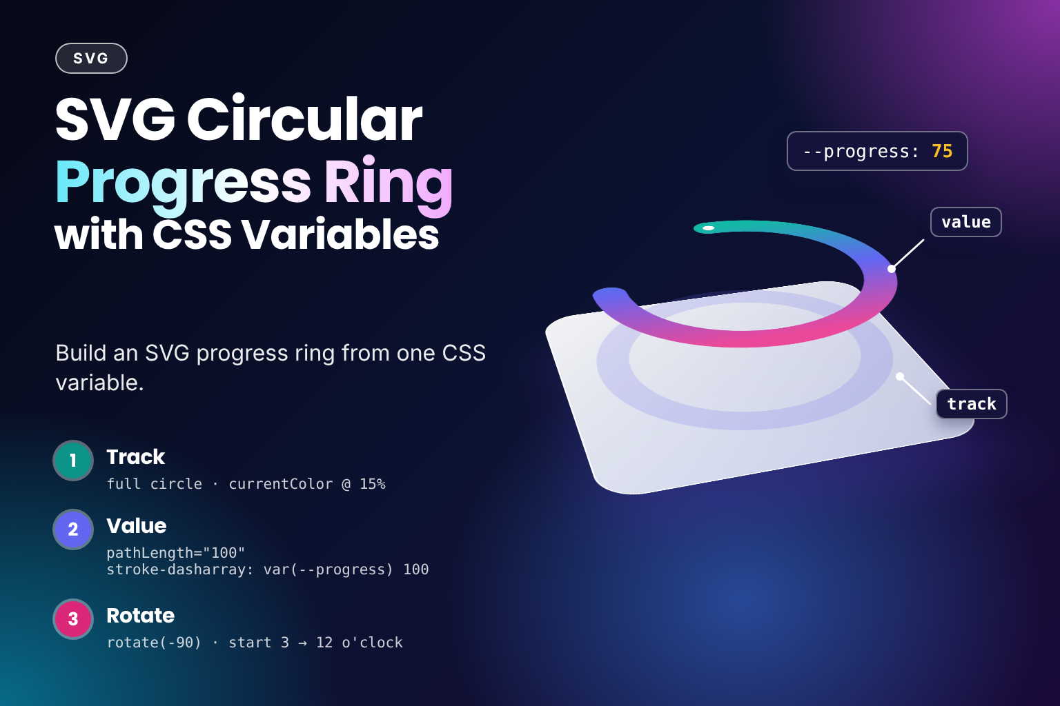
A circular progress ring shows how far along an upload, a quiz, or a profile setup is. It looks like it needs a charting library or some trigonometry, but it doesn't. It's two <circle> elements and one CSS custom property.
It's the natural sequel to the one-circle loading spinner. The spinner uses pathLength="100" to draw a fixed quarter arc. The ring uses the same attribute, but the arc length comes from a --progress variable, so the whole trick is one line: stroke-dasharray: var(--progress) 100.
The Code
<svg class="svg-ring" viewBox="0 0 100 100" width="96" height="96" style="--progress: 60" role="progressbar" aria-valuenow="60" aria-valuemin="0" aria-valuemax="100" aria-label="Upload progress">
  <style>
    .svg-ring circle {
      fill: none;
      stroke-width: 10;
    }

    .svg-ring-track {
      stroke: currentColor;
      stroke-opacity: 0.15;
    }

    .svg-ring-value {
      stroke: #6366f1;
      stroke-linecap: round;
      stroke-dasharray: var(--progress, 0) 100;
    }
  </style>
  <circle class="svg-ring-track" cx="50" cy="50" r="42" />
  <circle class="svg-ring-value" cx="50" cy="50" r="42" pathLength="100" transform="rotate(-90 50 50)" />
</svg>
How It Works
- The first circle is the track: a full ring in
currentColorat 15% opacity, so it shows on light and dark backgrounds alike. - The second circle has the same geometry and sits on top.
pathLength="100"makes the browser treat its outline as 100 units long, whatever the real circumference (2πr ≈ 263.9here). stroke-dasharray: var(--progress) 100draws one dash as long as the progress value, then a gap of100. With--progress: 60the dash covers 60% of the ring, and the gap is long enough to hide the rest.- A circle's stroke starts at 3 o'clock and runs clockwise.
transform="rotate(-90 50 50)"turns the value circle a quarter turn back around its centre, so 0% starts at 12 o'clock. Using the attribute form with a centre point avoids anytransform-originsetup. --progressis set inline on the<svg>and inherits down to the circle, so changing the value means changing one property in one place.role="progressbar"witharia-valuenow,aria-valueminandaria-valuemaxgives screen readers the actual number, andaria-labelsays what is progressing.
Variant: A Gradient Stroke
Point the value circle's stroke at a <linearGradient>. SVG has no conic gradient, so the colour runs across the ring rather than along it. Because the gradient uses the circle's own bounding box, it rotates with the circle: x1="1" and x2="0" put the start colour where the arc begins, at the top, and the end colour at the bottom.
<svg class="svg-ring-grad" viewBox="0 0 100 100" width="96" height="96" style="--progress: 75" role="progressbar" aria-valuenow="75" aria-valuemin="0" aria-valuemax="100" aria-label="Profile completion">
  <style>
    .svg-ring-grad circle {
      fill: none;
      stroke-width: 10;
    }

    .svg-ring-grad-track {
      stroke: currentColor;
      stroke-opacity: 0.15;
    }

    .svg-ring-grad-value {
      stroke-linecap: round;
      stroke-dasharray: var(--progress, 0) 100;
    }
  </style>
  <defs>
    <linearGradient id="cpr-gradient" x1="1" y1="0" x2="0" y2="0">
      <stop offset="0%" stop-color="#ec4899" />
      <stop offset="100%" stop-color="#6366f1" />
    </linearGradient>
  </defs>
  <circle class="svg-ring-grad-track" cx="50" cy="50" r="42" />
  <circle class="svg-ring-grad-value" cx="50" cy="50" r="42" pathLength="100" transform="rotate(-90 50 50)" stroke="url(#cpr-gradient)" />
</svg>
Variant: Animating Value Changes
The rings above are static: nothing moves until the value changes, and then the ring jumps straight to the new value. There are two ways to make it glide instead.
Transition the dash pattern. Changing --progress changes the computed stroke-dasharray, and that change can be transitioned like any other property. In the demo below, hovering stands in for JavaScript setting a new value. Hover over the ring to watch it glide from 30% to 90%:
<svg class="svg-ring-glide" viewBox="0 0 100 100" width="96" height="96" role="progressbar" aria-valuenow="30" aria-valuemin="0" aria-valuemax="100" aria-label="Upload progress">
  <style>
    .svg-ring-glide {
      --progress: 30;
    }

    /* Demo only: hover stands in for JavaScript setting a new value */
    .svg-ring-glide:hover {
      --progress: 90;
    }

    .svg-ring-glide circle {
      fill: none;
      stroke-width: 10;
    }

    .svg-ring-glide-track {
      stroke: currentColor;
      stroke-opacity: 0.15;
    }

    .svg-ring-glide-value {
      stroke: #6366f1;
      stroke-linecap: round;
      stroke-dasharray: var(--progress, 0) 100;
      transition: stroke-dasharray 0.6s ease;
    }

    @media (prefers-reduced-motion: reduce) {
      .svg-ring-glide-value {
        transition: none;
      }
    }
  </style>
  <circle class="svg-ring-glide-track" cx="50" cy="50" r="42" />
  <circle class="svg-ring-glide-value" cx="50" cy="50" r="42" pathLength="100" transform="rotate(-90 50 50)" />
</svg>
In this demo, --progress is set in the stylesheet rather than inline. An inline style attribute would beat the :hover rule, so the ring would never change. In a real app, JavaScript writes the value inline, and the transition on .svg-ring-value is the only line you need to add.
Register --progress with @property. An unregistered custom property is just text, so the browser can't animate it. Once it's registered as a <number>, the variable itself can be transitioned, and anything that uses it updates on every frame:
@property --progress {
  syntax: "<number>";
  inherits: true;
  initial-value: 0;
}

.svg-ring {
  transition: --progress 0.5s ease;
}

@media (prefers-reduced-motion: reduce) {
  .svg-ring {
    transition: none;
  }
}
The first option is enough for the ring on its own. The second is worth it when other styles also read --progress, such as a colour that changes near 100%, because they all animate in step.
Example Usage
Set --progress inline to show several values with the same CSS. A <text> element in the middle adds a percentage label. text-anchor="middle" and dominant-baseline="central" centre it on the point (50, 50):
<div class="svg-ring-row">
  <style>
    .svg-ring-row {
      display: flex;
      flex-wrap: wrap;
      justify-content: center;
      gap: 1.5rem;
    }

    .svg-ring-row circle {
      fill: none;
      stroke-width: 10;
    }

    .svg-ring-row .ring-track {
      stroke: currentColor;
      stroke-opacity: 0.15;
    }

    .svg-ring-row .ring-value {
      stroke: #14b8a6;
      stroke-linecap: round;
      stroke-dasharray: var(--progress, 0) 100;
    }

    .svg-ring-row text {
      fill: currentColor;
      font-size: 22px;
      font-weight: 600;
    }
  </style>
  <svg viewBox="0 0 100 100" width="96" height="96" style="--progress: 25" role="progressbar" aria-valuenow="25" aria-valuemin="0" aria-valuemax="100" aria-label="Step 1 of 4">
    <circle class="ring-track" cx="50" cy="50" r="42" />
    <circle class="ring-value" cx="50" cy="50" r="42" pathLength="100" transform="rotate(-90 50 50)" />
    <text x="50" y="50" text-anchor="middle" dominant-baseline="central">25%</text>
  </svg>
  <svg viewBox="0 0 100 100" width="96" height="96" style="--progress: 60" role="progressbar" aria-valuenow="60" aria-valuemin="0" aria-valuemax="100" aria-label="Upload progress">
    <circle class="ring-track" cx="50" cy="50" r="42" />
    <circle class="ring-value" cx="50" cy="50" r="42" pathLength="100" transform="rotate(-90 50 50)" />
    <text x="50" y="50" text-anchor="middle" dominant-baseline="central">60%</text>
  </svg>
  <svg viewBox="0 0 100 100" width="96" height="96" style="--progress: 90" role="progressbar" aria-valuenow="90" aria-valuemin="0" aria-valuemax="100" aria-label="Storage used">
    <circle class="ring-track" cx="50" cy="50" r="42" />
    <circle class="ring-value" cx="50" cy="50" r="42" pathLength="100" transform="rotate(-90 50 50)" />
    <text x="50" y="50" text-anchor="middle" dominant-baseline="central">90%</text>
  </svg>
</div>In a real app, JavaScript sets the value. Update --progress, aria-valuenow and the label together, so the drawing, the accessible value and the text never disagree:
function setProgress(ring, value) {
  const progress = Math.round(Math.min(100, Math.max(0, value)));

  ring.style.setProperty("--progress", progress);
  ring.setAttribute("aria-valuenow", progress);

  const label = ring.querySelector("text");
  if (label) label.textContent = `${progress}%`;
}

const ring = document.querySelector(".svg-ring");

// For example, from an XMLHttpRequest upload (fetch() has no upload progress event)
const xhr = new XMLHttpRequest();

xhr.upload.addEventListener("progress", (event) => {
  if (event.lengthComputable) {
    setProgress(ring, (event.loaded / event.total) * 100);
  }
});
Use Cases
- File uploads and downloads, driven by a progress event.
- Multi-step forms and onboarding, showing how many steps are done.
- Dashboards, for quotas, storage used, or goal completion.
- Timers and countdowns, where the ring empties as time runs out.
Notes & Tips
- Clamp the value: keep
--progressbetween0and100. A larger dash is harmless, since the ring is just full, butaria-valuenowshould never go pastaria-valuemax. - Round caps and small values:
stroke-linecap: roundadds half the stroke width to each end of the arc, so it looks slightly longer than the real value, and at0it can still draw a dot. Usebuttcaps if the ring must read exactly, or hide the value circle when the progress is0. - Unknown progress: if you can't measure progress, don't fake it. Remove
aria-valuenow(a progressbar without it is announced as indeterminate) or show a loading spinner instead. - The label is not read twice: a
progressbar's children are presentational, so screen readers announce the value fromaria-valuenow, not the<text>. Addaria-valuetextif the number needs words, such as "3 of 5 files". - Namespace the classes and ids: a
<style>inside an inline SVG applies to the whole page, and gradient ids must be unique on the page. Use specific names, or move the CSS into your stylesheet. - Browser support:
pathLength, custom properties instroke-dasharray, and transitions onstroke-dasharraywork in all current browsers.@propertyis supported in all current browsers too, but only since 2024 in Firefox, so treat the registered version as a progressive enhancement: without it, the ring still updates, just without the glide.
Frequently Asked Questions
Key Takeaway
Give the value circle pathLength="100" and stroke-dasharray: var(--progress) 100, rotate it -90 degrees so it starts at the top, and put a faint track circle behind it. The ring then follows one custom property, which JavaScript sets alongside aria-valuenow, and a transition or a registered @property makes changes glide.
Changelog
- — Initial publication.
Share this snippet
Spotted a mistake or something outdated in this snippet? Suggest a correction.