
SVG Marching Ants Border for Drop Zones and Selections
 (opens full-size image in a new tab)
Introduction
"Marching ants" is the moving dashed outline that image editors draw around a selection. On the web it's a clear way to say "this area is active": a drop zone with a file dragged over it, a selected card, or a region being cropped.
CSS border-style: dashed can't move, and the browser decides its dash sizes. An SVG <rect> can do both: stroke-dasharray sets the dashes, and animating stroke-dashoffset makes them march.
The first example is a fixed-size graphic that shows the technique. To put the border around an HTML element of any size, such as a real drop zone, use the overlay variant.
The Code
<svg class="svg-ants" viewBox="0 0 240 140" width="240" height="140" aria-hidden="true">
  <style>
    .svg-ants rect {
      stroke-dasharray: 8 6;
      animation: svg-ants-march 0.6s linear infinite;
    }

    @keyframes svg-ants-march {
      to {
        stroke-dashoffset: -14;
      }
    }

    @media (prefers-reduced-motion: reduce) {
      .svg-ants rect {
        animation: none;
      }
    }
  </style>
  <rect x="2" y="2" width="236" height="136" rx="12" fill="none" stroke="#6366f1" stroke-width="2" pathLength="728" />
</svg>
How It Works
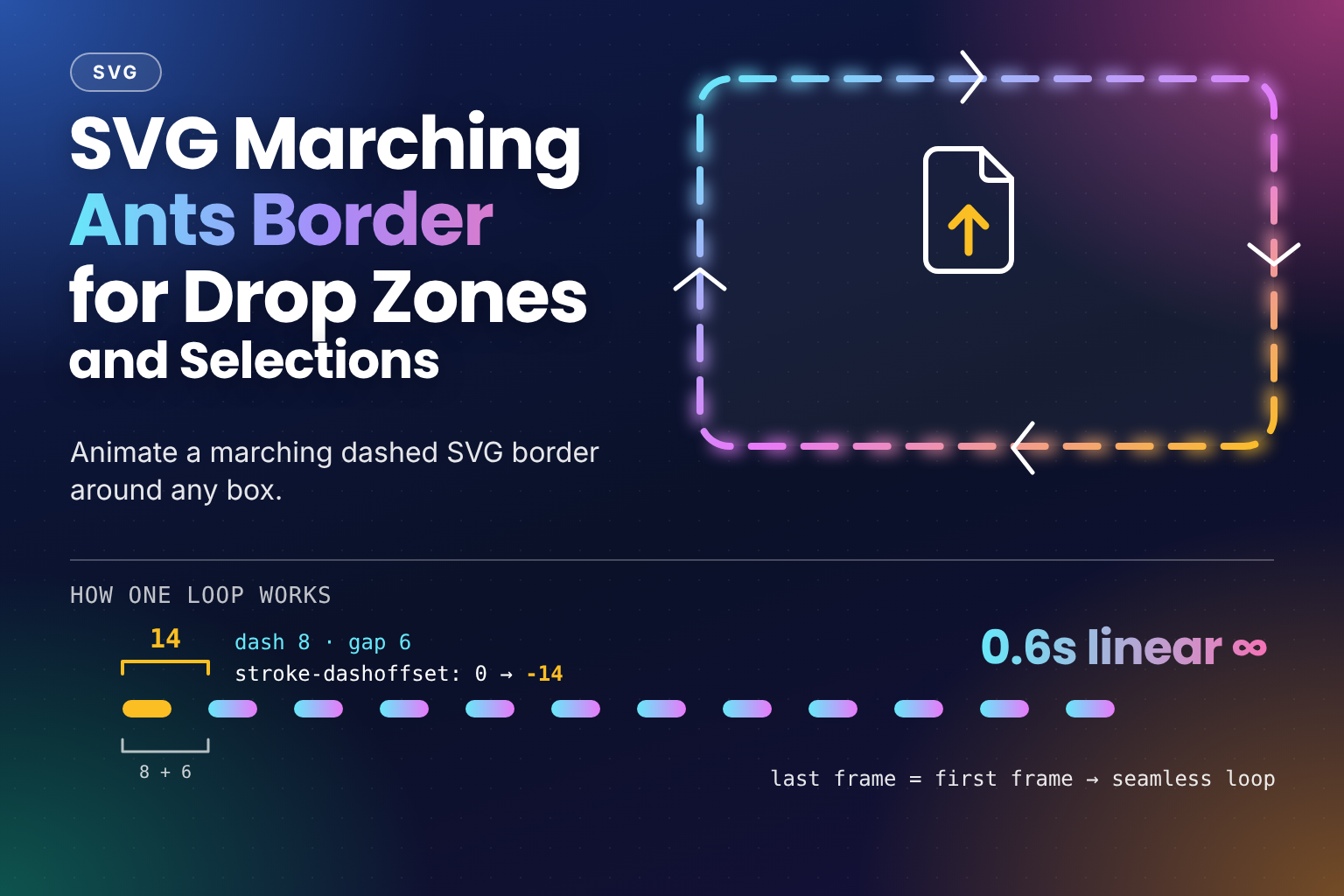
stroke-dasharray: 8 6cuts the outline into 8-unit dashes with 6-unit gaps. One dash plus one gap is a period of 14.- The animation moves
stroke-dashoffsetfrom0to-14, exactly one period. At the end, every dash sits where the next one started, so the last frame matches the first and theinfiniteloop has no visible jump. - A negative offset moves the pattern forwards along the outline. A
<rect>outline runs clockwise, starting on the top edge just after the top-left corner's curve, so the ants march clockwise. Use14instead of-14to reverse them. lineartiming keeps the speed constant. Any easing would make the ants speed up and slow down once per period.- The outline of a
<rect>has a start and an end at the same point, and the pattern rarely fits it exactly. The perimeter here is about723units, which is not a multiple of 14, so a short dash would sit next to a full one where the outline starts and ends, near the top-left corner.pathLength="728"(52 × 14) stretches the measurement slightly, so exactly 52 periods fit and the seam disappears. - The rectangle is inset by
2(x="2", width240 - 4), so the 2-unit stroke isn't cut off at the edge of the SVG.
Variant: An Overlay That Fits Any Box
A fixed viewBox scales the stroke along with the SVG, so the dashes and line width change with the box. For a border on an HTML element of any size, leave out the viewBox. User units are then CSS pixels, and width="100%" and height="100%" make the rectangle follow the box exactly. Lay the SVG over the element as an absolutely positioned overlay:
<div class="svg-ants-zone">
  <style>
    .svg-ants-zone {
      position: relative;
      display: grid;
      place-items: center;
      inline-size: min(100%, 320px);
      block-size: 140px;
      border-radius: 12px;
    }

    .svg-ants-zone .svg-ants-overlay {
      position: absolute;
      inset: 0;
      inline-size: 100%;
      block-size: 100%;
      overflow: visible;
      pointer-events: none;
      color: #6366f1;
    }

    .svg-ants-overlay rect {
      fill: none;
      stroke: currentColor;
      stroke-width: 2;
      stroke-dasharray: 8 6;
    }

    .svg-ants-zone:hover rect,
    .svg-ants-zone.is-dragover rect {
      animation: svg-ants-overlay-march 0.6s linear infinite;
    }

    @keyframes svg-ants-overlay-march {
      to {
        stroke-dashoffset: -14;
      }
    }

    @media (prefers-reduced-motion: reduce) {
      .svg-ants-zone:hover rect,
      .svg-ants-zone.is-dragover rect {
        animation: none;
      }
    }
  </style>
  <svg class="svg-ants-overlay" width="100%" height="100%" aria-hidden="true">
    <rect width="100%" height="100%" rx="12" />
  </svg>
  <p>Drop files here</p>
</div>
Drop files here
- No
viewBox: the 2px stroke and the 8px dashes stay the same size on any box, so the border is crisp at every width. overflow: visible: the stroke is centred on the rectangle's edge, so half of it falls outside the SVG. Letting it overflow keeps the full line visible, centred on the box edge likeoutline-offset: -1px.pointer-events: none: the overlay is positioned, so it's painted on top of the zone's content. It has no fill, so nothing is hidden, andpointer-events: nonemeans it never catches clicks or drag events either.- Static until active: the border is dashed at rest and only marches on hover or while
.is-dragoveris set. Hover over the preview to see it.
If you'd rather keep a viewBox, for example because the outline is a custom shape, vector-effect="non-scaling-stroke" on the shape stops the stroke width from scaling with the SVG. The overlay without a viewBox is simpler for plain rectangles.
Example Usage
Turn the marching on while a file is dragged over a drop zone. dragenter and dragleave also fire when the pointer moves over child elements, so a counter keeps the state from flickering. The hasFiles() check ignores other drags, such as selected text or a link from the same page:
const zone = document.querySelector(".svg-ants-zone");
const hasFiles = (event) => event.dataTransfer.types.includes("Files");
let depth = 0;

zone.addEventListener("dragenter", (event) => {
  if (!hasFiles(event)) return;
  depth += 1;
  zone.classList.add("is-dragover");
});

zone.addEventListener("dragleave", (event) => {
  if (!hasFiles(event)) return;
  depth -= 1;
  if (depth === 0) zone.classList.remove("is-dragover");
});

// Needed so the browser allows a drop here
zone.addEventListener("dragover", (event) => {
  if (hasFiles(event)) event.preventDefault();
});

zone.addEventListener("drop", (event) => {
  event.preventDefault();
  depth = 0;
  zone.classList.remove("is-dragover");
  handleFiles(event.dataTransfer.files); // your own upload function
});
For a "selected" state, use the same overlay and switch the animation on with a selector such as [aria-selected="true"] rect or .is-selected rect.
Use Cases
- File drop zones, marching while a file is dragged over them.
- Selected items in a canvas editor, a gallery, or a kanban board.
- Crop and selection tools, outlining the area that will be kept.
- Placeholder slots that are waiting for content, such as an empty layout region in a page builder.
Notes & Tips
- Animate by exactly one period: the offset must move by the dash plus the gap (
8 + 6 = 14), or a whole number of periods. Any other distance makes the dashes jump back at the end of each loop. If you change the pattern, change the keyframe too. - Reduced motion stops the march: a still dashed border still shows the state clearly, so the animation is simply removed. Don't rely on the movement alone to show that something is selected; the border itself, or a change of colour, should do that.
- The seam on resizable boxes: without a
viewBox, the perimeter changes with the box, so a fixedpathLengthwould stretch the dashes on large boxes and squash them on small ones. A short dash near the top-left corner is usually not noticeable. If it bothers you, setpathLengthto a multiple of 14 and accept dashes that scale with the box. - Keep a keyboard path: dragging only works with a mouse, touch or pen, so put a real
<input type="file">, or a button that opens one, inside the drop zone. Add.svg-ants-zone:focus-within rectto the animated selectors, and keyboard users see the same marching border when the input is focused. - Match the radius: keep the
rxon the<rect>the same as the element'sborder-radius, so the dashed line follows the corners. - Namespace classes and keyframes: a
<style>inside an inline SVG applies to the whole page. Use specific names like.svg-antsandsvg-ants-march, or move the rules into your stylesheet. - Keep it cheap: animating
stroke-dashoffsetrepaints the outline every frame. That's fine for one active drop zone, but turn the animation off for elements that aren't active instead of running it on dozens at once. - Browser support: dashed strokes,
stroke-dashoffsetanimation,pathLengthon<rect>, and percentage sizes on SVG shapes all work in all current browsers.
Frequently Asked Questions
Key Takeaway
Give a <rect> a dash pattern such as 8 6 and animate stroke-dashoffset by exactly one period, -14, with linear timing for a seamless loop. Leave out the viewBox and size the rectangle at 100% to get a crisp border that fits any HTML element as an overlay, and remove the animation for reduced motion, leaving a static dashed border.
Changelog
- — Initial publication.
Share this snippet
Spotted a mistake or something outdated in this snippet? Suggest a correction.