
CSS & SVG Loading Spinner from One Circle
 (opens full-size image in a new tab)
Introduction
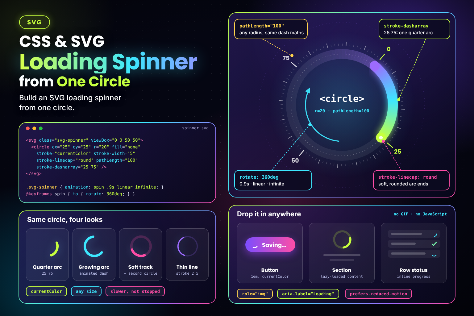
Loading spinners are often a GIF, an icon font glyph, or a stack of nested <div>s with borders. An SVG spinner can be smaller and simpler: one <circle>, no JavaScript, and about ten lines of CSS. Its stroke is cut into a single arc with a dash pattern, and CSS rotates it.
Because it's a vector stroke, it stays sharp at any size, takes its colour from currentColor, and its thickness is one attribute.
The Code
<svg class="svg-spinner" viewBox="0 0 50 50" width="48" height="48" role="img" aria-label="Loading">
  <style>
    .svg-spinner {
      animation: svg-spinner-rotate 0.9s linear infinite;
    }

    @keyframes svg-spinner-rotate {
      to {
        rotate: 360deg;
      }
    }

    @media (prefers-reduced-motion: reduce) {
      .svg-spinner {
        animation-duration: 3s;
      }
    }
  </style>
  <circle cx="25" cy="25" r="20" fill="none" stroke="currentColor" stroke-width="5" stroke-linecap="round" pathLength="100" stroke-dasharray="25 75" />
</svg>
How It Works
pathLength="100"tells the browser to treat the circle's outline as 100 units long, whatever its real circumference (2πr ≈ 125.66here). Dash values become percentages of the circle.stroke-dasharray="25 75"draws a 25-unit dash followed by a 75-unit gap. They add up to 100, so there's exactly one arc, a quarter of the circle.stroke-linecap="round"rounds the ends of the arc.- The
@keyframesrule rotates the whole<svg>from0to360degwithlineartiming, so the speed is constant and there's no pause at the end of each turn. - The rotation is applied to the outer
<svg>element, and an element'stransform-origindefaults to its centre, so it turns around its own middle with nothing extra to set.
Variant: A Growing and Shrinking Arc
For the Material-style spinner, where the arc grows and shrinks while it rotates, animate the dash pattern as well. A gap of 200 is longer than the whole circle, so there's still only one dash, however long it gets:
<svg class="svg-spinner-grow" viewBox="0 0 50 50" width="48" height="48" role="img" aria-label="Loading">
  <style>
    .svg-spinner-grow {
      animation: svg-spinner-grow-rotate 2s linear infinite;
    }

    .svg-spinner-grow circle {
      animation: svg-spinner-grow-dash 1.5s ease-in-out infinite;
    }

    @keyframes svg-spinner-grow-rotate {
      to {
        rotate: 360deg;
      }
    }

    @keyframes svg-spinner-grow-dash {
      0%   {
        stroke-dasharray: 1 200;
        stroke-dashoffset: 0;
      }

      50%  {
        stroke-dasharray: 75 200;
        stroke-dashoffset: -25;
      }

      100% {
        stroke-dasharray: 75 200;
        stroke-dashoffset: -99;
      }
    }

    @media (prefers-reduced-motion: reduce) {
      .svg-spinner-grow,
      .svg-spinner-grow circle {
        animation-duration: 4s;
      }
    }
  </style>
  <circle cx="25" cy="25" r="20" fill="none" stroke="#6366f1" stroke-width="5" stroke-linecap="round" pathLength="100" />
</svg>- 0% → 50%: the dash grows from a dot to three-quarters of the circle, and moving the offset back by 25 makes its tail move a little too.
- 50% → 100%: the dash keeps its length, but the offset moves it past the end of the path. Only its last unit is still visible, which matches the dot the next loop starts with, so the loop is seamless.
- The rotation and dash animations have different durations, so the arc starts each loop at a different angle and doesn't look repetitive.
Example Usage
Give the SVG a colour through color and its size through CSS, so one spinner works in buttons, cards, and page-level loading states:
.button .svg-spinner {
  inline-size: 1em;
  block-size: 1em;
  color: inherit;
}

.page-loader .svg-spinner {
  inline-size: 3rem;
  block-size: 3rem;
  color: var(--color-accent);
}
To add a faint track behind the arc, put a second circle before it with the same geometry, a low stroke-opacity, and no dash pattern. Only the arc needs the dash pattern, so the rotation still turns the whole SVG:
<svg class="svg-spinner-track" viewBox="0 0 50 50" width="48" height="48" role="img" aria-label="Loading">
  <style>
    .svg-spinner-track {
      color: #6366f1;
      animation: svg-spinner-track-rotate 0.9s linear infinite;
    }

    @keyframes svg-spinner-track-rotate {
      to {
        rotate: 360deg;
      }
    }

    @media (prefers-reduced-motion: reduce) {
      .svg-spinner-track {
        animation-duration: 3s;
      }
    }
  </style>
  <circle cx="25" cy="25" r="20" fill="none" stroke="currentColor" stroke-width="5" stroke-opacity="0.2" />
  <circle cx="25" cy="25" r="20" fill="none" stroke="currentColor" stroke-width="5" stroke-linecap="round" pathLength="100" stroke-dasharray="25 75" />
</svg>
Use Cases
- Button loading states, such as "Saving…", sized in
emto match the label. - Lazy-loaded sections and infinite-scroll footers.
- Full-page or route-change loaders while data is fetched.
- Inline status indicators in tables or lists, next to rows that are still processing.
Notes & Tips
- Announce it properly:
role="img"andaria-label="Loading"give the SVG a name. If the spinner replaces content, put it inside arole="status"container (or usearia-busy="true"on the region that's loading) so screen readers are told something is happening. - Slow it down, don't stop it, for reduced motion: a spinner that doesn't move can look frozen. A slower rotation still shows progress without fast movement. In the growing variant, the dash animation is switched off and the arc is held at a fixed length, so only the slow rotation remains. You could also swap either spinner for a "Loading…" text label.
- Namespace the class: a
<style>inside an inline SVG applies to the whole page, not just that SVG. Use a specific class name, or move the rules into your normal stylesheet. - No
pathLength? Use the real circumference instead: withr="20", a quarter arc isstroke-dasharray="31.4 94.2". - Browser support: the standalone
rotateproperty works in every current browser (Chrome 104+, Firefox 72+, Safari 14.1+). For older browsers, usetransform: rotate(360deg)in the keyframes instead. - Keep it cheap: rotating the
<svg>is a transform, which the compositor can handle. Animatingstroke-dasharrayrepaints the stroke each frame, which is fine for one small icon but adds up if you show many at once.
Frequently Asked Questions
Key Takeaway
One <circle> with pathLength="100" and stroke-dasharray="25 75" gives you a quarter arc, and a linear, infinite rotate animation turns it into a spinner. Animate the dash pattern too for an arc that grows and shrinks. Either way it's a few lines of markup that scale cleanly, follow currentColor, and respect reduced motion.
Changelog
- — Initial publication.
Share this snippet
Spotted a mistake or something outdated in this snippet? Suggest a correction.