
Advanced CSS @starting-style: Performance & Accessibility
 (opens full-size image in a new tab)
Introduction
Three posts in, you know what @starting-style is, how to build fade/slide/scale entrances with it, and how to pair it with transition-behavior: allow-discrete to animate display-toggled dialogs and popovers. That's the mechanism. This last part is about shipping it — making sure the entrances you've built stay smooth on a mid-range phone, don't fight with prefers-reduced-motion, survive contact with React or Vue, and don't quietly cost more than they need to.
None of what follows is specific to @starting-style in some exotic way. That's actually the point: a @starting-style-driven entrance is, from the browser's perspective, just a transition — the same rendering pipeline, the same performance rules, the same accessibility considerations as any other transition covered back in An Interactive Guide to CSS Transitions. If you've internalized that post's Why GPU-Accelerated Properties Are Cheap section, most of this one will feel like confirmation rather than new information. We'll also close out the series properly — comparing @starting-style against @keyframes, the Web Animations API, and the View Transitions API, so you know exactly which tool to reach for and when.
If you're arriving here without the rest of the series, the earlier parts are worth reading first: Part 1: Mastering CSS @starting-style covers the mechanism itself, Part 2: Practical @starting-style turns it into a pattern library of real entrances, and Part 3: @starting-style, display, and Animating Dialogs & Popovers covers allow-discrete and discrete properties. This post assumes all three.
A Quick Recap of the Rendering Pipeline
Every visual update a browser makes runs through some subset of four stages: Style (figure out which CSS rules apply and what the computed values are), Layout (work out geometry — where does everything sit, how big is it), Paint (rasterize the actual pixels for each element into a bitmap), and Composite (the GPU assembles those bitmaps into the final frame, applying any transforms or opacity along the way). A change that only needs Style and Composite is cheap; a change that forces Layout drags Paint and Composite along behind it, on every single frame of the transition.
This is exactly the same pipeline whether the transition is a :hover state change, a class toggle, or a @starting-style-driven entrance. There is nothing special or extra-expensive about the @starting-style mechanism itself — it doesn't add a stage, it doesn't run twice, it doesn't cost anything beyond what the properties you're transitioning would already cost on their own. The full breakdown of which properties land in which stage — with a labelled table you'll want to bookmark — lives in Why GPU-Accelerated Properties Are Cheap. Everything below assumes you've internalized that table; this post is about applying it specifically to entrances.
Why transform and opacity Are Still the Right Defaults
Every entrance example across this series has leaned on opacity and transform almost exclusively, and now you know precisely why: both are compositor-only properties. Changing either one skips Layout and Paint entirely — the browser already has a rasterized layer for the element, and animating opacity or transform just tells the GPU to blend or reposition that existing layer differently on each frame. No geometry recalculation, no re-rasterizing pixels, just cheap GPU math that runs independently of whatever the main thread is doing.
Where this bites people specifically in @starting-style land: it's tempting to reach for width, height, margin, or top/left for an entrance — "the card grows from nothing" reads intuitively as a width/height animation — but every one of those forces Layout on every frame, for the whole duration of the transition. The fix is almost always the same: express "grows from nothing" as transform: scale(0) to scale(1) instead of animating actual box dimensions. The visual result is close enough for the vast majority of UI entrances, and the performance difference is not subtle on lower-powered devices.
/* Avoid: forces Layout + Paint every frame */
.card {
  height: 320px;
  transition: height 0.3s ease-out;

  @starting-style {
    height: 0;
  }
}

/* Prefer: Composite-only, same visual intent */
.card {
  transform: scaleY(1);
  transform-origin: top;
  transition: transform 0.3s ease-out;

  @starting-style {
    transform: scaleY(0);
  }
}
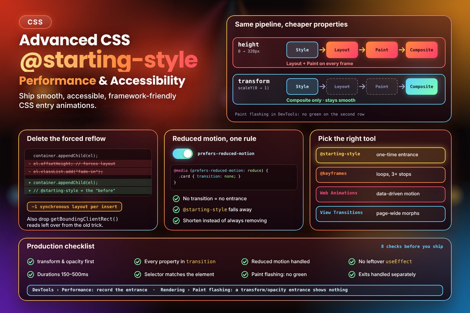
Those two rules are the two rows of the diagram below. The height version lights up all four stages on every frame of the entrance, while the scaleY() version skips Layout and Paint and hands each frame straight to the compositor.
If an element's content-visibility is also in play — say, an accordion panel you're revealing via content-visibility: hidden alongside @starting-style, the same way Part 3 covers display — there's a nuance worth knowing. Unlike display: none, which discards the element's rendering state entirely, content-visibility: hidden skips layout, paint, and rendering of the subtree while the browser still remembers roughly what it last looked like. For content that toggles often — accordions, tab panels, anything opened and closed repeatedly in one session — that can make repeated reveals cheaper than a display: none round-trip. It's a nuance, not a rule: for a one-time entrance it won't matter, but for frequently-toggled content it's worth knowing the option exists.
Avoiding Layout Thrashing (and a Habit You Can Finally Drop)
"Layout thrashing" is what happens when JavaScript interleaves writes and reads of layout-affecting properties — write a style, read offsetHeight, write another style, read again — forcing the browser to synchronously recalculate layout on every read instead of batching everything into one pass at the end of the frame. It's a classic performance foot-gun, and it's worth checking your insertion code isn't doing it right around where a @starting-style-driven element enters the DOM.
Here's the part specific to this series, though: Part 1 covered the old fix for the "transition doesn't play on insert" problem — insert the element, read el.offsetHeight to force a synchronous reflow, then add the class that changes its final state. That forced read was never free; it was a deliberate trade of "pay for one synchronous layout" in exchange for "get the browser to register an intermediate frame." @starting-style removes the need for that trade entirely — there's no intermediate frame to force anymore, because @starting-style supplies the "before" value directly.
More generally: avoid reading offsetHeight, offsetWidth, getBoundingClientRect(), or getComputedStyle() in a loop or in close proximity to style writes around the moment a @starting-style-driven element mounts. If you genuinely need to measure something (say, a dynamic height for a non-transform-based animation), batch all your reads before any writes, or defer the read to a requestAnimationFrame callback so it doesn't interleave with pending style changes.
Profiling: Confirming It Actually Stayed Cheap
Believing a transition is compositor-only and confirming it are different things, and confirming takes about thirty seconds in DevTools. Two tools are worth knowing:
The Styles pane. Open DevTools, select the element in the Elements/Inspector panel, and look at its Styles pane while it's in a matching state — Chrome and Edge show @starting-style as a real, inspectable rule here, the same way they show any other rule. You can toggle its declarations on and off or edit values live, which is a fast way to confirm the starting value you think you wrote is actually the one being applied.
The Performance panel. Record a trace while the entrance plays, then look at whether Layout ("Recalculate Style" and "Layout" in the trace) or Paint show up as separate events during the transition's duration. If the only activity during your transition is on the Composite thread, you're in compositor-only territory. The Rendering tab (usually reached via the DevTools overflow menu or a dedicated drawer) also has a Paint flashing overlay, which highlights any region the browser repaints in green — a transform/opacity-only entrance should show no green flashes at all — and a layer borders overlay, which outlines elements that have been promoted to their own compositor layer, useful for confirming the element you expect to be composited actually got its own layer.
Accessibility: Reduced Motion and @starting-style
prefers-reduced-motion gives users a way to tell the browser (and your CSS) that they'd rather not see large or fast motion — Accessibility: Respecting Motion Preferences covers the reasoning in depth: vestibular disorders can make animated motion genuinely uncomfortable, not just distracting.
The good news for @starting-style specifically is that you don't need a separate code path to disable it. @starting-style only has an effect because a transition is there to animate along it — remove or zero out the transition, and @starting-style naturally stops mattering:
.card {
  opacity: 1;
  transform: scale(1);
  transition: opacity 0.3s ease-out, transform 0.3s ease-out;

  @starting-style {
    opacity: 0;
    transform: scale(0.95);
  }
}

@media (prefers-reduced-motion: reduce) {
  .card {
    transition: none;
  }
}The same caveat from the transitions guide still applies here, though: don't reach for transition: none as a blanket reflex if the motion is communicating something meaningful rather than just being decorative. An entrance that visually signals "this is new" or "this just appeared" (a toast, an inserted list item) can lose useful signal if it snaps in silently — Accessibility: Respecting Motion Preferences covers the same nuance in more depth: shortening the duration or swapping a transform-heavy entrance for a subtle opacity-only fade is often a better middle ground than removing the transition outright.
Accessibility Beyond Motion
Reduced motion is only half of it. An entrance animation shouldn't change how the content is announced or how long it stays readable:
- Announce toasts properly. A toast that animates in should still live in a
role="status"(oraria-live="polite") container, so screen readers hear it whether or not it animates. - Don't rely on the animation to be noticed. The entrance draws the eye, but it can't be the only signal that something new appeared.
- Give people time. Don't auto-dismiss a toast so quickly that it can't be read; the animation duration is not part of the reading time.
- Keep the final state reachable. Content starts at
opacity: 0for a moment, so avoid long entrances on text people need to read straight away.
Progressive Enhancement, Briefly
Part 1 already covers this in depth, so just the one-line version here: browsers without @starting-style support simply ignore the at-rule and render the element in its final state immediately — no error, no broken layout, no @supports guard required. That means everything in this post is safe to ship unconditionally; older browsers just don't get the entrance motion, which is exactly the kind of graceful degradation @starting-style was designed to have.
Framework Integration: React, Vue, Svelte
This is the section that tends to surprise people coming from a component-framework background the most: @starting-style needs nothing framework-specific. It fires whenever a DOM node gets its first-ever computed style — full stop. It doesn't care whether that node was inserted by vanilla appendChild, a React render, a Vue v-if flipping true, or a Svelte {#if} block mounting. The DOM doesn't know or care which framework put it there, and neither does @starting-style.
That's a genuine departure from the pattern most framework developers are used to. The classic approach to "animate a component in on mount" has always needed a lifecycle hook — a React useEffect that adds a class one tick after mount, Vue's onMounted, Svelte's onMount — specifically because the component's DOM node already exists with its final style applied by the time any of those hooks run, and the only way to get a "before" frame was to render one state, wait a tick, then render another. Entire libraries exist largely to paper over this gap: react-transition-group and Framer Motion's AnimatePresence both do real, valuable work managing exit animations (which @starting-style cannot help with when a node is removed from the DOM — there's no "starting-style" equivalent for removal), but a meaningful chunk of what they're reached for is also just "fade/slide this in when it mounts," which @starting-style now handles with zero JavaScript and zero lifecycle hooks.
One nuance worth a sentence: some CSS-in-JS and utility-CSS tooling needs explicit support to let you author @starting-style conveniently, even though the browser-level mechanism itself doesn't care about your tooling. Tailwind CSS v4 added a starting: variant for exactly this — class="opacity-100 transition-opacity starting:opacity-0" compiles down to the same @starting-style block you'd write by hand. If you're using a different CSS-in-JS library or utility framework, it's worth checking whether it's caught up to emitting @starting-style rules yet; the underlying CSS feature works regardless, but your tooling's syntax for reaching it may or may not exist.
Common Mistakes: The Performance & Accessibility Roundup
A few of these echo points already made in Part 1 and Part 3 — worth a fast recap here since this is the post where they'll actually bite in production — plus two genuinely new ones specific to the performance/accessibility lens.
- Untransitioned
@starting-styleproperties (Part 1). A property set inside@starting-styleonly animates if it's also listed intransition. Easy to forget when copy-pasting a starting-style block between components with differenttransition-propertylists. - Forgetting
allow-discretefordisplay/content-visibility(Part 3). Without it, the discrete property still flips instantly and the browser can even skip the rest of the transition depending on timing. - Transitioning too many properties "just in case." It's tempting to throw
opacity,transform,filter,box-shadow, and abackground-colorfade all into one entrance because they're all available and the code looks tidy in one block. Each additional non-compositor property (abox-shadowblur change, abackground-colorcrossfade) drags Paint back into every frame of what could otherwise have been a pure Composite-stage animation. Audit your@starting-styleblocks for properties that snuck in without a real visual reason to be there — a starting-style entrance benefits from restraint just as much as any other transition does. - An overly long duration on a discrete
allow-discretetransition. The discrete flip is tied to the transition's duration, and on the way out that's a cost users feel. On exit,display(and top-layer membership, ifoverlayis transitioned) only flips at 100%, so a closing dialog stays on screen, in the top layer, with its::backdropstill covering the page, for the whole exit. A 600ms "for a bit of flourish" exit means 600ms after pressingEscwhere the user still can't click the page behind it. (Entry isn't affected the same way:displayflips at 0%, so an opening dialog is present from the first frame.) Keep discrete-property transitions in the same 150–500ms range recommended for ordinary UI transitions, and lean toward the shorter end for exits.
Comparison with CSS @keyframes Animations
@keyframes paired with animation doesn't need @starting-style at all, and it never has — a keyframe animation defines its own from/to (or 0%/100%) values explicitly, regardless of whether the element is on its first render or its hundredth. That's actually why the "fake a starting point with @keyframes" workaround from Part 1 worked at all before @starting-style existed: an animation was never subject to the single-frame collapse that only affects transition.
For a one-time, transition-shaped entrance — fade in, slide in, scale in, once, on mount — reaching for @keyframes is now optional boilerplate rather than a requirement. @starting-style lets you keep using a plain transition, which tends to be less code and easier to read than a dedicated @keyframes block that exists purely to describe two states.
@keyframes keeps its own lane, though, and remains the right tool whenever the motion genuinely needs more than a simple before/after: looping animations (spinners, marquees), multi-step motion with three or more distinct visual states, or anything that needs per-keyframe timing control (an animation-timing-function set on an individual keyframe selector, as covered in the companion FAQ on multi-keyframe easing). Nothing here makes @keyframes obsolete — it just stops being the only option for the specific case of "animate something in on its first appearance."
Comparison with the Web Animations API
The Web Animations API (WAAPI) is JS-driven and fully imperative: element.animate([...keyframes], { duration, easing }) returns an Animation object you can play, pause, reverse, or .cancel(), and its .finished promise resolves when the animation completes. It can express anything a CSS transition or @keyframes animation can, plus things neither can: keyframes generated dynamically from data at runtime, animations whose parameters depend on values only known in JavaScript, and precise programmatic control mid-animation.
That power comes at a cost @starting-style doesn't have: WAAPI requires JavaScript to run at all, and — just like the pre-@starting-style pattern covered in Part 1 — it still requires the developer to remember to actually call .animate() at the right moment, typically right after mount, the same lifecycle-hook problem @starting-style sidesteps for the declarative case. For a straightforward "fade/slide/scale in on first render" entrance, @starting-style needs zero JavaScript and zero explicit trigger; WAAPI is the right reach only once the motion needs logic @starting-style genuinely can't express — data-driven keyframes, or JS-side control like pausing an in-flight entrance based on some other event.
Comparison with the View Transitions API
The View Transitions API is worth explaining from scratch, since nothing else in this series covers it. At its core, it's a JS-triggered mechanism: you call document.startViewTransition(updateCallback), passing a callback that makes whatever DOM changes you want (swap in new content, navigate to a new state, toggle a class). The browser takes a screenshot of the page (or specific named elements) before your callback runs, lets your callback run and make its changes, then takes another screenshot after, and automatically cross-fades or morphs between the two snapshots — no manual keyframe authoring required for the transition itself.
Where it gets more powerful is scoped, named transitions: give two elements — one in the "before" DOM state, one in the "after" — the same view-transition-name, and the browser treats them as the same visual element, morphing size and position between them rather than just cross-fading two flat rectangles. This is the mechanism behind "shared element" transitions you may have seen in native apps — a thumbnail that visually grows into a full detail view across a page navigation, for instance — and it works across full page navigations (with the newer cross-document View Transitions) as well as within a single page's DOM updates.
The comparison with @starting-style comes down to scope, not sophistication. Both are built on the same underlying idea — capture a "before" and an "after," then animate between them — but they operate at wildly different scales. @starting-style concerns exactly one element's own first-ever style computation; it has no concept of "the rest of the page" or "what this element used to look like elsewhere in the DOM." View Transitions capture and diff an entire document (or an explicitly named subset of it) across an arbitrary DOM change, which is something @starting-style fundamentally cannot do — it was never designed to coordinate multiple elements or bridge two different points in the DOM tree. If you need one element to fade in on mount, @starting-style is simpler and needs no JavaScript. If you need a whole page transition, or a shared-element morph across a navigation, View Transitions is the only one of the two built for that job.
When Not to Use @starting-style
Knowing when to reach for something else is as valuable as knowing how to use the tool at all. Read the matrix by picking the need you have and finding the first row that covers it:
For example, a looping spinner needs the "Loops, 3+ stops" column, so the first row that covers it is @keyframes. A fade-in on mount needs only "Entrance on mount" with no JavaScript, so @starting-style wins. Data-driven motion pushes you down to the Web Animations API, and only View Transitions covers page-wide or shared-element changes.
The cases below spell out the same boundaries in words:
- The element isn't on its first render or a display-toggle moment. Ordinary state changes on an element that's already live and rendered — a hover colour change, a value updating, a class toggling on an existing, already-visible element — just need a normal
transition. There's no first-computation moment involved, so@starting-stylehas nothing to do. - You need coordinated, multi-element or shared-element transitions across a full page navigation. That's the View Transitions API's job, not
@starting-style's — it operates at the scope of a whole document or subtree, not a single element's own entrance. - You need complex, data-driven, or programmatically-scrubbed motion. Reach for the Web Animations API or a dedicated JS animation library once the motion's parameters depend on runtime data or need frame-by-frame JS control.
- The motion needs more than two keyframe-like states in one continuous sequence.
@starting-stylegives you exactly one synthetic "before" state; anything with three or more distinct stops in a single continuous animation is still@keyframesterritory.
Production Checklist
A last pass before shipping any @starting-style-driven entrance:
- Every property inside
@starting-stylealso appears intransition(ortransition: allis used deliberately). - The entrance animates
transformand/oropacitywherever visually possible, rather thanwidth/height/top/left. - Any
display/content-visibilitytoggle involved has a matchingtransition-behavior: allow-discrete(or is included viatransition: ... , display allow-discrete). - No stray
offsetHeight/getBoundingClientRect()read has been left over from a pre-@starting-styleforced-reflow pattern. @media (prefers-reduced-motion: reduce)shortens or removes thetransition— and you've considered whether removing it entirely loses meaningful signal versus just shortening it.- Duration stays in the 150–500ms range, especially for discrete exits, where a long duration keeps a dismissed dialog and its backdrop blocking the page.
- You've confirmed in DevTools (Performance panel, or the Rendering tab's Paint flashing overlay) that the entrance stays Composite-only where you expect it to.
- The selector inside
@starting-styleactually matches the element being inserted (a silent mismatch produces no error, just no animation). - You haven't set a
@starting-stylevalue that's identical to the final value — nothing to interpolate means no visible motion regardless oftransition. - Framework code doesn't carry leftover mount-detection state (a
visibleflag, auseEffect) that@starting-stylehas made unnecessary. - You've sanity-checked behaviour in a browser predating Baseline 2024 support — it should degrade to an instant final-state render, not an error or broken layout.
- Exit animations (if any) are still handled by whatever mechanism you were already using —
@starting-styledoesn't cover removal.
Frequently Asked Questions
Conclusion
This closes out the series. @starting-style itself is a small, sharply-scoped mechanism — one synthetic "before" frame, fired exactly once, for exactly one element's first-ever style computation — but shipping it well means treating it like any other transition: same rendering pipeline, same GPU-friendly property preferences, same reduced-motion obligations, no special-casing required anywhere in your performance or accessibility checklist. The one place it genuinely simplifies your life beyond "just another transition" is removing the JavaScript ceremony frameworks have trained you to expect — no mount-detection hook, no forced reflow, no library pulled in purely to fake a first frame that CSS can now supply on its own.
Key Takeaways:
@starting-styletransitions go through the exact same Style → Layout → Paint → Composite pipeline as any other transition — there's nothing extra-expensive about the mechanism itself, only about which properties you choose to animate.- Prefer
transformandopacityfor entrances; they stay Composite-only, exactly as they would for any other transition. - If you're migrating code from the pre-
@starting-styleforced-reflow pattern, delete the leftoveroffsetHeight/getBoundingClientRect()read — it now costs a synchronous layout for nothing. transition: noneunderprefers-reduced-motionis sufficient to disable@starting-styletoo — no separate code path needed, since there's no transition left for it to animate along.@starting-styleneeds nothing framework-specific — it fires on any DOM node's first computed style, which is why it replaces a meaningful chunk of whatuseEffect/onMounted/onMount-driven mount animations and libraries likereact-transition-groupor Framer Motion'sAnimatePresenceexist for (though not their exit-animation handling).@keyframesis still right for loops and multi-step motion, WAAPI for JS-driven/data-dependent animation, and the View Transitions API for whole-page or shared-element transitions —@starting-styleonly ever concerns one element's own first render.- Run through the production checklist above before shipping — most of it takes seconds to verify and catches the mistakes that are otherwise invisible until a user on a slower device notices.
This half turns @starting-style from "a neat trick" into something you can ship — I hope the rendering-pipeline diagram, the tool-choice matrix, the framework side-by-sides, and the production checklist save you from reaching for a bigger tool than the job needs, or from shipping an entrance that's slow or uncomfortable for someone. Thanks for working through the whole series with me. 🚀