
Mastering CSS @starting-style: The Complete Beginner's Guide
 (opens full-size image in a new tab)
Introduction
You build a modal. You give it a clean transition: opacity 0.25s ease, transform 0.25s ease;, set opacity: 0 and transform: scale(0.95) as its resting state, and flip both to opacity: 1 and transform: scale(1) the moment it should appear. You test it — and the modal just materializes, fully formed, with zero motion. No fade, no scale, nothing. The transition you wrote so carefully never runs.
If that's happened to you, you already know the usual next step: reach for JavaScript. Mount the element hidden, force a reflow by reading offsetHeight, then add the class that reveals it a frame later — three lines of ceremony just to get a fade-in that should have been one CSS rule.
@starting-style is the CSS-only fix for exactly this problem. It lets you declare, in plain CSS, what an element should look like the instant before its very first real style is computed — giving a transition something to actually transition from on that first paint. No JavaScript, no forced reflow, no wrapper element.
That guide actually already touches on this exact topic in passing — see Pitfall 2: You Can't Transition display or visibility (Discrete Properties) for the quick version. This post is the deep dive: why the problem happens at all, what @starting-style actually is, and how to use it correctly across fades, slides, and scale-ins.
The Problem @starting-style Solves
Transitions are brilliant at animating a property from one known value to another. Hover states, focus rings, toggled classes — all of them work because the browser has a "before" frame and an "after" frame to interpolate between.
But an element's very first appearance is different. There is no "before" frame. The moment an element is inserted into the DOM — or the moment its display flips from none to something rendered — the browser computes its style for the first time ever. There's nothing preceding that computation to compare against, so there's nothing to animate from. The element just shows up already in its final, fully-resolved state.
This is true even if you write opacity: 0 as the "starting point" in a stylesheet rule and opacity: 1 as the applied state — if both are decided in the same style computation (which happens whenever an element is freshly inserted and immediately matches its final selector), the browser never renders the opacity: 0 frame at all. It jumps straight to 1.
@starting-style exists to hand the browser an explicit, synthetic "before" frame for precisely that first computation — so a normal transition has something real to interpolate from, without any JavaScript trickery.
Why the First Render Doesn't Animate
It helps to think about this in terms of what the browser is actually doing, frame by frame, rather than treating it as an arbitrary rule.
A transition works by comparing two separate style computations: the style an element had before some change, and the style it has after. The browser diffs those two, sees that a transitionable property moved, and animates between them.
The catch is that this only works if the "before" computation actually happened — if the browser genuinely rendered a frame with the old value before the new one took over. When JavaScript inserts an element and applies its final class in the same synchronous block, or when a display: none element's display flips to block in one step, the browser never gets a chance to paint an intermediate frame. Both the "before" and "after" values are resolved together, in a single style pass, and a single pass has nothing to diff against. The element's first-ever computed style is its final style — there was never a prior one to transition away from.
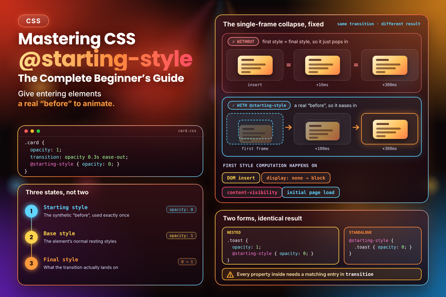
This is the single-frame collapse: an element's whole life, as far as the render pipeline is concerned, starts at frame one, and frame one already shows the finished result.
Read the diagram one row at a time. In the top row, the "before" and "after" cards are identical, because both styles were computed in the same frame and there is nothing to animate between. In the bottom row, the faint, shifted-down card is the @starting-style value, and the solid card is the final style, so the transition has a real distance to cover.
@starting-style breaks that collapse by giving the browser a manufactured "frame zero" to use instead of nothing. It doesn't change how the DOM insertion happens — the element still gets its real style computed in one pass — but that computation now has an explicit starting point to transition from, supplied by you, instead of jumping in cold.
Three States, Not Two
It's easy to conflate "starting style" with "the CSS you'd normally think of as the initial state," but they're genuinely different concepts. There are three distinct states worth naming precisely:
| State | What it means | When it applies |
|---|---|---|
| Starting style | The synthetic "before" value(s) declared inside @starting-style | Exactly once — the instant before the element's first style computation |
| Base style | The element's normal resting styles, declared outside @starting-style | Whenever no other, more specific state applies |
| Final style | The resolved style the element actually ends up transitioning to | Determined by whatever selector/state matches once the element is "live" |
A concrete example makes this click. Take a card that fades in on insert:
.card {
  opacity: 1;
  transition: opacity 0.3s ease-out;

  @starting-style {
    opacity: 0;
  }
}
Here, the base style is opacity: 1 — that's also the final style, since nothing else overrides it once the card exists. The starting style is opacity: 0, used only for that first computation. The transition then plays from 0 to 1, exactly once, and never again — every subsequent change to .card's opacity (if any) transitions normally between base/final values, with no starting style involved.
What @starting-style Actually Is
Formally, @starting-style is a CSS at-rule that defines the style values a browser should use for an element's first style computation — the very first time it computes a style for that element, which happens in one of four situations:
- The element is newly inserted into the DOM.
- The element's (or an ancestor's)
displaychanges fromnoneto any rendered value. - The element becomes visible again after being hidden via
content-visibility: hidden. - The page first renders, for elements already present in the initial HTML.
Outside of those first-computation moments, @starting-style has no effect at all. It is not a persistent style you can rely on later — it applies for exactly that one instant, and then the browser transitions away from it toward whatever the element's real, resolved style is. Think of it as a one-time seed value, not an alternate resting state.
This diagram sorts the situations people most often mix up. Everything on the left gives the element a brand-new first style; everything on the right happens to an element that already has one, so a plain transition is the tool for those.
Two entries on the right catch people out. Adding a class to a node that's already on screen is not an entrance, so the starting style is ignored; a plain transition between the two states is what you want there. And a re-render only updates the node React or Vue already has, so nothing replays. On the left, the surprise is the last card: elements in the initial HTML do get a first style, so a @starting-style rule can fade content in on page load.
Syntax: Two Equivalent Forms
@starting-style can be written in two ways, and they behave identically — pick whichever reads better for the rule at hand.
Nested Form
Nest @starting-style directly inside the ruleset it belongs to. This keeps the starting values right next to the final values they pair with, which usually reads more naturally:
.toast {
  opacity: 1;
  transform: translateY(0);
  transition: opacity 0.3s ease-out, transform 0.3s ease-out;

  @starting-style {
    opacity: 0;
    transform: translateY(-12px);
  }
}
Standalone Form
Alternatively, write @starting-style as a top-level at-rule, with your selector nested inside it instead:
.toast {
  opacity: 1;
  transform: translateY(0);
  transition: opacity 0.3s ease-out, transform 0.3s ease-out;
}

@starting-style {
  .toast {
    opacity: 0;
    transform: translateY(-12px);
  }
}
Both forms produce the exact same result. The standalone form is handy when you want to group every starting style in a stylesheet in one place, or when a build/preprocessing setup makes nesting awkward; the nested form keeps related declarations physically close together, which tends to be easier to maintain in practice.
Where It Can Be Used
@starting-style isn't scoped to modals or any particular UI pattern — it applies to any rule targeting any element undergoing its first style computation. That includes:
- Elements freshly inserted via JavaScript (
appendChild, a framework mounting a component, etc.). - Elements whose
displayflips fromnonetoblock/flex/grid/etc. — a class toggle, a:checkedsibling selector, anything that changesdisplay. - Elements revealed after
content-visibility: hiddenstops hiding their rendering. - Elements matched by any selector — a class, an attribute selector, an ID, a pseudo-class like
:hoverif it happens to be true at insertion time, a descendant combinator — the same matching rules that apply everywhere else in CSS apply here too.
In other words, there's nothing special about the selector side of a @starting-style rule. The only special thing is when its declarations get used: exactly once, at first computation, instead of never.
How the Cascade Treats Starting Styles
@starting-style rules aren't a separate, isolated system — they participate in the normal CSS cascade, with the usual specificity and matching rules applying on top.
Selector matching still has to succeed. Writing a @starting-style block doesn't automatically apply to "whatever gets inserted nearby" — the selector inside it has to actually match the element, exactly like any other rule. If you write:
@starting-style {
  .card {
    opacity: 0;
  }
}
...and the element being inserted is <div class="card featured">, this rule still applies — .card matches any element with the card class, including one that also has featured. Ordinary cascade matching, not an exact-selector requirement, is what decides whether a starting style applies. If you needed a different starting value specifically for .card.featured, you'd write a second, more specific @starting-style rule for it — and normal specificity rules would decide which declarations win, exactly as they would anywhere else.
Inherited properties propagate normally. If a @starting-style rule sets an inherited property (like color or visibility) on a parent, children inherit that starting value during that first render, the same way they'd inherit any other declared value. There's no special carve-out here — inheritance during the starting-style moment behaves exactly like inheritance during any other style computation.
Only transitioned properties actually animate. This is the one rule worth committing to memory above all others: a property declared inside @starting-style only animates if that same property is also listed in the element's transition (or covered by transition: all). Anything else declared inside @starting-style but not transitioned simply jumps straight to its final value with no animation — @starting-style supplies a starting value, but the transition property is what actually turns "value A to value B" into motion.
First Worked Example: Fade-In on DOM Insert
Here's the complete pattern for the exact problem from the introduction — an element that should fade in the moment it's inserted, with no JavaScript beyond the insertion itself:
.notification {
  opacity: 1;
  transition: opacity 0.3s ease-out;

  @starting-style {
    opacity: 0;
  }
}
const note = document.createElement("div");
note.className = "notification";
note.textContent = "Saved!";
document.body.appendChild(note);
// No offsetHeight hack, no requestAnimationFrame — it just fades in.The moment note is appended, the browser computes its first style. Thanks to @starting-style, that computation starts from opacity: 0 instead of jumping straight to opacity: 1 — and because opacity is listed in transition, the browser animates between the two.
Try it yourself. Each click of Insert card appends the same card to both columns; the only difference between them is the @starting-style block:
With @starting-style
Without @starting-style
Three things worth trying, one per idea in this post:
- Insert a few cards. The left column eases each one in; the right column's cards just appear, even though both lists share the same
transition. That's the single-frame collapse, side by side with its fix. - Click Re-render. Every card's render count ticks up, but nothing replays its entrance. Each card already had its first style computed, so
@starting-stylehas nothing left to do (see Mistake 3 below). - Uncheck "List
transformintransition" and insert again. New cards still fade, but they no longer rise or grow; they sit at their final position from the first frame. That's the single most common mistake, covered in the warning above: the startingtransformis there, but nothing transitions it.
Slide-In Example
The same pattern works for a position-based entrance — a toast or banner sliding down into place:
.banner {
  transform: translateY(0);
  transition: transform 0.35s ease-out;

  @starting-style {
    transform: translateY(-100%);
  }
}
On insertion, the banner starts fully translated off-screen above its own box, and transitions down to translateY(0) — a clean slide-in with no keyframes required.
Scale-In Example
A scale-based "pop in" reads well for small UI elements like tooltips, badges, or a button that appears after some async action completes:
.badge {
  transform: scale(1);
  transition: transform 0.25s ease-out;

  @starting-style {
    transform: scale(0);
  }
}
The badge starts at zero scale and grows to its full size the instant it's inserted — a plain transition, doing something that used to require a @keyframes block just to fake a "from nothing" starting point.
Combining Multiple Properties in One Rule
None of these examples are mutually exclusive — the more common real-world case combines opacity, a small transform, or both, in a single @starting-style block:
.card {
  opacity: 1;
  transform: translateY(0) scale(1);
  transition: opacity 0.3s ease-out, transform 0.3s ease-out;

  @starting-style {
    opacity: 0;
    transform: translateY(8px) scale(0.96);
  }
}
This is the classic "fade up and settle" entrance — a subtle combination of fade, slight rise, and slight scale, all driven by a single @starting-style block and a single transition declaration, with no JavaScript involvement at all.
Nested vs. Standalone: A Quick Comparison
Both forms shown earlier are functionally identical, but they suit slightly different situations:
| Nested form | Standalone form | |
|---|---|---|
| Best for | A single rule, or a small handful, where the starting values belong visually next to their final values | Grouping many starting-style declarations together, or generated/authored CSS where nesting is awkward |
| Readability | Easier to see "final value → starting value" at a glance for one rule | Easier to audit every starting style in a file at once |
| Selector repetition | None — the selector is written once | The selector is repeated inside the at-rule |
Most of the examples in this post use the nested form simply because it keeps each example self-contained, but reach for whichever form makes your actual stylesheet easier to read.
Browser Support and Progressive Enhancement
allow-discrete and @starting-style reached Baseline in 2024 (Chrome/Edge 117+, Firefox 129+, Safari 17.5+ — Safari shipped allow-discrete one release earlier, in 17.4).
The good news is that shipping @starting-style today requires no fallback code and no @supports guard. In a browser without support, the at-rule is simply ignored entirely — the element renders in its final state instantly, with no error and no broken layout. That's a graceful, invisible degradation: users on older browsers just don't get the entrance animation; everyone else does. There's nothing unsafe about shipping it unconditionally.
Common Beginner Mistakes
Mistake 1: Setting a Property in @starting-style That Isn't Transitioned
Covered above, but worth repeating as its own item because it's the mistake nearly everyone hits first: @starting-style only supplies a value. Animation still requires that property to appear in transition or transition-property. Declare transform inside @starting-style without transitioning transform, and it will jump to its final value instantly, silently, with no console warning to point you at the cause.
Mistake 2: Assuming the Starting-Style Selector Matches Automatically
@starting-style { .card { opacity: 0; } } only applies to elements the selector .card actually matches. If your real markup only ever inserts <div class="card-item"> (a different class entirely, not .card with an extra class), the starting style silently never applies, and the element pops in with no animation and no error — because as far as the cascade is concerned, no rule matched at all. Double-check that the selector inside @starting-style genuinely matches the element you're inserting, the same way you'd debug any other "my CSS isn't applying" issue.
Mistake 3: Expecting It to Re-Apply on Every Re-Render
@starting-style fires exactly once per "becomes newly visible" event — first DOM insertion, or a display: none → rendered flip, or emerging from content-visibility: hidden. It does not re-apply every time a component re-renders, every time a class toggles, or every time some unrelated property changes on an already-visible element. If you're expecting a starting-style-driven animation to replay on a state change that isn't one of those three triggers, it won't — you'd want a normal transition between two "real" states instead, or you'd need to actually remove and re-insert the element (or toggle its display) to get a fresh first-computation moment.
Mistake 4: Using It on a Property That Never Actually Changes at Insertion
@starting-style only produces motion when the starting value and the final value genuinely differ. If your final style is the property's normal initial value — say, opacity: 1 is both the base style and also what the element would've rendered at without any @starting-style at all — and you set @starting-style { opacity: 1; } too, there's nothing to interpolate: the "before" and "after" are identical, so no visible change occurs regardless of what's in transition. Make sure the starting value you declare is actually different from the final value you're transitioning to — otherwise you're describing a transition with no distance to cover.
Frequently Asked Questions
Where This Goes Next
This post covers the mechanism in isolation — fades, slides, scales, one property at a time. Part 2 turns this into a full pattern library — cards, toasts, dropdowns, and more, built from the same handful of primitives covered here.
A couple of things intentionally weren't covered here. Combining @starting-style with display: none and modal/popover patterns — where transition-behavior: allow-discrete becomes necessary alongside it — is Part 3's job, since that mechanism deserves its own explanation rather than a rushed mention here. Performance characteristics and accessibility considerations (like respecting prefers-reduced-motion for these entrance animations) are covered in Part 4.
Conclusion
@starting-style closes a gap that's existed in CSS for as long as transitions have: the total lack of a "before" frame on an element's very first render. By letting you declare that before-frame explicitly — for exactly one moment, and nowhere else — it turns what used to require JavaScript reflow hacks or a throwaway @keyframes block into a couple of lines of plain, declarative CSS. The mental model is small once it clicks: three distinct states (starting, base, final), a starting style that fires exactly once, and a normal transition that does the actual animating between whichever two values genuinely differ.
Key Takeaways:
@starting-stylesupplies the missing "before" state for an element's first-ever style computation — DOM insertion, adisplay: none→ rendered flip, or emerging fromcontent-visibility: hidden.- It fires exactly once per first-computation event — it is not a persistent style, and it does not re-apply on ordinary re-renders or state changes.
- Only properties also listed in
transition(ortransition: all) actually animate from their starting values — anything else just jumps straight to its final value. - Two equivalent syntax forms exist: nested inside a ruleset, or standalone as a top-level at-rule wrapping a selector. Pick whichever keeps your stylesheet more readable.
@starting-stylerules follow the normal cascade — the selector inside still has to match, and ordinary specificity rules decide which declarations win.- Inherited properties set inside
@starting-stylepropagate to children exactly like normal inheritance during that first render. allow-discreteand@starting-stylereached Baseline in 2024 (Chrome/Edge 117+, Firefox 129+, Safari 17.5+ — Safari shippedallow-discreteone release earlier, in 17.4), and browsers without support simply ignore the at-rule with no fallback code required.- The most common mistakes are all selector- or transition-list mismatches: an untransitioned property, a starting-style selector that doesn't actually match, or a starting value that's identical to the final value.
This one's the foundation the rest of the series builds on, and the single-frame collapse was surprisingly hard to draw so it reads at a glance — that diagram, the trigger map beside it, and the side-by-side insert demo took more iterations than the prose did. I hope seeing both columns run makes the fix click faster than the spec ever could. Part 2 turns it into a full pattern library. 🌱