
Animate Dialogs & Popovers with CSS @starting-style
 (opens full-size image in a new tab)
Introduction
Part 1 introduced @starting-style as the missing "before" state for properties that were already animatable — opacity, transform, background-color, and friends. Part 2 put that idea to work across a whole catalogue of real UI patterns: cards, toasts, dropdowns, accordions. In every one of those examples, the property doing the animating could already be interpolated — the browser knows how to compute "70% of the way between 0 and 1," or "40% of the way between scale(0.9) and scale(1)."
There's one property neither post touched, because it can't be solved the same way: display. You cannot fade opacity on an element that isn't generating a box in the first place, and display: none means exactly that — no box, nothing painted, nothing to animate. Pitfall 2 of An Interactive Guide to CSS Transitions already covers the short version of this problem and gives a quick preview of the fix. This post is the deep dive: why display behaves so differently from every other property you've transitioned, what transition-behavior: allow-discrete actually does under the hood, and how that combines with @starting-style to animate the two browser features built entirely around toggling display on and off — the native <dialog> element and the Popover API — along with the top layer both of them quietly depend on.
This is the densest post in the series so far. There's more genuine, easy-to-miss nuance packed into "just add allow-discrete" than the one-liner makes it sound like, so we'll go slow.
Why display Never Animated
Every CSS transition or animation works by computing intermediate values between a start and an end — the browser needs something to interpolate. opacity: 0 to opacity: 1 gives it a number line to walk along. transform: scale(0.9) to scale(1) gives it a matrix to interpolate between. Even color transitions work this way, blending through intermediate RGB or OKLCH values.
display: none breaks that model at the most fundamental level, before interpolation even becomes a question: an element with display: none generates no box at all. It isn't hidden-but-present, the way visibility: hidden or opacity: 0 leave a box in place that simply doesn't paint or doesn't accept clicks — it's absent from the render tree entirely. There is no width, no height, no position, no paintable surface. When the browser tries to animate to or from that state, there's nothing on that end of the transition to compute a mid-point from. You can't be "40% of the way" between a box that doesn't exist and a box that does — the question doesn't have an answer.
That's the underlying reason display historically couldn't be transitioned at all, full stop, regardless of duration or timing function. It wasn't a missing feature so much as a structural impossibility given how the rest of the transition model works: no box, no hook, no animation.
Discrete vs. Interpolable Properties
Zoom out one level and display turns out to be one example of a broader category. Most CSS properties you've ever transitioned are interpolable — the browser can compute a meaningful value partway between the start and the end. opacity: 0.3, translateX(12px), background-color: rgb(120, 45, 200) — all of these have an infinite number of valid in-between states, and the browser's whole transition engine is built around walking through them smoothly.
Discrete properties don't have that luxury. Their values are keywords or otherwise non-continuous — there's no meaningful "60% of the way between none and flex," no fractional value that sits between dashed and solid for border-style. A discrete property is only ever fully at its start value or fully at its end value, with nothing valid in between. Common examples besides display:
content-visibility(visible/hidden/auto)background-image(there's no way to blend two arbitrary images)list-style-type,border-style,overlay(more on that one later)
The distinction matters because it changes what a transition or animation can do with the property, not just how smoothly it does it.
The Default 50% Flip
Here's a detail that surprises a lot of developers: discrete properties can be animated, in a narrow sense — they just can't be interpolated. Instead of moving through in-between values, the browser holds the start value and then flips to the end value at the midpoint (50%) of the duration. That's what a @keyframes animation has always done with a discrete property, and it's what a transition does too, once the property has been opted in with allow-discrete (the next section).
Without that opt-in, a transition doesn't flip a discrete property at 50% — it doesn't transition it at all. Listing the property in transition changes nothing, and the value switches the instant the state changes:
.card {
  border-style: dashed;
  transition: border-style 1s;
}

.card:hover {
  border-style: solid; /* switches instantly — a plain transition skips discrete properties */
}

.card.opted-in {
  transition: border-style 1s allow-discrete; /* holds dashed for 0.5s, then snaps to solid */
}
Neither version produces motion you can see — there's nothing to interpolate either way. The opted-in one just waits half the duration before it snaps. The classic visibility fade-out trick from Pitfall 2 of the transitions guide is a hand-rolled version of the same idea: a carefully chosen transition-delay held the value change back until the fade had finished, long before allow-discrete existed to do it properly.
display and content-visibility don't follow this generic 50% rule at all — once allow-discrete is involved, they get their own, more useful direction-aware timing, which is the subject of the next few sections.
transition-behavior and allow-discrete
transition-behavior is the property that changes a discrete property's status from "excluded" to "included." It only has two values: normal (the default — discrete properties don't meaningfully transition) and allow-discrete (opt the property in).
You almost never write transition-behavior as its own standalone declaration, though — in practice it's set per-property, as one more slot in the transition shorthand, positioned exactly like transition-duration, transition-timing-function, and transition-delay already are:
.modal {
  transition: opacity 0.3s ease, display 0.3s allow-discrete;
}
Read that comma-separated list the same way you'd read transition-property matched up against transition-duration: each segment before a comma is its own independent mini-transition, with its own property, its own duration, its own timing function, and — new here — its own behaviour keyword. opacity gets a normal, interpolated 0.3s ease transition. display gets its own 0.3s duration and the allow-discrete keyword tacked on at the end, which is what actually lets it participate instead of being silently skipped.
With allow-discrete in place, display stops being invisible to the transition engine — but it still can't be interpolated, because keywords like none and block still have nothing meaningful in between. What changes is when it flips.
Opening Elements Smoothly: The Entry Flip
For display and content-visibility specifically — not generic discrete properties, which still default to the 50% midpoint flip described above — the browser special-cases the flip point based on direction. When an element is transitioning into a displayed, rendered state (an entry), display flips at 0%: the very first instant of the duration.
That's deliberate, and it's the piece that makes the rest of the entry pattern work. If display waited until 50% or 100% to flip to block, the element still wouldn't exist as a paintable box for the first part of its own entrance transition — opacity and transform would have nothing to animate on, because there'd be no box yet to apply those styles to. Flipping at 0% means the box exists for the entire entrance, so every other property in the same transition list has something real to interpolate across from the very first frame.
.modal {
  display: none;
  opacity: 0;
  transform: scale(0.95);
  transition: opacity 0.25s ease, transform 0.25s ease, display 0.25s allow-discrete;
}

.modal[open] {
  display: block;
  opacity: 1;
  transform: scale(1);
}

/* The state the browser transitions FROM the instant [open] is first applied. */
@starting-style {
  .modal[open] {
    opacity: 0;
    transform: scale(0.95);
  }
}
Notice that allow-discrete alone wouldn't be enough here, and neither would @starting-style alone. allow-discrete fixes when display flips, but says nothing about opacity or transform — without @starting-style, the browser still has no "before" value to animate those from on the very first render where the element goes from not-rendered to rendered, so they'd just pop straight to 1 and scale(1) instantly, for the same underlying reason Part 1 covers for any first-paint entrance. And @starting-style alone doesn't touch display's flip timing at all — without allow-discrete in the transition list, display still isn't a participating property, so nothing about it (or anything gated behind it existing as a box) transitions smoothly. You need both, together, for a display: none ↔ visible transition to actually animate.
Closing Elements Smoothly: The Exit Flip
The exit direction is the mirror image, and it's just as deliberate. When an element transitions out of a displayed state — back toward display: none — the flip happens at 100%, the very end of the duration, instead of the start.
If display flipped to none immediately when the closing state was applied (the old, un-fixed default), the element would vanish from the render tree — and along with it, from layout, from hit-testing, from focus — the instant the transition "started," even though opacity and transform are still supposed to be visibly fading and shrinking for the next quarter-second. You'd see nothing happen at all; the box would already be gone. Flipping at 100% instead means the element stays fully present, in the layout, and interactive for the entire exit — only actually disappearing once the fade/shrink has visually finished playing.
/* Closing: [open] is removed, so this is what the element transitions TO. */
.modal {
  opacity: 0;
  transform: scale(0.95);
}
Because the base .modal rule (from the entry example above) already declares display: none, opacity: 0, and transform: scale(0.95) as the "closed" values, removing the open attribute is all it takes to trigger the exit — the same transition declaration handles both directions automatically, just with display's flip landing at the opposite end of the timeline depending on which way the change is going.
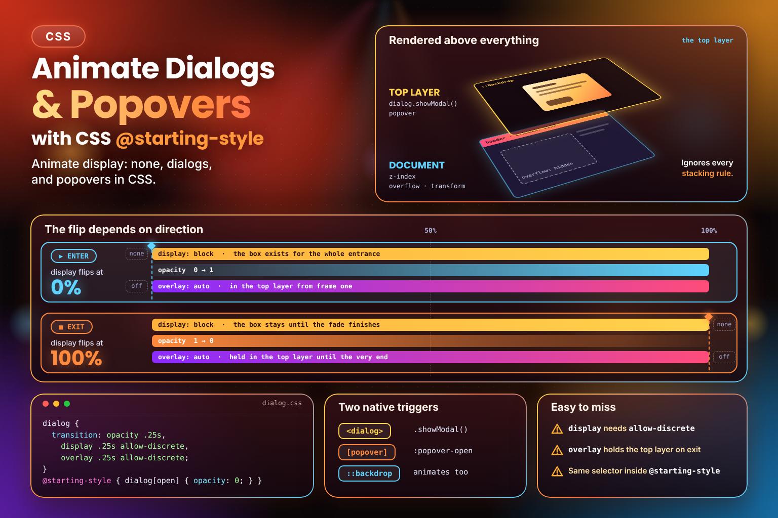
This asymmetry — flip at 0% going in, flip at 100% going out — is the single most important idea in this whole post, and it's worth seeing laid out visually rather than just described:
Both timelines run across the exact same duration. The top one shows why an entrance needs the box to exist from the very first frame; the bottom one shows why an exit needs the box to keep existing until the very last one. Every pattern in the rest of this post — dialogs, popovers, the top layer — is this same shape applied to a specific browser feature.
Animating the <dialog> Element
The native <dialog> element is the most common place you'll actually reach for this pattern, because <dialog> is built around exactly the discrete-property problem described above. Closed, a <dialog> has a user-agent default of display: none — there's no need to set that yourself. Opened via its .showModal() method, it does two things at once: it sets display to a rendered value (reflected by the open attribute appearing on the element) and it promotes the element into the top layer, which we'll unpack shortly.
Here's the minimal markup and script the CSS below animates. showModal() opens it, and close() (or a <form method="dialog"> button, or Esc) closes it:
<button id="open-btn">Open dialog</button>

<dialog id="my-dialog">
  <h2>Hello</h2>
  <p>This is a native modal dialog.</p>
  <button id="close-btn">Close</button>
</dialog>
const dialog = document.getElementById("my-dialog");
document.getElementById("open-btn").addEventListener("click", () => dialog.showModal());
document.getElementById("close-btn").addEventListener("click", () => dialog.close());The transition pattern is identical to the generic one above, just targeting the open attribute instead of a class:
dialog {
  opacity: 0;
  transform: scale(0.95) translateY(-0.5rem);
  transition: opacity 0.25s ease, transform 0.25s ease, display 0.25s allow-discrete, overlay 0.25s allow-discrete;
}

dialog[open] {
  opacity: 1;
  transform: scale(1) translateY(0);
}

@starting-style {
  dialog[open] {
    opacity: 0;
    transform: scale(0.95) translateY(-0.5rem);
  }
}
You don't need to declare display: none explicitly here — the user-agent stylesheet already does that for a closed <dialog> — but display still needs to appear in the transition list with allow-discrete, since that's what governs when the browser's own default flip happens, not just whether one exists.
The ::backdrop pseudo-element — the dimmed layer showModal() places behind the dialog — can be animated with the exact same combination, which is what turns a dialog's entrance from "content pops in over a background that's already dark" into "content and dimming fade in together":
dialog::backdrop {
  background: rgb(0 0 0 / 0%);
  transition: background 0.25s ease, display 0.25s allow-discrete, overlay 0.25s allow-discrete;
}

dialog[open]::backdrop {
  background: rgb(0 0 0 / 50%);
}

@starting-style {
  dialog[open]::backdrop {
    background: rgb(0 0 0 / 0%);
  }
}
background here is interpolable on its own (it's really animating the alpha channel of a color), so @starting-style is doing the same job it always does — it's display and overlay on the pseudo-element itself that need allow-discrete, for the same top-layer reason described in a couple of sections.
Animating Popovers
The Popover API gives any element the same top-layer, light-dismiss, display-toggling behaviour <dialog> has, without needing an actual <dialog> element. Add a popover attribute (popover="auto" for the common case with light-dismiss and only-one-open-at-a-time behaviour, or popover="manual" if you want to control opening/closing entirely yourself), then wire it to a trigger with popovertarget:
<button popovertarget="info-popover">Show info</button>

<div id="info-popover" popover="auto">
  <p>Here's some extra detail, shown without any JavaScript.</p>
</div>
That markup alone is enough to get a working, dismissible popover with zero script — the browser wires up the open/close behaviour from the attributes. :popover-open is the pseudo-class you style the open state with, and it plays exactly the same role [open] plays for <dialog>:
[popover] {
  opacity: 0;
  transform: translateY(0.5rem);
  transition: opacity 0.2s ease, transform 0.2s ease, display 0.2s allow-discrete, overlay 0.2s allow-discrete;
}

[popover]:popover-open {
  opacity: 1;
  transform: translateY(0);
}

@starting-style {
  [popover]:popover-open {
    opacity: 0;
    transform: translateY(0.5rem);
  }
}
If you'd rather trigger it from JavaScript instead of (or alongside) popovertarget, .showPopover(), .hidePopover(), and .togglePopover() are the imperative equivalents — none of that changes anything about the CSS side, which stays exactly as written above. The same pattern also animates the picker of a customisable <select>.
The overlay Property
You've seen overlay alongside display in a couple of the examples already, and it deserves its own explanation, because it's solving a subtly different problem. overlay is a discrete property — like display, only two effective states — that specifically controls an element's top-layer membership during a transition.
Here's the gap it closes: display and opacity/transform can be transitioning correctly, flip point and all, while the element is still instantly yanked out of the top layer the moment its closing state is applied. An element removed from the top layer stops being rendered above everything else immediately — so even with a perfectly smooth fade playing out on opacity, the dialog could visually disappear (or start rendering behind other content) before that fade has actually finished, because top-layer removal doesn't wait for anything by default.
Listing overlay in the same transition list as display, with allow-discrete, fixes exactly that: it keeps the element in the top layer for the full duration of its exit transition, and only actually removes it once the transition completes — mirroring the same "flip at 100%" behaviour display already gets. You never set overlay yourself; the browser sets it to auto while an element is in the top layer, and author styles can't override it. All you do is transition it.
dialog {
  transition: opacity 0.25s ease, display 0.25s allow-discrete, overlay 0.25s allow-discrete;
}
Here's the same exit timeline from earlier, this time tracking top-layer membership instead of display:
Without overlay in the list, the dialog drops out of the top layer at 0%. It keeps fading, but now as an ordinary element in its DOM position, clipped by its ancestors and covered by anything stacked above it, with its ::backdrop already gone. With overlay transitioned, it stays on top until the fade has finished.
For most everyday dialogs and popovers, the simpler display-only pattern from earlier in this post is already enough to look and feel right — overlay matters most when you notice a dialog's exit transition visually breaking (flashing behind other content, or the backdrop disappearing a beat early) despite display and opacity both being set up correctly. Treat it as the more complete, more advanced version of the same pattern, not a replacement for it.
The Top Layer, Explained
Both <dialog> (opened modally) and the Popover API rely on a browser-managed rendering layer called the top layer, and understanding it explains a lot of behaviour that otherwise looks like magic. The top layer sits logically above the entire rendered document — above every stacking context a page's own CSS could construct. Elements promoted into it ignore the usual rules that would otherwise pin an element beneath something else: an ancestor's z-index, an ancestor's overflow: hidden clipping it, a transform on an ancestor creating a new stacking context that would normally trap the element inside it. None of that applies once an element is in the top layer. (The z-index and stacking contexts guide shows how this plays out against real stacking bugs.)
In the diagram, the lower plane is the document, with a clipped, transformed wrapper and a header at z-index: 9999; the dialog is written inside that wrapper. The upper plane is the top layer, where showModal() makes the dialog render, above everything below it, along with its ::backdrop.
That's precisely why a modal dialog reliably renders above absolutely everything else on the page, no matter how deeply nested it is in the DOM or how aggressively some ancestor tries to clip or stack beneath it — the top layer isn't part of that stacking hierarchy at all, it's a separate layer the browser composites on top of the whole thing. The Fullscreen API uses the same mechanism for the same reason.
The catch, and the reason this post exists, is that by default, removal from the top layer is instant — the moment a dialog closes or a popover is dismissed, it's yanked out immediately, regardless of what CSS transition might still be visually playing on it. That's the exact same discrete-property problem display has, just at the top-layer level instead of the render-tree level, which is why overlay — the property built specifically to manage top-layer membership over time — needs the identical allow-discrete treatment to behave correctly during an exit.
Multiple Discrete Properties in One Transition
Real dialogs and popovers often need more than one discrete property flipping in sync. display handles whether the element renders at all; overlay handles whether it stays in the top layer; content-visibility is a third discrete property worth knowing about, useful when you want the browser to skip rendering work for an off-screen or closed element entirely (not just hide it, but avoid paying for layout and paint it doesn't need yet).
All of them slot into the same shorthand the same way, each with its own duration and allow-discrete:
.panel {
  content-visibility: hidden;
  opacity: 0;
  transition:
    opacity 0.25s ease,
    display 0.25s allow-discrete,
    overlay 0.25s allow-discrete,
    content-visibility 0.25s allow-discrete;
}

.panel.is-open {
  content-visibility: visible;
  opacity: 1;
}

@starting-style {
  .panel.is-open {
    opacity: 0;
  }
}
Every discrete property in that list follows the same entry/exit asymmetry independently — display, overlay, and content-visibility all flip at 0% going in and 100% going out, in lockstep with whatever interpolable properties are transitioning alongside them.
Accessibility
<dialog> opened with .showModal() and the Popover API both come with meaningful accessibility behaviour built in, for free: focus is trapped or moved sensibly, and Esc dismisses the element without you writing a single line of JavaScript for either. The animation techniques in this post don't touch any of that — they only change how the transition looks, not how focus or keyboard dismissal behave. The one thing worth actively watching for is duration: because the exit transition now keeps an element visible, focusable, and in the top layer for its entire length, an exit that's too long can make the interface feel stuck — a user presses Esc, expects the dialog gone, and it visually lingers for half a second longer than feels responsive. Keep exit transitions on the shorter end of what you'd use anywhere else.
As with every animation technique in this series, respect prefers-reduced-motion — wrap the transition declarations (or at least shorten them drastically) inside that media query for anyone who's asked for less motion. Part 4 covers this, and general @starting-style performance, in full depth.
Browser Support
allow-discrete and @starting-style reached Baseline in 2024 (Chrome/Edge 117+, Firefox 129+, Safari 17.5+ — Safari shipped allow-discrete one release earlier, in 17.4). The Popover API and native <dialog> are also Baseline. The exception is overlay: at the time of writing only Chromium-based browsers support it (MDN compatibility table). Elsewhere it's ignored, so a dialog's exit fade may be cut short, but nothing breaks. Treat overlay as a Chromium enhancement layered on top of the display pattern. None of this is bleeding-edge at this point, but it's still worth building with the fallback in mind: a browser without support for allow-discrete simply flips display (and overlay, and content-visibility) instantly, the way it always has — the rest of the transition either gets skipped alongside it or, depending on what else is in your rule, just pops rather than eases. Nothing breaks; it degrades to the old, abrupt-but-functional behaviour.
Common Pitfalls
Forgetting allow-discrete on display's own entry in the shorthand. It's easy to add display to the property list and forget the keyword that actually makes it participate:
/* ❌ display is listed, but nothing about it actually changes */
transition: opacity 0.3s ease, display 0.3s;
Without allow-discrete on that segment specifically, display is excluded from the transition exactly as if it weren't listed at all, and the element still snaps to display: none (or away from it) the instant the state changes — undermining the smooth entrance or exit you were trying to build for every other property in the list too, since they now have no box to sit on for part of the sequence.
Reaching for .show() when you meant .showModal(). Covered above, but common enough to repeat: if a dialog isn't getting a backdrop, isn't trapping focus, or isn't responding to Esc, check which method opened it before assuming your CSS is broken.
Giving the @starting-style rule a weaker selector than the open-state rule. Starting styles aren't a separate system that automatically wins — the browser works them out by cascading your @starting-style rules together with every normal rule that matches the element, using ordinary specificity and source order. The element already has [open] at that moment, so a starting value written against a less specific selector loses to the open-state rule it's meant to precede. The element then "starts" at its final value, and there's nothing left to animate:
.modal[open] {
  opacity: 1;
}

/* ❌ .modal (0,1,0) loses to .modal[open] (0,2,0) — the starting opacity resolves to 1 */
@starting-style {
  .modal {
    opacity: 0;
  }
}

/* ✅ same selector as the open state, declared after it, so the starting value wins */
@starting-style {
  .modal[open] {
    opacity: 0;
  }
}
The same trap applies to dialog versus dialog[open], and to [popover] versus [popover]:popover-open. The reliable habit: write the selector inside @starting-style exactly as the open-state rule writes it, and place the @starting-style block after that rule — which is what every example in this post does.
Leaving overlay out of the transition list and wondering why an exit "glitches." If a dialog's fade-out looks correct for a moment and then visually jumps (disappearing behind other content, or its backdrop cutting out early) before the transition duration has elapsed, that's almost always top-layer removal happening instantly. Add overlay 0.25s allow-discrete alongside display in the same shorthand.
Debugging Tips
When a display/@starting-style transition isn't behaving, DevTools' Styles pane is the fastest way to find out why:
- Check whether the
@starting-stylerule shows up as matched against the element in its open state at all — if it's absent, the selector inside it doesn't match; if it's there but its declarations are struck through, a more specific rule is overriding them, which is the specificity pitfall above. - Check
transition-property(or the shorthand) actually listsdisplay(andoverlay/content-visibilityif you're using them) — a property left out of that list is simply not part of the transition, no matter what else is declared on the element. - Toggle the element's open/closed state directly in DevTools rather than through your trigger, and watch whether
display's computed value updates instantly or only after the rest of the transition finishes — that tells you immediately whetherallow-discreteis actually taking effect.
Interactive Example
The playground below has a real <dialog> and a real popover, each wired up with the full allow-discrete + @starting-style pattern from this post. Toggle either one's checkbox off and watch the same open/close interaction snap instantly instead of animating — the exact difference every code block above has been describing.
Dialog & Popover Entry/Exit Playground
Open and close a native <dialog> and a popover with @starting-style and transition-behavior: allow-discrete — toggle either one off to watch the animation break.
<!DOCTYPE html> <html lang="en"> <head> <meta charset="UTF-8" /> <meta name="viewport" content="width=device-width, initial-scale=1.0" /> <title>Dialog & Popover Entry/Exit Playground</title> </head> <body> <main class="playground"> <div class="playground-header"> <h1>Dialog & Popover Entry/Exit Playground</h1> <p>Open and close a real <code><dialog></code> and a real popover, both animated with <code>transition-behavior: allow-discrete</code> and <code>@starting-style</code>. Flip either checkbox off, then open/close that one again, to feel the difference between a real transition and an instant snap.</p> </div> <section class="demo-area" aria-label="Dialog and popover triggers"> <div class="demo-block"> <h2 class="demo-block-title">Native Dialog</h2> <p class="demo-block-desc">Opens via <code>.showModal()</code> — top layer, <code>::backdrop</code>, focus trap, and Esc-to-dismiss all included for free.</p> <button id="open-dialog-btn" class="toggle-btn" type="button">Open Dialog</button> </div> <div class="demo-block"> <h2 class="demo-block-title">Popover</h2> <p class="demo-block-desc">Opens via <code>popovertarget</code> — top layer and light-dismiss included, no JavaScript required just to trigger it.</p> <button popovertarget="demo-popover" class="toggle-btn" type="button">Open Popover</button> </div> </section> <output id="playground-output" class="readout" aria-live="polite">Dialog closed · Popover closed</output> <fieldset class="control-group"> <legend>Dialog Transition</legend> <div class="fields-grid"> <div class="field field--full"> <label class="checkbox-field" for="dialog-discrete-toggle"> <input type="checkbox" id="dialog-discrete-toggle" checked> <span>Enable <code>allow-discrete</code> + <code>@starting-style</code></span> </label> </div> </div> <p class="tip">Turn this off, then open or close the dialog again — <code>display</code> snaps instantly instead of fading and scaling, because it's no longer part of the transition and there's no starting-style value left for opacity/transform to animate from either.</p> </fieldset> <fieldset class="control-group"> <legend>Popover Transition</legend> <div class="fields-grid"> <div class="field field--full"> <label class="checkbox-field" for="popover-discrete-toggle"> <input type="checkbox" id="popover-discrete-toggle" checked> <span>Enable <code>allow-discrete</code> + <code>@starting-style</code></span> </label> </div> </div> <p class="tip">Same toggle, applied to the popover instead. Dismiss it with Esc, an outside click, or the button inside it — all built into the Popover API for free.</p> </fieldset> <dialog id="demo-dialog" class="dialog-demo"> <h2 class="dialog-demo-title">A Native <dialog></h2> <p>This element is opened with <code>.showModal()</code>, which promotes it to the top layer, gives it a <code>::backdrop</code>, traps focus inside it, and closes it on Esc — none of that is written in this sandbox's JavaScript.</p> <button id="close-dialog-btn" class="toggle-btn" type="button">Close</button> </dialog> <div id="demo-popover" class="popover-demo" popover="auto"> <h2 class="popover-demo-title">A Popover</h2> <p>Promoted to the top layer purely by the <code>popover</code> attribute. Click outside, press Esc, or use the button below to dismiss it.</p> <button popovertarget="demo-popover" popovertargetaction="hide" class="toggle-btn toggle-btn--ghost" type="button">Close</button> </div> </main> <script src="./index.js"></script> </body> </html>
Starting sandbox…
No console output yet.
No original version of /index.html to compare against.
Frequently Asked Questions
Conclusion
display: none was the one thing CSS transitions genuinely could not touch, for a structural reason rather than a missing-feature one: no box, nothing to animate. transition-behavior: allow-discrete and @starting-style fix that together — one governs when a discrete property like display, overlay, or content-visibility flips relative to the transition's direction, the other supplies the "before" value every other interpolable property in the same rule needs on that very first render. Neither alone is enough, and the direction-dependent asymmetry — flip at 0% going in, flip at 100% going out — is the detail that makes both native <dialog> and the Popover API animate correctly instead of just popping open and shut. With the top layer explained, you now have the full picture of why these elements behave the way they do, animated or not.
Key Takeaways:
display: nonegenerates no box, so historically there was nothing for a transition to interpolate to or from — a structural limit, not a missing feature.- Discrete properties (keyword-only, no in-between) can't be interpolated. A plain transition switches them instantly;
@keyframesanimations andallow-discretetransitions flip them at the 50% midpoint — exceptdisplayandcontent-visibility, which get direction-aware flip timing underallow-discrete. transition-behavior: allow-discreteis set per-property, positionally, in thetransitionshorthand —display 0.25s allow-discreteneeds its own duration slot, just liketransition-duration/transition-delayalways have.- Entry flips
displayat 0% (box exists for the whole entrance); exit flips it at 100% (box stays until the exit visually finishes) — you need bothallow-discreteand@starting-styletogether for a smoothdisplay: none↔ visible transition. - Native
<dialog>needs.showModal(), not.show(), to get the top layer,::backdrop, focus trapping, andEsc-to-dismiss. - The Popover API gives any element the same top-layer, light-dismiss behaviour via the
popoverattribute,popovertarget, and:popover-open. - Transitioning
overlay(withallow-discrete) keeps an element in the top layer for its full exit transition instead of being yanked out instantly — you only ever transitionoverlay, never set it. - The top layer ignores normal stacking-context rules entirely, which is why modals and popovers reliably render above everything else regardless of DOM position.
allow-discreteand@starting-stylereached Baseline in 2024; unsupported browsers just flip instantly, a safe fallback rather than a broken one.
Getting the display flip to land at the *start* of the entrance and the *end* of the exit — and drawing that asymmetry so it reads at a glance — took more iterations than I expected, as did the top-layer diagram and a playground where a real dialog and popover each snap back to the old behaviour on demand. I hope the timelines make that one rule stick. Part 4 closes the series with performance and accessibility. 🗂️