
CSS @starting-style Entry Animations: Practical Patterns
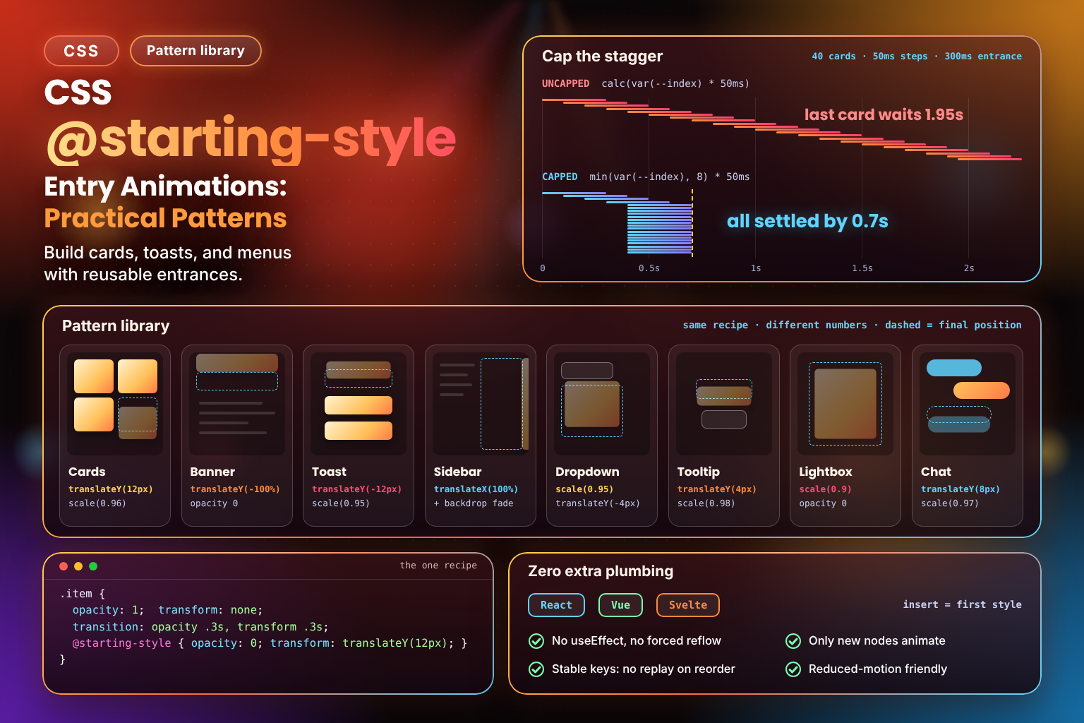 (opens full-size image in a new tab)
Introduction
@starting-style solves one very specific problem: a transition needs a "before" and an "after" to animate between, and an element that's just appeared on screen for the first time has never had a "before" — its first computed style is its only style, so there's nothing to animate from. @starting-style gives the browser that missing before-state, for exactly one moment: the instant the element is first rendered.
What follows isn't another explanation of the mechanism — it's the pattern library. Toasts, cards, sidebars, dropdowns, chat messages, table rows: the same handful of shapes come up over and over in real UIs, and every one of them turns out to be a small, predictable recipe once you know what you're looking for. Almost everything below only ever toggles opacity and transform — properties that don't need display to change, so @starting-style alone does the whole job, no display toggling required. The one place display: none genuinely can't be avoided (dialogs, popovers, true show/hide) is Part 3's territory, and I'll point you there each time a pattern edges close to it.
Cards Entering a Grid or List
The single most common real-world trigger for this pattern isn't a class toggle at all — it's a framework appending a new item to an array that a .map() (or v-for, or #each) is already rendering. The moment React (or Vue, or Svelte) inserts that new DOM node is the node's first-style moment, and @starting-style is watching for exactly that.
.card {
  opacity: 1;
  transform: translateY(0) scale(1);
  transition: opacity 0.35s ease, transform 0.35s ease;
}

@starting-style {
  .card {
    opacity: 0;
    transform: translateY(12px) scale(0.96);
  }
}
That's the whole recipe, and it's the shape you'll see repeated — with different numbers — through most of this post: a final state with a transition, and an @starting-style block giving the same properties a different starting value. No display: none anywhere, because the card was already part of the grid's layout the instant it existed; it just needed somewhere visually distinct to animate from.
👉 Try this hands-on in the interactive playground below — click Add Card a few times with @starting-style enabled, then switch it off and add a few more.
Notifications & Banners
A banner that slides down from the top of the page (a cookie notice, a "you're offline" bar, an announcement strip) is the same recipe with a different axis and, usually, a longer travel distance:
.banner {
  opacity: 1;
  transform: translateY(0);
  transition: opacity 0.3s ease, transform 0.3s ease;
}

@starting-style {
  .banner {
    opacity: 0;
    transform: translateY(-100%);
  }
}If the banner is inserted into the DOM only when it's needed (rather than always present and hidden), this works as-is — the insertion itself is the first-style moment. If instead you're toggling an existing, already-display: none banner back to visible, that's discrete-property territory, and belongs to Part 3 instead.
Toast Queues: Every New Toast Animates Independently
Toasts are where @starting-style genuinely earns its keep over the old class-toggle-plus-reflow dance, because a toast queue isn't one element transitioning — it's an unbounded stream of brand-new elements, each one appearing at a different moment while its neighbours sit still.
.toast {
  opacity: 1;
  transform: translateY(0) scale(1);
  transition: opacity 0.35s ease, transform 0.35s ease;
}

@starting-style {
  .toast {
    opacity: 0;
    transform: translateY(-12px) scale(0.95);
  }
}
The important part is what isn't happening here: when toast #4 gets pushed onto the stack, toasts #1 through #3 don't replay their entrance, flicker, or shift their transition state in any way. @starting-style only ever applies at the moment an element's style is first computed — and for #1 through #3, that moment is long past. Each toast's entrance is scoped to that one toast, which is exactly the behaviour you want from a queue and exactly the behaviour that used to take careful bookkeeping (tracking "is this toast new or existing?" in JavaScript) to get right.
👉 Try this hands-on in the interactive playground below — mash Add Toast a few times in a row and watch each one animate in on its own, independent of whatever the others are doing.
Sliding Sidebars
A slide-in sidebar (a filter panel, a cart drawer, a settings pane) is the cards recipe again, just travelling further and usually paired with a backdrop:
.sidebar {
  opacity: 1;
  transform: translateX(0);
  transition: opacity 0.3s ease, transform 0.35s ease;
}

@starting-style {
  .sidebar {
    opacity: 0;
    transform: translateX(100%);
  }
}

.backdrop {
  opacity: 1;
  transition: opacity 0.3s ease;
}

@starting-style {
  .backdrop {
    opacity: 0;
  }
}
This works cleanly as long as the sidebar and its backdrop are only ever inserted when opened and removed when closed — no persistent display: none element being flipped back and forth. If your sidebar instead lives permanently in the DOM and toggles display: none ↔ block, you're back in Part 3 territory: @starting-style alone won't animate that flip without transition-behavior: allow-discrete sitting on display too.
Mobile Navigation Reveal
A mobile nav overlay is functionally the same pattern as a sidebar — a panel that appears, usually full-screen or near it — so rather than repeat the recipe, it's worth calling out the one thing that trips people up here specifically: stagger the links, not just the panel.
.nav-panel {
  opacity: 1;
  transform: translateY(0);
  transition: opacity 0.25s ease, transform 0.3s ease;
}

@starting-style {
  .nav-panel {
    opacity: 0;
    transform: translateY(-8px);
  }
}

.nav-link {
  opacity: 1;
  transform: translateX(0);
  transition: opacity 0.25s ease, transform 0.25s ease;
  transition-delay: calc(var(--i) * 40ms);
}

@starting-style {
  .nav-link {
    opacity: 0;
    transform: translateX(-8px);
  }
}
Each link sets its own --i (an index — 0, 1, 2…) as an inline custom property, and transition-delay staggers them a fraction of a second apart. @starting-style doesn't need anything special to cooperate with this — it just supplies the starting value; the delay math is ordinary transition-delay, doing exactly what it always does.
Dropdown Menus, Tooltips & Accordions
These three get grouped together because they share the same shape: a small piece of UI that expands into view, usually triggered by a hover, click, or focus, and usually able to stay fully within opacity + transform (and, for the accordion, grid-template-rows) without ever needing display: none.
Dropdown Menus
.dropdown-menu {
  opacity: 1;
  transform: scale(1) translateY(0);
  transform-origin: top;
  transition: opacity 0.15s ease, transform 0.15s ease;
}

@starting-style {
  .dropdown-menu {
    opacity: 0;
    transform: scale(0.95) translateY(-4px);
  }
}
A dropdown that's only ever inserted/removed from the DOM (rather than kept around with display: none) gets this entrance for free. The moment it's mounted is the moment @starting-style fires.
Tooltips
Tooltips are the same recipe again, tuned for a much shorter, subtler distance — a tooltip that travels 12px and takes 300ms to appear reads as sluggish rather than helpful:
.tooltip {
  opacity: 1;
  transform: translateY(0) scale(1);
  transition: opacity 0.12s ease, transform 0.12s ease;
}

@starting-style {
  .tooltip {
    opacity: 0;
    transform: translateY(4px) scale(0.98);
  }
}Accordions
An accordion's expand/collapse is the one pattern here (note that @starting-style only animates a panel being inserted; once a panel is already in the DOM, toggling it open and closed is an ordinary 0fr ↔ 1fr transition with no starting style involved) that's tempted to reach for height: auto, which still can't be transitioned directly — auto isn't a fixed value the browser can interpolate toward. The safest way to stay inside this post's scope (no display toggling, no interpolate-size dependency) is to transition grid-template-rows between an explicit 0fr and 1fr, a well-known trick that sidesteps the "you can't animate to auto" limitation entirely:
.accordion-panel {
  display: grid;
  grid-template-rows: 1fr;
  opacity: 1;
  transition: grid-template-rows 0.25s ease, opacity 0.2s ease;
}

.accordion-panel > .accordion-content {
  overflow: hidden;
}

@starting-style {
  .accordion-panel {
    grid-template-rows: 0fr;
    opacity: 0;
  }
}
The inner wrapper's overflow: hidden is what makes a 0fr row actually clip its content instead of just letting it overflow — grid-template-rows doesn't imply clipping on its own.
Image Galleries & Lightbox Reveals
A lightbox overlay showing a full-size image is another insert-on-open, remove-on-close panel, so the CSS is the same shape you've seen a few times now. What's worth calling out here is scale direction: lightboxes tend to feel best growing into place rather than shrinking:
.lightbox {
  opacity: 1;
  transform: scale(1);
  transition: opacity 0.25s ease, transform 0.3s ease;
}

@starting-style {
  .lightbox {
    opacity: 0;
    transform: scale(0.9);
  }
}Product Grids & Staggering with transition-delay
An e-commerce grid populated by search results or a filter change is the cards pattern at scale — a whole batch of new elements appearing at once. Doing them all with the exact same timing can look like a flat, mechanical "flash," so a small stagger goes a long way:
.product-card {
  opacity: 1;
  transform: translateY(0);
  transition: opacity 0.3s ease, transform 0.3s ease;
  transition-delay: calc(var(--index) * 50ms);
}

@starting-style {
  .product-card {
    opacity: 0;
    transform: translateY(10px);
  }
}
Each card sets --index inline (its position in the batch), and transition-delay fans the entrances out over time. Resist the urge to write a .product-card:nth-child(1), :nth-child(2)… rule per position — the calc() + custom-property version handles any grid size with one rule, and it keeps working correctly if the grid is re-filtered and re-populated with a different item count later.
Here's what that cap buys on a 40-card grid, plotted on one time axis. Each bar is one card's 300ms entrance:
Uncapped, the delay grows linearly, and the last card doesn't even start until almost two seconds after the first. Capped at 8, the ramp stops after the eighth card and everything after it starts together, so the whole batch has settled by 0.7s. Readers still see the stagger at the top of the grid, where they're looking, without waiting for the bottom of it.
Masonry Layout Items
A masonry grid (columns of varying-height tiles, whether built with CSS columns, a JavaScript layout library, or the still-emerging native masonry layout) doesn't change anything about the recipe — each tile is still an independent grid item getting its own first-style moment when it's inserted. The one masonry-specific wrinkle is that tiles vary in height, so a uniform translateY distance can look inconsistent between a short tile and a tall one:
.masonry-item {
  opacity: 1;
  transform: scale(1);
  transition: opacity 0.3s ease, transform 0.3s ease;
}

@starting-style {
  .masonry-item {
    opacity: 0;
    transform: scale(0.95);
  }
}
Scaling in rather than translating sidesteps the height-inconsistency problem entirely — a 0.95 → 1 scale reads the same regardless of how tall the tile underneath it happens to be.
Lazy-Loaded Content
A lazy-loaded <img> is a trap worth knowing about (it's the "class added to a live node" card in Part 1's trigger diagram), because the obvious @starting-style version silently does nothing. @starting-style only applies to an element's first style computation, and adding a class to an <img> that's already in the DOM isn't one. A plain transition between two real states is the right tool instead:
img[data-lazy] {
  opacity: 0;
  transition: opacity 0.4s ease;
}

img[data-lazy].is-loaded {
  opacity: 1;
}
const img = document.querySelector("img[data-lazy]");
img.addEventListener("load", () => {
img.classList.add("is-loaded");
});Here the image has two genuine states, hidden and loaded, so no starting style is needed. If you'd rather insert the <img> into the DOM only once it has finished loading, that insertion is a first style computation and the standard @starting-style recipe applies again.
Search Results & Reordering Lists
Filtering or re-sorting a list (search-as-you-type, a sort-by-price toggle) is where @starting-style's per-element scoping matters most, because most of what changes in a re-render isn't new content — it's the same items in a different order.
.result-item {
  opacity: 1;
  transform: translateY(0);
  transition: opacity 0.25s ease, transform 0.25s ease;
}

@starting-style {
  .result-item {
    opacity: 0;
    transform: translateY(6px);
  }
}Stable keys are doing more work here than it might look like. Here's the same update, a new result N arriving at the top of A, B, C, rendered both ways:
With key={item.id}, the framework moves the three existing nodes down and creates exactly one new node for N, so N gets the entrance. With key={index}, it matches nodes by position instead: nodes 0–2 are reused in place and simply re-rendered with new content (N, A, B), and the only brand-new node is the one appended at the end, which now shows C. @starting-style does exactly what it always does and animates the new node. The new node just happens to hold the wrong item, so C, which was already on screen, animates in again while N appears without any entrance.
Infinite Scroll & Chat Messages
Both of these are the same shape as the toast queue: a list that keeps growing, one or a few items at a time, for as long as the user stays on the page. Infinite scroll appends items as the user nears the bottom; a chat thread appends a message whenever one arrives. Either way, it's the identical recipe:
.message-bubble {
  opacity: 1;
  transform: translateY(0) scale(1);
  transition: opacity 0.25s ease, transform 0.25s ease;
}

@starting-style {
  .message-bubble {
    opacity: 0;
    transform: translateY(8px) scale(0.97);
  }
}
The only meaningfully different thing worth handling in a chat thread specifically is scroll position — you'll typically want to scroll the container to the bottom right after appending a new bubble, so the entrance is actually visible rather than happening below the fold. That's ordinary JavaScript (container.scrollTo(...)), unrelated to @starting-style itself, but easy to forget and notice only once a real conversation gets long enough to scroll.
Table Row Insertion
A <table> row inserted at runtime (a new order landing in an admin dashboard, a live-updating leaderboard) follows the same pattern, applied to <tr>:
tbody tr.new-row {
  opacity: 1;
  background-color: transparent;
  transition: opacity 0.3s ease, background-color 1.5s ease;
}

@starting-style {
  tbody tr.new-row {
    opacity: 0;
    background-color: color-mix(in srgb, var(--highlight-color, #fde68a) 60%, transparent);
  }
}
Fading a highlight colour back to transparent alongside the opacity fade is a nice extra touch for a table specifically — it draws the eye to which row is new without requiring a fade-in on layout properties like row height.
Dynamic Components in React, Vue & Svelte
Every pattern above has been framework-agnostic on purpose, and that's the actual point: none of them need a useEffect, a mounted-lifecycle hook, or a forced reflow to work correctly. A framework rendering a new item from an array it already controls is that element's first-style moment — @starting-style fires the instant the browser computes styles for the newly-inserted node, which happens automatically as part of the framework's own render, no extra plumbing required.
// Framework-agnostic: whatever appends this object to the rendered array —
// setState, a Vue ref push, a Svelte store update — the newly-rendered node's
// first style computation is what @starting-style hooks into. No effect, no
// rAF, no "wait a frame before adding the animate-in class" dance needed.
items.push({ id: crypto.randomUUID(), text: "New item" });
This is the single biggest practical upgrade over the old JavaScript approach of adding an element, then forcing a reflow (or waiting a requestAnimationFrame or two), then adding a second class to trigger the transition. @starting-style collapses all of that into one CSS rule. Part 4 goes further into framework-specific integration details, exit animations, and how this compares to the Web Animations API — this post is deliberately just the "it works with zero extra code" headline.
Interactive Playground
Reading the recipe is one thing; watching the difference between "has a starting style" and "doesn't" is another. This playground wires up a toast queue and a card grid, both driven by the exact CSS pattern from the sections above — plus a switch that disables @starting-style entirely, so you can feel exactly what it was doing.
Entry Animation Pattern Playground
Add cards, toasts, and accordion items on the fly — toggle @starting-style on and off to feel the difference between a real transition and an instant pop-in.
<!DOCTYPE html>
<html lang="en">
  <head>
    <meta charset="UTF-8" />
    <meta name="viewport" content="width=device-width, initial-scale=1.0" />
    <title>Entry Animation Pattern Playground</title>
  </head>
  <body>
    <main class="playground">
      <div class="playground-header">
        <h1>Entry Animation Pattern Playground</h1>
        <p>Add toasts and cards on the fly, then flip the toggle below off to feel the difference between a real transition and an instant pop-in.</p>
      </div>

      <section class="demo-area starting-style-enabled" id="demo-area" aria-label="Entry animation preview">
        <div class="demo-block">
          <h2 class="demo-block-title">Toast Queue</h2>
          <div id="toast-stack" class="toast-stack" aria-live="polite"></div>
        </div>

        <div class="demo-block">
          <h2 class="demo-block-title">Card Grid</h2>
          <div id="card-grid" class="card-grid"></div>
        </div>
      </section>

      <output id="playground-output" class="readout" aria-live="polite">0 toasts · 0 cards</output>

      <fieldset class="control-group">
        <legend>Controls</legend>
        <div class="fields-grid">
          <div class="field field--full">
            <label class="checkbox-field" for="starting-style-toggle">
              <input type="checkbox" id="starting-style-toggle" checked>
              <span>Enable <code>@starting-style</code></span>
            </label>
          </div>
        </div>
        <p class="tip">Turn this off, then add another toast or card — it pops in instantly instead of transitioning, because there's no "before" state left for the browser to animate from.</p>
      </fieldset>

      <div class="button-row">
        <button id="add-toast-btn" class="toggle-btn" type="button">Add Toast</button>
        <button id="add-card-btn" class="toggle-btn" type="button">Add Card</button>
        <button id="clear-btn" class="toggle-btn toggle-btn--ghost" type="button">Clear All</button>
      </div>
    </main>

    <script src="./index.js"></script>
  </body>
</html>
Starting sandbox…
No console output yet.
No original version of /index.html to compare against.
With the toggle on, every new toast and card eases in from a slightly offset, transparent state. Flip it off and add a few more — they'll simply appear, instantly, at their final position and opacity. Nothing else in the CSS changes between those two runs; the only difference is whether an @starting-style rule matches the new element at the moment it's inserted.
Best Practices
- Keep the starting-style delta small. A 12px offset and a 0.95 scale read as a polished entrance; a 200px offset and a 0.5 scale read as a jarring emergence. Subtlety is what makes these feel native to the interface instead of like a special effect.
- Stagger with
transition-delay, not with N handwritten rules. Acalc(var(--index) * 50ms)delay handles any list length with one rule;:nth-child(1),:nth-child(2),:nth-child(3)… doesn't scale and breaks the moment the list's length changes. - Match duration to distance and purpose. A tooltip earns a much shorter transition than a full-screen sidebar — see the durations used throughout this post as a rough starting point, and tune from there.
- Don't forget
prefers-reduced-motion. Every pattern here is still atransition, so@media (prefers-reduced-motion: reduce) { .card { transition: none; } }applies exactly like it would anywhere else. Part 4 covers this, and general performance, in depth.
Frequently Asked Questions
Key Takeaways
- The same shape — a final state with a
transition, plus an@starting-styleblock giving those same properties a different starting value — covers the overwhelming majority of real entry animations. - For framework-rendered lists, the moment a new item is inserted from an array is its first-style moment. No
useEffect, no forced reflow, no two-render dance. - In a queue (toasts, chat, infinite scroll), only the newly-inserted item gets the entrance treatment — items already on screen are untouched, because their first style was already computed.
- Reordering a stably-keyed list doesn't replay anyone's entrance; only genuinely new nodes trigger
@starting-style. - Dropdowns, tooltips, and accordions can usually stay entirely within
opacity/transform/grid-template-rows, avoidingdisplay: nonealtogether — and staying in this post's scope. - The moment a pattern genuinely needs
display: none↔ visible (a true show/hide, not just an opacity fade),@starting-stylealone isn't enough — that'stransition-behavior: allow-discrete's job, covered in Part 3. - Stagger with a
calc()+ custom-property delay, keep the starting-style delta subtle, and respectprefers-reduced-motion.
Conclusion
Once you've internalized the one recipe underneath all of this — a real final state plus an @starting-style block supplying an alternate starting value for the same properties — the seventeen-odd patterns in this post stop looking like seventeen things to memorize and start looking like the same four lines of CSS, copy-pasted with different numbers. That's really the whole promise of @starting-style: it turns "how do I animate this thing appearing" from a bespoke JavaScript problem into a boring, predictable CSS one.
Everything here deliberately stayed inside opacity, transform, and grid-template-rows — properties that don't need any extra help to participate in a transition. The moment you actually need to toggle display: none itself — a modal, a native <dialog>, a popover — is where @starting-style needs a partner, transition-behavior: allow-discrete, and that pairing (plus the CSS top layer it interacts with) is the entirety of Part 3. From there, Part 4 closes out the series with rendering performance, prefers-reduced-motion in depth, and a fuller look at framework integration.
Building this one meant testing every pattern in a real browser, then catching a few that looked right but quietly didn't animate — plus a stagger diagram, a keyed-list diagram, and a toast-and-card playground with an on/off switch so you can feel the difference. I hope it saves you the same trial and error. Part 3 tackles the entrance CSS can't do alone: display: none. 🍞