
contrast-color(): Automatic Readable Text on Any Background
 (opens full-size image in a new tab)
Introduction
A button whose background comes from a design token, a tag whose colour a user picked, a badge tinted by a
category: whenever a background colour isn't known in advance, someone has to decide whether the text on it should be
light or dark. Until now that meant a second token for every colour (--brand and --brand-text), a Sass function
run at build time, or a few lines of JavaScript that work out the colour's luminance in the browser.
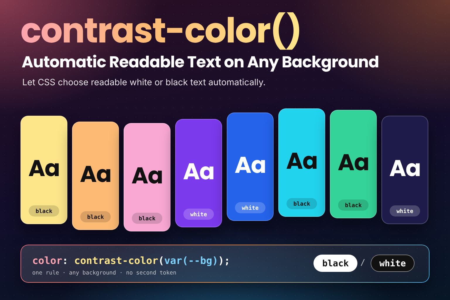
contrast-color() moves that decision into CSS. Give it a colour and it returns white or black, whichever
contrasts more with it, so the text stays readable when the background changes:
.badge {
  background: var(--badge-bg);
  color: contrast-color(var(--badge-bg));
}
It's defined in CSS Color Level 5 and supported in Chrome and Edge 147, Firefox 146 and Safari 26.
What It Returns
The current spec gives contrast-color() exactly one argument, a colour, and exactly two possible results:
contrast-color(white)    /* black */
contrast-color(#facc15)  /* black: yellow is light */
contrast-color(#6d28d9)  /* white: violet is dark */
contrast-color(black)    /* white */
The rules, as CSS Color 5 states them:
- The result is always
whiteorblack, whichever gives the most contrast for text when the argument is used as a solid background. - If white and black contrast equally, the result is white.
- The algorithm is up to the browser. The spec doesn't fix one at this level, and it advises browsers not to simply use the WCAG 2.1 contrast ratio to choose, because that formula has known issues.
- Whatever the browser picks should still meet WCAG 2.1 AA for large text, a ratio of at least 3:1, because many sites have legal requirements tied to WCAG.
That third point matters more than it looks. Two browsers may disagree on a few mid-tone colours, and a colour that gets black text in one could get white in another. Both answers are allowed, as long as they reach 3:1.
The argument can be any <color>: a hex value, a named colour, oklch(), color-mix(), light-dark() or a custom
property holding one of them. It can't be a gradient or an image.
With Custom Properties and Brand Colours
contrast-color() is most useful when the background comes from a variable. Define the colour once, and the text
colour follows it everywhere it's used:
:root {
  --brand: #6d28d9;
}

.button {
  background: var(--brand);
  color: contrast-color(var(--brand)); /* white on this violet */
}
Rebrand to a pale yellow and the button's text turns black with no other change. Because it's an ordinary colour
value, it also works for borders, icons and fill:
.button svg {
  fill: contrast-color(var(--brand));
}
Hover and Active States
Each state that changes the background needs its own contrast-color(), since a darker hover colour may need the
other text colour:
.button {
  --bg: var(--brand);
  background: var(--bg);
  color: contrast-color(var(--bg));
}

.button:hover {
  --bg: color-mix(in oklch, var(--brand), black 20%);
}
Putting the background in a local --bg property means the hover rule only changes one value. color reads the same
--bg, so it's recalculated for the hover colour automatically.
Badges and Tags with Colours from Data
Colours that come from content, such as labels in an issue tracker or categories chosen in a CMS, are where this pays off most. The colour arrives as an inline custom property, and one rule handles every tag:
<ul class="tags">
  <li class="tag" style="--tag: #fde68a">design</li>
  <li class="tag" style="--tag: #1e3a8a">backend</li>
  <li class="tag" style="--tag: #10b981">docs</li>
</ul>
.tag {
background: var(--tag, #e5e7eb);
color: contrast-color(var(--tag, #e5e7eb));
padding: 0.125rem 0.5rem;
border-radius: 999px;
}The pale yellow and the green get black text and the navy gets white, without anyone storing a text colour next to
each tag. The fallback inside var() keeps the background and text colour in step when a tag has no colour set.
Pairing with light-dark()
light-dark() picks one of two colours depending on the active colour scheme.
Pass its result to contrast-color() and the text colour follows the theme as well:
:root {
  color-scheme: light dark;
  --accent: light-dark(#1d4ed8, #93c5fd);
}

.pill {
  background: var(--accent);
  color: contrast-color(var(--accent));
}
In light mode the accent is a deep blue and the pill's text is white. In dark mode the accent becomes a light blue and the text turns black. You only choose the two accent colours; the text colour for each is worked out for you.
Try It Live
Pick any background colour, or choose one from the swatch grid. The preview uses contrast-color() for its text, and
the readout shows which colour your browser returned, the WCAG 2 contrast ratio of the background against white and
against black (worked out in JavaScript), and whether the browser's choice agrees with the WCAG 2 ratio. Each swatch
also uses contrast-color(), and shows the ratio of the text colour it was given. Try a mid-tone such as #777777
or #3b82f6 to see how close the two options get.
contrast-color() Text on Any Background
Pick any background colour and see the white or black text contrast-color() returns on a preview, button, badge and tag, with the WCAG 2 ratio against white and against black worked out in JavaScript, a flag when the browser's choice differs from WCAG 2, and a swatch grid of light, dark and mid-tone colours.
<!DOCTYPE html>
<html lang="en">
  <head>
    <meta charset="UTF-8" />
    <meta name="viewport" content="width=device-width, initial-scale=1.0" />
    <title>contrast-color() Playground</title>
  </head>
  <body>
    <main class="playground">
      <header class="playground-header">
        <h1>Readable Text on Any Background with contrast-color()</h1>
        <p>Pick a background colour. The text on it is set with <code>color: contrast-color(var(--bg))</code>, so the browser chooses white or black. The readout compares that choice with the WCAG 2 contrast ratio against each, worked out in JavaScript.</p>
      </header>

      <p class="tip" id="support-tip" hidden>Your browser doesn't support <code>contrast-color()</code>, so the text below uses a fixed white fallback. It's supported in Chrome and Edge 147, Firefox 146 and Safari 26 or later. The WCAG ratios in the readout still work.</p>

      <fieldset class="control-group">
        <legend>Background</legend>
        <div class="fields-grid">
          <div class="field">
            <label for="bg-picker">Colour picker</label>
            <input type="color" id="bg-picker" value="#6d28d9">
          </div>
          <div class="field">
            <label for="bg-hex">Hex value</label>
            <input type="text" id="bg-hex" value="#6d28d9" spellcheck="false" autocomplete="off" pattern="#[0-9a-fA-F]{6}">
          </div>
        </div>
      </fieldset>

      <section class="demo-area preview" id="preview" aria-label="Preview on the chosen background">
        <p class="preview-title">The quick brown fox jumps over the lazy dog</p>
        <p class="preview-small">Small body text is where a close call shows first.</p>
        <div class="preview-row">
          <span class="preview-button">Button</span>
          <span class="preview-badge">Badge</span>
          <span class="preview-tag">#tag</span>
        </div>
      </section>

      <output class="readout" id="readout" aria-live="polite"></output>

      <fieldset class="control-group">
        <legend>Swatches</legend>
        <p class="hint">Each swatch sets its own text with <code>contrast-color()</code> and shows the WCAG 2 ratio of that text. Select one to load it above.</p>
        <div class="swatches" id="swatches"></div>
      </fieldset>
    </main>

    <script src="./index.js"></script>
  </body>
</html>
Starting sandbox…
No console output yet.
The Limits
Black or White Only
contrast-color() can't return your brand's near-black, a tinted white, or a darker shade of the background. If the
design calls for #1f2937 text rather than pure black, you still need to choose that colour yourself.
Mid-Tones Are Close Calls
With the WCAG 2 formula, the better of white and black always reaches at least 4.58:1, so one of them always
passes AA for normal text (4.5:1). The worst case is a background with a relative luminance of about 0.18, a mid
grey such as #777777, where white scores 4.48:1 and black 4.69:1. Neither gets anywhere near AAA (7:1).
Two things follow from that:
- On mid-tones the result is a narrow win either way, so check those colours rather than assuming the text is comfortable to read.
- Since the algorithm is the browser's choice, it may pick the colour WCAG 2 rates lower. Take
#3b82f6: WCAG 2 gives black 5.71:1 and white 3.68:1, but many people find white easier to read on that blue, which is the kind of known issue the spec has in mind. A browser that picks white there still meets the spec's 3:1 floor, but white text on that blue fails WCAG 2 AA for normal-size text.
If your site has to pass a WCAG 2 audit, test the colours you actually use, and avoid mid-tone backgrounds behind small text. The playground's readout flags any colour where the browser and the WCAG 2 ratio disagree.
Contrast Isn't Legibility
The spec makes the same point: enough contrast is one part of readable text, not all of it. Font size, weight, the typeface and the colours around an element matter too. A 3:1 pair is fine for a large heading and poor for 12px body text.
No Gradients or Images
The argument has to be a single colour, so contrast-color(linear-gradient(...)) is invalid. For text on a
gradient, pass the stop that's hardest to read against, or the colour at the point where the text sits. For text over
a photo, put a solid or semi-opaque overlay behind it and pass the overlay's colour.
No Control Yet
A draft of CSS Color Level 6 sketches a longer form of contrast-color() with your own candidate colours and a target
contrast level. Its keywords are still marked "to be decided" and no browser supports it, so any declaration using
extra arguments is invalid today. Stick to the single-argument form.
Browser Support and Fallbacks
contrast-color() is supported in Firefox 146, Safari 26 and Chrome and Edge 147. Chrome 147 completed the set in
April 2026, which made it Baseline newly available, and it's one of the Interop 2026 focus areas. See What's New in CSS in 2026: What You Can Use Now for the rest of that year's CSS features, and Interop 2026 and CSS Snapshot 2026: What They Mean for CSS for what an Interop focus area means for using it.
For older browsers, set a safe text colour first and switch to contrast-color() inside a feature query:
.button {
  background: var(--brand);
  color: var(--brand-text, white); /* pre-chosen fallback */
}

@supports (color: contrast-color(red)) {
  .button {
    color: contrast-color(var(--brand));
  }
}
If your palette is fixed, the fallback can be a hand-picked --brand-text for each colour. If the colours come from
data, the server or a few lines of JavaScript can calculate a fallback text colour with the WCAG formula and set it as
--brand-text.
Common Pitfalls
1. Relying on a Repeated Declaration as the Fallback
Repeating color with a fallback first doesn't work here:
.button {
  color: white;
  color: contrast-color(var(--brand)); /* the fallback above is never used */
}
Any declaration containing var() is accepted when the stylesheet is parsed, so an older browser keeps the second
line. It only discovers that contrast-color() is unknown when it works out the value, and by then white has
already been discarded, so color falls back to the inherited value instead. Use @supports.
2. Forgetting the Hover State
If :hover changes the background but not the text, the text keeps the colour chosen for the original background.
Recalculate it from the same variable, as in the hover example above.
3. Using the Wrong Colour as the Argument
The argument should be the colour actually behind the text. A semi-transparent background mixes with whatever is
underneath it, so contrast-color(rgb(0 0 0 / 0.2)) is judging a colour that never appears on screen. Pass the
colour you see.
4. Treating It as a Guarantee of AA
The spec only asks for 3:1 (AA large text). For small text on mid-tone backgrounds, check the ratio yourself.
Where Should You Use This?
- Buttons, badges and chips whose background comes from a design token or theme variable
- Tags, labels and avatars coloured by user choice or data, where nobody stores a matching text colour
- Theme builders and colour pickers that preview text on any colour
- Charts and legends where each series colour needs a readable label
Native form controls already make a similar choice for their accent colour, as
Theming Native Controls with accent-color
explains.
Reach for something else when the design needs a specific text colour other than black or white, when the background is an image or gradient, or for fixed colours where a designer has already picked the text colour.
Frequently Asked Questions
Key Takeaway
contrast-color(<color>) returns white or black, whichever contrasts more with the colour you pass it, so text on
variable backgrounds stays readable without a second token or JavaScript. The algorithm is up to the browser and
only promises 3:1, so test mid-tones that sit behind small text. It doesn't accept gradients or images, and it only
chooses between black and white. Pair it with light-dark() for themed accents, and wrap it in @supports with a
fixed fallback for older browsers.
Changelog
- — Initial publication.
Share this tutorial
Spotted a mistake or something outdated in this tutorial? Suggest a correction.