
Padding Around the Notch with env()
 (opens full-size image in a new tab)
Introduction
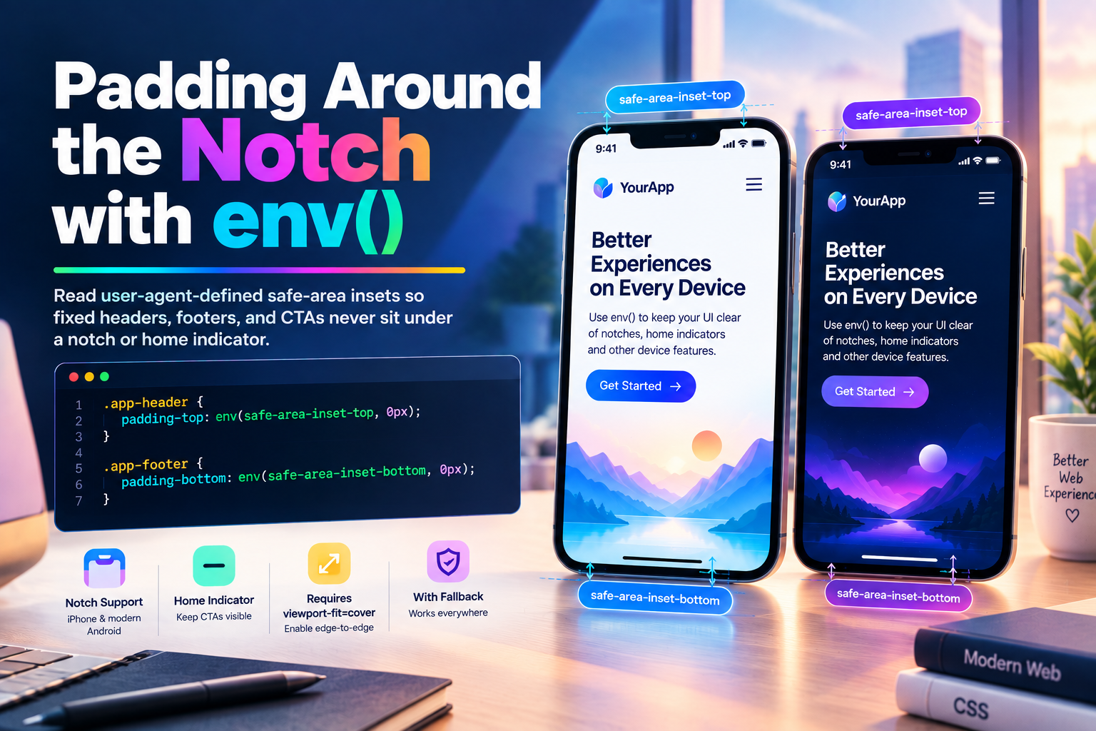
Notches, camera cutouts, and home-indicator gesture bars aren't the same size on every device, and they aren't something a stylesheet can measure. Hardcoding padding-top: 44px to clear an iPhone's notch works for exactly one device — anything else is either padded too much or not enough.
env() reads a small set of variables the user agent defines, not your stylesheet — most usefully safe-area-inset-top/right/bottom/left, the exact space a fixed or sticky element needs to clear the surrounding hardware on the device it's actually running on.
The Core Function
.app-header {
  padding-top: env(safe-area-inset-top, 0px);
}

.app-footer {
  padding-bottom: env(safe-area-inset-bottom, 0px);
}
env() takes a variable name and an optional fallback — the second argument, used when that variable isn't defined at all (an older browser, a non-notched device). On a device with no notch, safe-area-inset-top simply resolves to 0px, so the same rule is safe to ship unconditionally; it only does something on hardware that actually needs it.
Try It Live
The phone shape below is fixed — the notch and home indicator are always there. What changes is whether safe-area-inset-* padding is applied: toggle it to watch the header and CTA move clear of the hardware instead of sitting underneath it.
env() Safe Area Playground
Toggle a simulated notch and home indicator to see safe-area-inset padding move header and CTA content clear of them.
<!DOCTYPE html>
<html lang="en">
  <head>
    <meta charset="UTF-8" />
    <meta name="viewport" content="width=device-width, initial-scale=1.0" />
    <title>env() Safe Area Playground</title>
  </head>
  <body>
    <main class="playground">
      <header class="playground-header">
        <h1>env(safe-area-inset-*)</h1>
        <p>A real notched device reports these automatically — this demo drives the same padding rule with a stand-in variable so the effect is visible on any screen.</p>
      </header>

      <section class="demo-block">
        <button id="toggle-btn" class="toggle-btn" type="button">Apply safe-area padding</button>

        <div class="phone" id="phone">
          <div class="notch"></div>
          <div class="screen">
            <div class="safe-content" id="safe-content">
              <div class="fake-header">Header</div>
              <p class="fake-body">Screen content</p>
              <div class="fake-cta">Continue</div>
            </div>
          </div>
          <div class="home-indicator"></div>
        </div>

        <code id="inset-code">padding: 0px 1rem 0px;</code>
      </section>
    </main>

    <script src="./index.js"></script>
  </body>
</html>
Starting sandbox…
No console output yet.
Requires viewport-fit=cover
safe-area-inset-* values only resolve to anything nonzero once the page has explicitly opted the viewport into drawing under the notch/indicator in the first place:
<meta name="viewport" content="width=device-width, initial-scale=1, viewport-fit=cover">Without viewport-fit=cover, Safari/Chrome on a notched device simply letterboxes the page inside the safe area — every safe-area-inset-* resolves to 0px because there's nothing to inset around. This is the single most common reason env() "doesn't work": the padding rule is correct, but the meta tag opting into edge-to-edge layout was never added.
Where Should You Use This?
- Fixed/sticky headers and footers that must never sit under a notch or home indicator
- Full-bleed/edge-to-edge layouts (
viewport-fit=cover) that still need readable margins - Bottom action bars and tab bars, so a home-indicator swipe doesn't overlap a tappable button
- PWAs and installed web apps, where the browser chrome that normally provides this margin is gone
Production Considerations & Edge Cases
- Always pass a fallback.
env(safe-area-inset-top, 0px)degrades safely on non-notched devices and older browsers alike;env(safe-area-inset-top)with no fallback also resolves to0pxwhen undefined, but an explicit fallback keeps the intent readable and gives you a non-zero default to reach for if you ever want one. env()values are constants, not reactive to layout — they come from the physical device/viewport-fit state, not from your CSS. Rotating the device or resizing does update them, but nothing you do in a stylesheet changes what they report.- Combine with
max()for a minimum gutter.padding-inline: max(env(safe-area-inset-left, 0px), 1rem);guarantees at least1remof padding even on square-cornered devices where the inset is0px. - It's four separate properties, not a shorthand —
safe-area-inset-top,-right,-bottom,-lefteach need their ownenv()call; there's no singlesafe-area-insetthat expands to all four. - Browser support is solid on every modern mobile browser (Safari since iOS 11, Chrome/Edge/Firefox on Android) as of this writing — the desktop case is largely moot since desktop insets are always
0px.
Frequently Asked Questions
Key Takeaway
env() turns "pad around this one device's notch" into "pad around whatever hardware cutout this device happens to have" — one rule, a safe fallback, and a viewport-fit=cover meta tag away from working everywhere.
Changelog
- — Added Frequently Asked Questions section
- — Initial publication.
Share this tutorial
Spotted a mistake or something outdated in this tutorial? Suggest a correction.