
The Holy Grail Layout (Grid Edition)
 (opens full-size image in a new tab)
Introduction
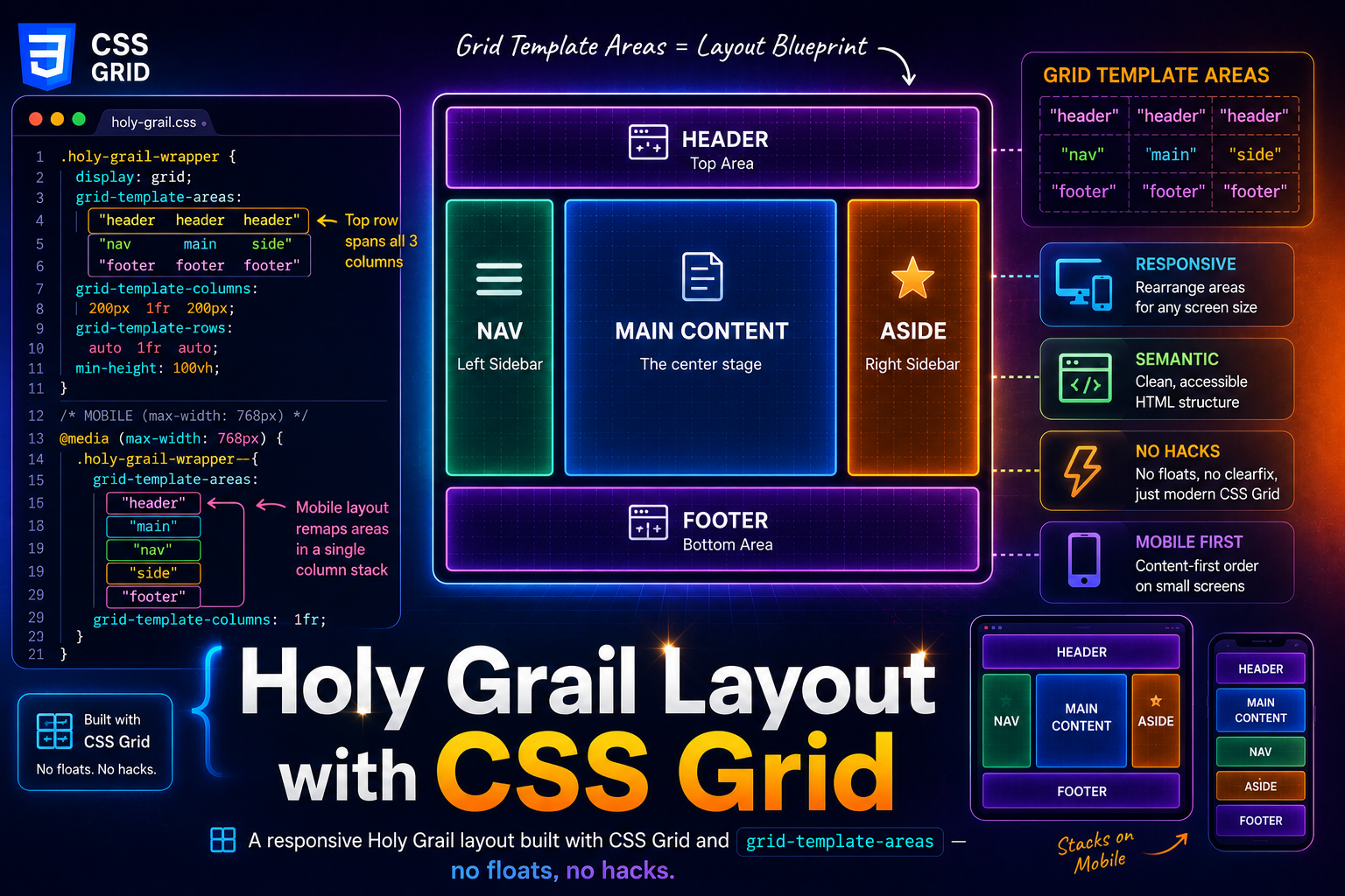
The Holy Grail layout is a classic web design pattern consisting of a header, three columns (sidebar, main content, sidebar), and a footer. Historically, this layout was difficult to achieve with floats or early flexbox techniques without structural hacks.
CSS Grid makes this pattern straightforward — providing a clear, semantic, and responsive solution with minimal code.
The Grid Snippet
:root {
  --sidebar-width: 200px;
  --layout-gap: 0;
}

.holy-grail-wrapper {
  display: grid;
  grid-template-areas:
    "header header header"
    "nav main side"
    "footer footer footer";
  grid-template-columns: var(--sidebar-width) 1fr var(--sidebar-width);
  grid-template-rows: auto 1fr auto;
  min-height: 100vh;
  gap: var(--layout-gap);
}

header {
  grid-area: header;
}

nav {
  grid-area: nav;
}

main {
  grid-area: main;
}

aside {
  grid-area: side;
}

footer {
  grid-area: footer;
}

/* Mobile Responsive */
@media (max-width: 768px) {
  .holy-grail-wrapper {
    grid-template-areas:
      "header"
      "main"
      "nav"
      "side"
      "footer";
    grid-template-columns: 1fr;
  }
}
Minimal HTML Structure
Only the wrapper requires a class. All layout positioning is handled by semantic elements.
<div class="holy-grail-wrapper">
  <header>Header</header>
  <nav>Navigation</nav>
  <main>Main Content</main>
  <aside>Right Sidebar</aside>
  <footer>Footer</footer>
</div>
This keeps the markup clean and readable while allowing CSS Grid to control layout independently of source order.
Holy Grail Layout
Header, two sidebars, main content, and footer — CSS Grid template areas with a responsive mobile stack.
<!DOCTYPE html>
<html lang="en">
  <head>
    <meta charset="UTF-8" />
    <meta name="viewport" content="width=device-width, initial-scale=1.0" />
    <title>Holy Grail layout - Grid</title>
  </head>
  <body>
    <div class="holy-grail-wrapper">
      <header>Header</header>
      <nav>Navigation</nav>
      <main>
        <h1>Main Content</h1>
        <p>
          This is the primary content area. Resize the viewport to see how the
          grid adapts across screen sizes.
        </p>
      </main>
      <aside>Right Sidebar</aside>
      <footer>Footer</footer>
    </div>
  </body>
</html>
Starting sandbox…
No console output yet.
Highlights
- Semantic naming:
grid-template-areasacts as a visual blueprint for the layout. - Sticky footer:
min-height: 100vhcombined with a1frrow pushes the footer to the bottom. On mobile, that100vhcan render taller than what's actually visible behind the browser's address bar — see Dynamic Viewport Height Units for100dvh, the fix that tracks the real visible height. - Ultra-responsive: Mobile layout is achieved by remapping areas — no DOM changes required.
- Configurable: Sidebar widths are controlled via CSS variables.
Customization Tips
Adjust Sidebar Width
:root {
  --sidebar-width: 240px;
}
Remove the Right Sidebar
- Remove the
<aside>element - Update the grid areas:
.holy-grail-wrapper {
  grid-template-areas:
    "header header"
    "nav main"
    "footer footer";
  grid-template-columns: var(--sidebar-width) 1fr;
}
Make a Sidebar Sticky
nav {
  position: sticky;
  top: 0;
  align-self: start;
}
Change Mobile Order
Simply rearrange the grid-template-areas inside the media query.
Accessibility Notes
- Semantic elements (
header,nav,main,aside,footer) provide meaningful landmarks for assistive technologies. - Ensure the source order matches the logical reading order, even if the visual layout changes.
- Avoid unnecessary ARIA roles when semantic elements already convey meaning.
Common Variations
- Two-column layout: Remove the right sidebar for blogs and docs.
- Dashboard layout: Left nav + main + utility rail.
- Content-first mobile: Stack
mainimmediately belowheader. - Ad rail: Replace
asidewith promotional or analytics content.
Use Cases
- Dashboard UIs: Left nav, center data, right-side filters.
- Blog Layouts: Main article with a sidebar for categories and another for ads.
- Documentation Sites: Header navigation with a sticky table of contents.
Frequently Asked Questions
Key Takeaway
This Grid-based Holy Grail layout is:
- Modern and hack-free
- Easy to reason about
- Fully responsive
- Accessible by default
- Flexible enough for real-world UI systems
Use it as a layout foundation, then adapt it via grid areas rather than restructuring your markup.
Changelog
- — Added Frequently Asked Questions section
- — Added cross-reference to tutorial 'Dynamic Viewport Height Units'
- — Initial publication
Share this tutorial
Spotted a mistake or something outdated in this tutorial? Suggest a correction.