
CSS Gradient Borders: Complete Guide with Techniques & Examples
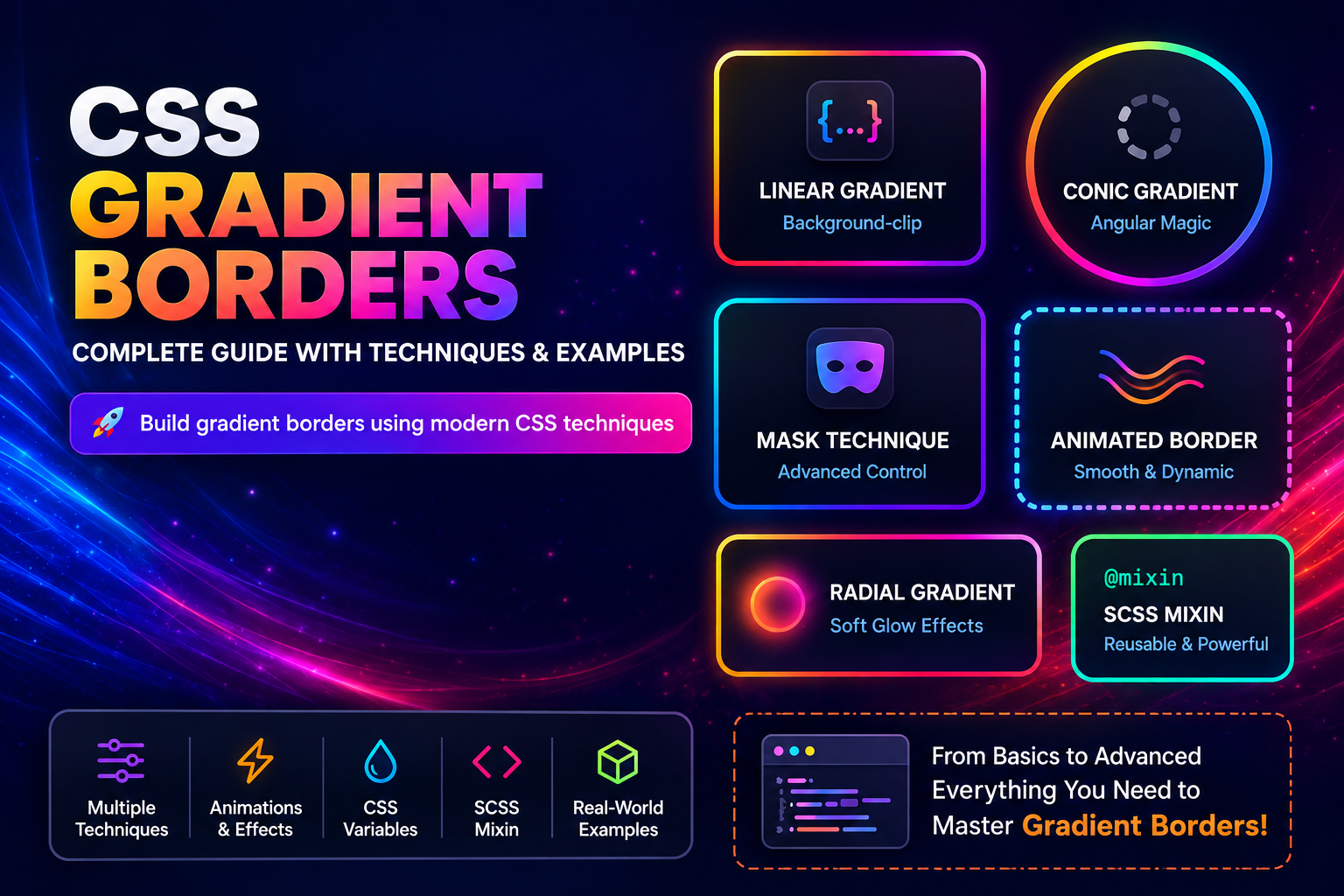 (opens full-size image in a new tab)
Borders don't have to be boring. With a few lines of CSS, you can create gradient borders that add depth and visual interest to your UI.
The challenge is that CSS does not accept gradients in border-color — it only takes solid colors. So instead
of styling the border directly, we have to simulate a gradient border with other properties.
Each approach in this guide answers one core question:
We'll explore:
border-imagefor simple, square-cornered bordersbackground-clipfor rounded, flexible bordersmaskfor borders with a see-through center- Animated, rotating, and hover-only gradient borders
- A reusable SCSS mixin for production use
This post assumes you're comfortable writing gradients. If linear, radial, and conic gradients are new to you, start with Mastering CSS Gradients: Types, Use Cases, and Best Practices.
How a Border Is Painted
Every element is made of nested boxes, and the two gradient-border techniques that use backgrounds depend on knowing which one is which:
- Content box — where the text and children sit.
- Padding box — the content box plus its
padding. - Border box — the padding box plus the
border. This is the element's full outer edge.
By default, an element's background is painted across the whole border box — it runs underneath the border
too. You normally don't see that, because a solid border covers it. But make the border transparent, and whatever
background sits underneath shows through the border area.
That one fact is the foundation of most gradient borders: a transparent border is a window onto the background beneath it, and the techniques below differ only in what they put behind that window.
Visual Illustration
Core Techniques
border-image — Simple and Native
.gradient-border {
  border: 5px solid;
  border-image: linear-gradient(45deg, #ff6a00, #ee0979) 1;
}
How It Works
border-image replaces the border's normal color with an image — and a gradient counts as an image.
border→ sets the thickness (and a style, which is required for the border to exist at all)border-image→ paints the gradient into that border area
The 1 at the end is the slice value. It tells the browser to cut a 1-pixel frame from the edges of the
gradient and stretch it along each side of the border. Leave it out and the slice defaults to 100%, which puts
the whole gradient into the four corners and leaves the sides empty — the most common reason a border-image
gradient "doesn't show up."
Great for Single Sides
Because border-image works per side, it's the easiest way to add a gradient to just one edge — like a gradient
underline under a heading:
.gradient-underline {
  border-bottom: 4px solid;
  border-image: linear-gradient(90deg, #ff6a00, #ee0979) 1;
}
When to Use
- You need a quick gradient border with square corners
- You only want a gradient on one or two sides
- The inside of the element must stay transparent
Limitations
- Ignores
border-radiuscompletely — the corners are always square, no matter what radius you set - Harder to animate than the background-based techniques
background-clip — The Most Practical Approach
.gradient-border {
  border: 5px solid transparent;
  border-radius: 12px;
  background:
    linear-gradient(#fff, #fff) padding-box,
    linear-gradient(45deg, #ff6a00, #ee0979) border-box;
}
How It Works
This technique uses two background layers on the same element, each clipped to a different box:
- Layer 1 (
padding-box) → a solid white fill that stops at the inner edge of the border - Layer 2 (
border-box) → the gradient, which reaches all the way to the outer edge
Visual Illustration
The first layer listed is painted on top. It covers the gradient everywhere except the border ring, and because
the border is transparent, that ring is exactly where the gradient shows through. (linear-gradient(#fff, #fff)
is just a way to write a solid color as an image, since only images can be layered.)
Why This Is Preferred
- Works perfectly with
border-radius - Supports every gradient type
- Easy to animate and theme
Limitation: The Center Isn't See-Through
The inner layer has to be a solid color that matches your element's background. If the element sits on a
photo, a pattern, or another gradient, that solid fill hides it. When you need a see-through center, use the
mask technique below instead.
mask — Advanced and Precise
.gradient-border {
  position: relative;
  border-radius: 12px;
}

.gradient-border::before {
  content: "";
  position: absolute;
  inset: 0;
  padding: 3px; /* The border thickness */
  border-radius: inherit;
  background: linear-gradient(90deg, #ff6a00, #ee0979);
  pointer-events: none;

  -webkit-mask:
    linear-gradient(#fff 0 0) content-box,
    linear-gradient(#fff 0 0);
  -webkit-mask-composite: xor;
  mask:
    linear-gradient(#fff 0 0) content-box exclude,
    linear-gradient(#fff 0 0);
}
How It Works
A pseudo-element covers the whole element with the gradient, then a mask cuts out the middle:
- The pseudo-element (
::before) is stretched over the element withinset: 0, and itspaddingis set to the border thickness you want. - It gets two mask layers. The first covers only its content box (the area inside that padding); the second covers the whole pseudo-element.
excludekeeps only the parts where the two layers don't overlap — which is exactly the padding ring. The gradient shows there, and everything inside is cut away.
Visual Illustration
Unlike background-clip, nothing is painted over the center, so whatever is behind the element shows through.
When to Use
- The element sits on an image, a pattern, or a translucent (glassmorphism) background
- You need a gradient border without a solid inner fill
- Custom border effects and advanced UI animations
Trade-offs
- Uses up the element's
::beforepseudo-element - Older Safari and Chromium versions need the
-webkit-masklines — and they usexor, notexclude - Slightly more expensive to render than the other methods
Advanced & Interactive Techniques
Animated Gradient Borders
@keyframes border-animation {
  0% {
    background-position: 0% 50%;
  }

  50% {
    background-position: 100% 50%;
  }

  100% {
    background-position: 0% 50%;
  }
}

.animated-border {
  border: 4px solid transparent;
  border-radius: 12px;

  background:
    linear-gradient(#fff, #fff) padding-box,
    linear-gradient(90deg, #ff6a00, #ee0979, #00c6ff) border-box;

  background-size: 300% 300%;
  animation: border-animation 6s linear infinite;
}

@media (prefers-reduced-motion: reduce) {
  .animated-border {
    animation: none;
  }
}
How It Works
Browsers can't smoothly animate from one gradient image to another, so instead we make the gradient three times
bigger than the element (background-size: 300% 300%) and slide it back and forth with background-position.
Only part of the gradient is visible through the border at any moment, so the colors appear to flow. (The solid
inner layer is resized too, but a solid color looks the same at any size.)
The keyframes go out to 100% and back to 0%, so the loop never jumps. For more on @keyframes, see the
CSS keyframes guide.
Best Use Cases
Buttons and CTAs, highlighted cards, hero elements.
You can try this live — switch the playground further down this post to Advanced →
Animated and watch the same background-position trick run in real time.
Want moving dashes rather than a moving gradient? border-style: dashed can't be animated, but an SVG stroke can — see SVG Marching Ants Border for Drop Zones and Selections.
Rotating Conic Borders with @property
Sliding background-position doesn't work well for conic gradients — it just zooms into one part of the color
wheel. What you really want is to rotate the gradient, and that means animating its starting angle.
Normally that's impossible: a custom property like --angle is an untyped string, so the browser can't
interpolate it. Registering it with @property gives it a type (<angle>), and a typed property can be
animated:
@property --angle {
  syntax: "<angle>";
  inherits: false;
  initial-value: 0deg;
}

.spinning-border {
  border: 4px solid transparent;
  border-radius: 16px;
  background:
    linear-gradient(#fff, #fff) padding-box,
    conic-gradient(from var(--angle), #ff6a00, #ee0979, #00c6ff, #ff6a00) border-box;
  animation: spin-border 4s linear infinite;
}

@keyframes spin-border {
  to {
    --angle: 360deg;
  }
}
The gradient itself spins while the element stays perfectly still. That's the key difference from the Border Beam technique in the gradients guide, which rotates an oversized pseudo-element instead.
Switch the playground to Advanced → Rotating conic to see this exact technique running.
Hover-Only Gradient Borders
Show a plain border by default and reveal the gradient on interaction. A plain swap from a solid border to a
gradient happens instantly, because background-image can't be transitioned. Registering the gradient's colors
with @property makes them transitionable, so the border can fade smoothly from gray to gradient:
@property --border-start {
  syntax: "<color>";
  inherits: false;
  initial-value: #d0d7de;
}

@property --border-end {
  syntax: "<color>";
  inherits: false;
  initial-value: #d0d7de;
}

.card {
  border: 2px solid transparent;
  border-radius: 12px;
  background:
    linear-gradient(#fff, #fff) padding-box,
    linear-gradient(45deg, var(--border-start), var(--border-end)) border-box;
  transition: --border-start 0.3s ease, --border-end 0.3s ease;
}

.card:hover,
.card:focus-within {
  --border-start: #ff6a00;
  --border-end: #ee0979;
}
Both colors start as the same gray, so the border looks solid until hover. Including :focus-within gives
keyboard users the same feedback when they tab into the card.
Why use this: keeps the UI calm by default and gives clear interaction feedback. For more on how transitions decide what can animate, see the CSS transitions guide.
Conic Gradient Borders
You can create circular or angular gradient borders using conic-gradient.
.conic-border {
  border: 4px solid transparent;
  border-radius: 50%;

  background:
    linear-gradient(#fff, #fff) padding-box,
    conic-gradient(red, yellow, lime, cyan, blue, magenta, red) border-box;
}
Ending on the same color you started with (red) avoids a hard seam at the top. For a deeper understanding of
how conic gradients work, see the
conic gradient section of the gradients guide.
When to use: circular elements (avatars, loaders), decorative UI elements, experimental or modern designs.
Radial Gradient Borders
A radial gradient spreads outward from the center, so the border ring only ever shows its outer colors. The middle of each side is closest to the center and picks up more of the first color, while the corners are farthest away and get the last color — a soft, glowing falloff around the element.
.radial-border {
  border: 4px solid transparent;
  border-radius: 12px;

  background:
    linear-gradient(#fff, #fff) padding-box,
    radial-gradient(circle, #ff6a00, #ee0979) border-box;
}
For a deeper understanding of radial gradients, see the radial gradient section of the gradients guide.
When to use: glow effects, soft UI highlights, focus states.
Dynamic, Theme-Aware Borders with CSS Variables
Hard-coding #fff for the inner layer breaks as soon as you add a dark theme — the card turns into a white box.
Store both the gradient and the surface color in CSS variables instead:
:root {
  --surface: #fff;
  --gradient-start: #ff6a00;
  --gradient-end: #ee0979;
}

@media (prefers-color-scheme: dark) {
  :root {
    --surface: #0d1117;
  }
}

.dynamic-border {
  border: 4px solid transparent;
  background:
    linear-gradient(var(--surface), var(--surface)) padding-box,
    linear-gradient(90deg, var(--gradient-start), var(--gradient-end)) border-box;
}
Benefits: easy theme switching, works with dark mode, and can be driven by JavaScript or UI sliders — exactly how the playground updates its border live.
Reusable SCSS Mixin
Here's a mixin you can drop into your SCSS setup. It wraps the background-clip technique so every card and
button gets the same layering without repeating it:
@mixin gradient-border($colors, $size: 4px, $radius: 0, $direction: 90deg, $inner: #fff, $animate: false) {
  border: $size solid transparent;
  border-radius: $radius;
  background:
    linear-gradient($inner, $inner) padding-box,
    linear-gradient($direction, $colors) border-box;

  @if $animate {
    background-size: 300% 300%;
    animation: gradient-border-anim 5s linear infinite;

    @media (prefers-reduced-motion: reduce) {
      animation: none;
    }
  }
}

@keyframes gradient-border-anim {
  0% {
    background-position: 0% 50%;
  }

  50% {
    background-position: 100% 50%;
  }

  100% {
    background-position: 0% 50%;
  }
}
How the Mixin Works
$colors→ a list of gradient colors, e.g.(#ff6a00, #ee0979)$size→ border thickness$radius→ corner rounding$direction→ gradient angle$inner→ the fill color inside the border (pass a CSS variable for theme support)$animate→ turns on the flowing animation, with a reduced-motion guard built in
Because the colors are passed as one list rather than as separate arguments, every other parameter keeps its default and can be set by name, in any order.
Example usage:
// Static gradient border
.card {
  @include gradient-border((#ff6a00, #ee0979), $radius: 12px, $direction: 45deg);
}

// Animated rainbow border on a themed surface
.button {
  @include gradient-border(
    (red, orange, yellow, green, blue, indigo, violet),
    $size: 3px,
    $radius: 8px,
    $inner: var(--surface),
    $animate: true
  );
}
Why Use This
- Avoid repeating the two-layer syntax on every component
- Keep border thickness, radius, and motion consistent across the UI
- Plug straight into design tokens and themes through
$innerand$colors
The gradients guide has a companion SCSS gradient mixin for backgrounds, if you want the two to share the same color tokens.
Real-World Example: Contact Form
This technique is used in production on the contact page of this blog, where a repeating gradient border creates a subtle yet visually engaging frame around the form.
<div class="contact-form-container">
  <form class="contact-form">
    <!-- form fields -->
  </form>
</div>
The .contact-form-container uses the background-clip + layered gradient technique to simulate a gradient
border:
.contact-form-container {
  border: 0.5rem solid transparent;

  background:
    linear-gradient(var(--color-bg-muted), var(--color-bg-muted)) padding-box,
    repeating-linear-gradient(
      45deg,
      var(--color-bg-danger-emphasis) 0 15px,
      var(--color-bg-default) 15px 25px,
      var(--color-bg-accent-emphasis) 25px 40px,
      var(--color-bg-default) 40px 50px
    ) border-box;

  background-clip: padding-box, border-box;
  border-radius: 0.75rem;
  padding: 0.25rem;
}
Why This Works
- The transparent border creates space for the gradient
- The first background layer fills the inner area with the site's muted background color
- The second layer (repeating gradient) shows only through the border
- The explicit
background-clipline repeats what thepadding-box/border-boxkeywords already set — it's not required, but it makes the intent obvious to anyone reading the stylesheet
Design Highlights
- Uses
repeating-linear-gradientfor a striped, patterned border - Fully integrated with design tokens (
--color-*), so both layers follow the light and dark themes - Maintains consistent border radius and spacing
When to Use This Pattern
This approach works especially well for contact forms, highlighted containers, cards that need emphasis, and sections that need subtle visual separation.
This example shows how gradient borders can move beyond decorative demos and become a practical UI pattern in real-world layouts.
Try It Yourself
Now that you've seen the different techniques, try every one of them interactively:
- Core:
background-clip,border-image(all sides or a single-side underline), andmask. Turn on the patterned backdrop to see which ones keep a see-through center. - Advanced: animated borders, rotating conic borders with
@property, hover-only borders that fade in, and theme-aware borders you can flip between dark and light. - Pitfalls: each of the common pitfalls below, reproduced live with a toggle that applies the fix.
Swap the gradient between linear, radial, conic, and repeating stripes, then adjust thickness, radius, direction,
and colors. The panel under the preview always shows the CSS for exactly what you're looking at. The
Production CSS options can switch it to CSS variables, add a :focus-visible outline, or output it as the
SCSS mixin.
Gradient Border Playground
Switch between linear and conic gradient borders, tune thickness, direction, and colors, and toggle animation — a background-position pan for linear, an @property spin for conic — with the generated CSS updating live.
<!DOCTYPE html>
<html lang="en">
  <head>
    <meta charset="UTF-8" />
    <meta name="viewport" content="width=device-width, initial-scale=1.0" />
    <title>Gradient Border Playground</title>
  </head>
  <body>
    <main class="playground">
      <header class="playground-header">
        <h1>Gradient Border Playground</h1>
        <p>Every technique from the post in one place — pick one, swap the gradient type, tune thickness, radius and colors live, and copy the CSS for exactly what you see.</p>
      </header>

      <section class="demo-area" aria-label="Gradient border preview">
        <div class="stage" id="stage">
          <div class="gradient-border-card mode-background-clip" id="gradient-border-card" tabindex="0">
            <span id="card-label">Gradient Border</span>
          </div>
        </div>
      </section>

      <p class="stage-note" id="stage-note"></p>

      <output id="border-output" class="readout" aria-live="polite"></output>

      <div class="tabs" role="tablist" aria-label="Technique group" id="group-switch">
        <button class="tab tab--active" type="button" data-mode="core" role="tab" aria-selected="true">Core</button>
        <button class="tab" type="button" data-mode="advanced" role="tab" aria-selected="false">Advanced</button>
        <button class="tab" type="button" data-mode="pitfalls" role="tab" aria-selected="false">Pitfalls</button>
      </div>

      <div id="core-demo" class="tab-panel tab-panel--active">
        <fieldset class="control-group">
          <legend>Technique</legend>
          <div class="segmented-control" role="radiogroup" aria-label="Core technique">
            <label class="segment"><input type="radio" name="technique" value="background-clip" checked><span>background-clip</span></label>
            <label class="segment"><input type="radio" name="technique" value="border-image"><span>border-image</span></label>
            <label class="segment"><input type="radio" name="technique" value="mask"><span>mask</span></label>
          </div>
        </fieldset>
      </div>

      <div id="advanced-demo" class="tab-panel">
        <fieldset class="control-group">
          <legend>Technique</legend>
          <div class="segmented-control" role="radiogroup" aria-label="Advanced technique">
            <label class="segment"><input type="radio" name="technique" value="animated"><span>Animated</span></label>
            <label class="segment"><input type="radio" name="technique" value="rotating"><span>Rotating conic</span></label>
            <label class="segment"><input type="radio" name="technique" value="hover"><span>Hover-only</span></label>
            <label class="segment"><input type="radio" name="technique" value="theme"><span>Theme-aware</span></label>
          </div>
        </fieldset>
      </div>

      <div id="pitfalls-demo" class="tab-panel">
        <fieldset class="control-group">
          <legend>Pitfall</legend>
          <div class="segmented-control" role="radiogroup" aria-label="Pitfall">
            <label class="segment"><input type="radio" name="technique" value="not-showing"><span>Not showing</span></label>
            <label class="segment"><input type="radio" name="technique" value="bleeding"><span>Bleeding</span></label>
            <label class="segment"><input type="radio" name="technique" value="corners"><span>Square corners</span></label>
            <label class="segment"><input type="radio" name="technique" value="not-moving"><span>Not moving</span></label>
            <label class="segment"><input type="radio" name="technique" value="safari-mask"><span>Safari mask</span></label>
            <label class="segment"><input type="radio" name="technique" value="white-box"><span>White box</span></label>
          </div>
        </fieldset>
      </div>

      <fieldset class="control-group">
        <legend>Options</legend>

        <div class="segmented-control" id="gradient-type" role="radiogroup" aria-label="Gradient type">
          <label class="segment"><input type="radio" name="gradient-type" value="linear" checked><span>Linear</span></label>
          <label class="segment"><input type="radio" name="gradient-type" value="radial"><span>Radial</span></label>
          <label class="segment"><input type="radio" name="gradient-type" value="conic"><span>Conic</span></label>
          <label class="segment"><input type="radio" name="gradient-type" value="stripes"><span>Stripes</span></label>
        </div>

        <div class="segmented-control" id="sides-variant" role="radiogroup" aria-label="Sides" hidden>
          <label class="segment"><input type="radio" name="sides-variant" value="all" checked><span>All sides</span></label>
          <label class="segment"><input type="radio" name="sides-variant" value="bottom"><span>Bottom only</span></label>
        </div>

        <div class="segmented-control" id="theme-variant" role="radiogroup" aria-label="Color scheme" hidden>
          <label class="segment"><input type="radio" name="theme-variant" value="dark" checked><span>Dark</span></label>
          <label class="segment"><input type="radio" name="theme-variant" value="light"><span>Light</span></label>
        </div>

        <div class="segmented-control" id="not-showing-variant" role="radiogroup" aria-label="Cause" hidden>
          <label class="segment"><input type="radio" name="not-showing-variant" value="solid" checked><span>Solid border color</span></label>
          <label class="segment"><input type="radio" name="not-showing-variant" value="slice"><span>Missing slice</span></label>
        </div>

        <div class="segmented-control" id="bleeding-variant" role="radiogroup" aria-label="Cause" hidden>
          <label class="segment"><input type="radio" name="bleeding-variant" value="no-inner" checked><span>No inner layer</span></label>
          <label class="segment"><input type="radio" name="bleeding-variant" value="no-keyword"><span>No padding-box</span></label>
        </div>

        <div class="fields-grid">
          <div class="field" id="thickness-field">
            <label for="thickness-input">Thickness</label>
            <div class="range-row">
              <span class="range-edge">2px</span>
              <div class="range-track">
                <input type="range" id="thickness-input" min="2" max="12" step="1" value="4">
                <output class="range-bubble" id="thickness-value" for="thickness-input">4px</output>
              </div>
              <span class="range-edge">12px</span>
            </div>
          </div>

          <div class="field" id="radius-field">
            <label for="radius-input">Radius</label>
            <div class="range-row">
              <span class="range-edge">0px</span>
              <div class="range-track">
                <input type="range" id="radius-input" min="0" max="65" step="1" value="16">
                <output class="range-bubble" id="radius-value" for="radius-input">16px</output>
              </div>
              <span class="range-edge">65px</span>
            </div>
          </div>

          <div class="field field--full" id="angle-field">
            <label for="angle-input" id="angle-label">Direction</label>
            <div class="range-row">
              <span class="range-edge">0deg</span>
              <div class="range-track">
                <input type="range" id="angle-input" min="0" max="360" step="1" value="90">
                <output class="range-bubble" id="angle-value" for="angle-input">90deg</output>
              </div>
              <span class="range-edge">360deg</span>
            </div>
          </div>
        </div>

        <div class="fields-grid fields-grid--3">
          <div class="field">
            <label for="color-1">Color 1</label>
            <input type="color" id="color-1" value="#ff6a00">
          </div>
          <div class="field">
            <label for="color-2">Color 2</label>
            <input type="color" id="color-2" value="#ee0979">
          </div>
          <div class="field" id="color-3-field">
            <label for="color-3">Color 3</label>
            <input type="color" id="color-3" value="#00c6ff">
          </div>
        </div>

        <label class="checkbox-field" for="pattern-toggle" id="pattern-field">
          <input type="checkbox" id="pattern-toggle">
          <span>Put a patterned backdrop behind the card</span>
        </label>
        <label class="checkbox-field" for="hover-toggle" id="hover-field" hidden>
          <input type="checkbox" id="hover-toggle" checked>
          <span>Hold the <code>:hover</code> state on</span>
        </label>
        <label class="checkbox-field" for="fix-toggle" id="fix-field" hidden>
          <input type="checkbox" id="fix-toggle">
          <span id="fix-label">Apply the fix</span>
        </label>
      </fieldset>

      <fieldset class="control-group">
        <legend>Production CSS</legend>
        <label class="checkbox-field" for="vars-toggle">
          <input type="checkbox" id="vars-toggle">
          <span>Use CSS variables for the colors and surface</span>
        </label>
        <label class="checkbox-field" for="focus-toggle">
          <input type="checkbox" id="focus-toggle">
          <span>Add a <code>:focus-visible</code> outline</span>
        </label>
        <label class="checkbox-field" for="mixin-toggle" id="mixin-field">
          <input type="checkbox" id="mixin-toggle">
          <span>Output as the SCSS <code>gradient-border</code> mixin</span>
        </label>
        <p class="tip">Animated borders always get a <code>prefers-reduced-motion</code> rule. The gradient border is decoration, so keep a real focus outline rather than relying on it.</p>
      </fieldset>
    </main>

    <script src="./index.js"></script>
  </body>
</html>
Starting sandbox…
No console output yet.
No original version of /index.html to compare against.
Choosing the Right Technique
| Technique | Rounded corners | See-through center | Easy to animate | Best for |
|---|---|---|---|---|
border-image | ❌ | ✅ | ❌ | Square borders, single sides |
background-clip | ✅ | ❌ | ✅ | Most cards, buttons, and forms |
mask | ✅ | ✅ | ✅ | Borders over images or glass |
A quick rule of thumb:
- Rounded element on a solid background? Use
background-clip. - Rounded element on an image or translucent background? Use
mask. - Square corners, or just one side? Use
border-image.
Want corners that aren't round at all? background-clip paints into the element's own corners, so it also follows
corner-shape — squircles, bevels and scoops included. border-image still ignores it.
Best Practices
- Prefer
background-clipfor most use cases - Keep borders subtle (2–4px) so they frame content instead of competing with it
- Use animation only for emphasis, and always add a
prefers-reduced-motionguard - Test in both light and dark themes — especially the inner fill color
Accessibility
- Don't use a gradient border as your only focus indicator. Keep a visible
:focus-visibleoutline; a subtle color shift in the border isn't enough on its own. - Don't rely on the border to carry meaning. A gradient border can't signal an error or a selected state by itself — pair it with text or an icon.
- Respect reduced motion. Stop animated borders for visitors who have asked for less motion — see Respecting Motion Preferences.
Browser Support
border-image→ supported everywhere.background-clipwithpadding-box/border-box→ supported everywhere.mask→ supported unprefixed in all modern browsers; keep the-webkit-masklines for older Safari and Chromium versions.@property→ all modern browsers (Firefox from version 128); without it, animations simply don't run.
Performance
- Static gradient borders are cheap — they're painted once like any other background.
- Animated borders repaint on every frame, so keep them to a few elements at a time.
maskis slightly heavier than the other techniques, because the browser has to composite the mask layers.
Common Pitfalls
1. Border Not Showing
For the background-clip technique, check that the border is transparent — a solid border color covers the
gradient. For border-image, check that you included the slice value (the 1); without it, the gradient only
appears in the corners.
2. Gradient Bleeding Into the Content (or Hidden Border)
The two background layers fail in opposite ways when one piece is missing:
- No inner layer: nothing covers the middle, so the gradient bleeds under your content.
- Inner layer without
padding-box: it falls back to the defaultborder-boxand paints over the border ring too, so the border disappears entirely.
Make sure the background lists both layers, each with its box:
background:
  linear-gradient(#fff, #fff) padding-box,
  linear-gradient(45deg, #ff6a00, #ee0979) border-box;
3. Square Corners Despite border-radius
border-image ignores border-radius entirely. Switch to background-clip (or mask) for rounded UI.
4. Animation Not Moving
background-position can't move a gradient that's the same size as its element — there's nothing extra to slide
into view. Set background-size to at least 200% (this post uses 300%).
5. Mask Not Working in Safari
Include both the -webkit-mask and -webkit-mask-composite: xor lines alongside the standard mask. The
prefixed version uses the older keyword xor, while the standard one uses exclude.
6. White Box in Dark Mode
The inner padding-box layer is hard-coded to #fff. Use a CSS variable for the surface color, as shown in
Dynamic, Theme-Aware Borders.
Frequently Asked Questions
Wrapping Up
Gradient borders are a small detail that can significantly improve the visual polish and hierarchy of your UI.
More importantly, you now understand the core techniques behind them, not just the syntax: border-image
for quick square borders, two background layers for rounded ones, and a mask when the center needs to stay
see-through. That lets you build reusable utilities, integrate them with your design system, and create custom
variations confidently.
Experiment, combine techniques, and adapt them to your components — this is where CSS truly becomes powerful.
If you want the same layering trick applied to typography instead of borders, the companion post
CSS Gradient Text Guide covers background-clip: text in full, including
animated and stroke variants. And for the gradients themselves — color spaces, layering, and more animated
effects — revisit Mastering CSS Gradients.
Three techniques that look alike on a white page turned out to behave very differently once I put them over a striped background — which is how the see-through-center rule for picking mask over background-clip ended up at the heart of this post. Rebuilding the playground's conic animation around an @property angle, after the background-position version just zoomed into one flat hue, and reworking the mixin so every argument can be named, took more iterations than the rest of the post combined. I hope the side-by-side comparison saves you from guessing which one to reach for. Thanks for bordering on obsessive with me. 🖼️