
The CSS shape() Function: Responsive clip-path Shapes
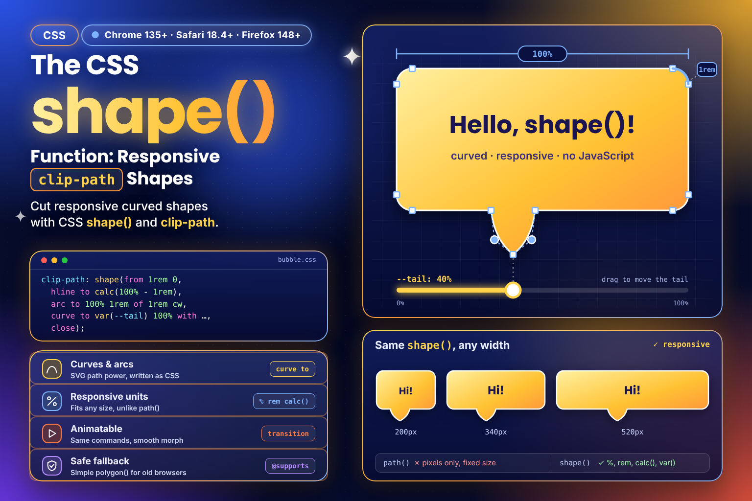 (opens full-size image in a new tab)
Introduction
clip-path cuts an element down to a shape: everything inside the shape stays visible, everything outside it
disappears. For straight-edged shapes there's polygon(), and for anything with curves there's path(), which takes
the same path data an SVG <path> uses. The catch is that path() only understands pixels. A speech bubble drawn
for a 320px-wide box stays 320px wide when the box grows or shrinks, so curved clip-paths have never been responsive.
shape() fixes that. It has the same drawing commands as SVG paths (lines, curves and arcs), but written as
CSS, so every coordinate can be a percentage, a rem, a calc() or a custom property. This tutorial starts with
the basics of drawing a shape, works through every command, and ends with animation, fallbacks and the pitfalls to
watch for.
How clip-path Coordinates Work
Every clip-path shape is drawn on the element's own box. 0% 0% is the top-left corner, 100% 0% the top-right
and 100% 100% the bottom-right. Percentages are measured against the border box by default, so 50% across is
always the middle, whatever the element's size.
/* A triangle pointing up: top centre, bottom right, bottom left */
.triangle {
  clip-path: polygon(50% 0%, 100% 100%, 0% 100%);
}
polygon() joins a list of points with straight lines. That's perfect for triangles, arrows and chevrons, but it
can't draw a curve. That's the gap shape() fills.
Basic Usage
.triangle {
  clip-path: shape(
    from 50% 0%,
    line to 100% 100%,
    line to 0% 100%,
    close
  );
}
This draws the same triangle, one command at a time:
from 50% 0%places the pen at the starting point, without drawing anything.line to 100% 100%draws a straight line from where the pen is to a new point.closedraws a line back to the starting point and closes the outline.
Commands are separated by commas, and each one starts where the previous one ended. If you've written SVG path data
before, this is M50 0 L100 100 L0 100 Z spelt out in words.
The Commands
| Command | What it draws | SVG equivalent |
|---|---|---|
move to x y | Lifts the pen and moves it without drawing, to start a new sub-shape | M |
line to x y | A straight line to a point | L |
hline to x | A horizontal line to an x coordinate | H |
vline to y | A vertical line to a y coordinate | V |
curve to x y with cx cy | A quadratic Bézier curve with one control point | Q |
curve to x y with c1x c1y / c2x c2y | A cubic Bézier curve with two control points | C |
smooth to x y | A curve that continues smoothly from the previous one | T / S |
arc to x y of r | An elliptical arc with radius r | A |
close | A straight line back to the start | Z |
Every command except close also has a by form, which measures from the pen's current position instead of from
the top-left corner. line by 2rem 0 draws a line 2rem to the right of wherever the pen is, which is handy for
fixed-size details such as a notch or tab.
Curves
The point after with is a control point. The curve doesn't pass through it; it bends towards it, like a magnet
pulling the line:
/* A banner with a curved bottom edge that bulges downwards */
.banner {
  clip-path: shape(
    from 0% 0%,
    hline to 100%,
    vline to 80%,
    curve to 0% 80% with 50% 100%,
    close
  );
}
Because the control point is at 50% 100%, the bottom edge dips towards the middle of the bottom edge. Change the
element's width and the curve stretches with it.
Arcs
arc to draws part of a circle or ellipse, which makes it the natural way to round a corner:
/* top edge, then a 1rem rounded top-right corner */
hline to calc(100% - 1rem),
arc to 100% 1rem of 1rem cw,
of 1rem is the radius (give two values for an ellipse). Between any two points there are always two possible arcs
of a given radius, and each can go either way round, so two optional keywords pick one:
cworccwsets the direction: clockwise or anticlockwise. The default isccw.smallorlargepicks the shorter or longer of the two arcs. The default issmall.
A quick rule: when you trace an outline clockwise, its outward-bulging corners are cw arcs.
What shape() Can Do That path() Can't
Here's a speech bubble with rounded corners and a curved tail, first in path():
.bubble {
  clip-path: path("M16 0 H304 A16 16 0 0 1 320 16 V104 A16 16 0 0 1 304 120 H180 Q164 120 160 144 Q156 120 140 120 H16 A16 16 0 0 1 0 104 V16 A16 16 0 0 1 16 0 Z");
}
Every number in that string is a pixel. It only fits a box that's exactly 320 × 144px, and moving the tail means
working out a new string, usually in JavaScript. Here's the same outline as a shape():
.bubble {
  --tail: 50%;
  clip-path: shape(
    from 1rem 0,
    hline to calc(100% - 1rem),
    arc to 100% 1rem of 1rem cw,
    vline to calc(100% - 2.5rem),
    arc to calc(100% - 1rem) calc(100% - 1.5rem) of 1rem cw,
    hline to calc(var(--tail) + 1.25rem),
    curve to var(--tail) 100% with calc(var(--tail) + 0.25rem) calc(100% - 1.5rem),
    curve to calc(var(--tail) - 1.25rem) calc(100% - 1.5rem) with calc(var(--tail) - 0.25rem) calc(100% - 1.5rem),
    hline to 1rem,
    arc to 0 calc(100% - 2.5rem) of 1rem cw,
    vline to 1rem,
    arc to 1rem 0 of 1rem cw,
    close
  );
}
It's longer, but it reads like a description of the shape, and it does three things the path() version can't:
- It's responsive. The edges are drawn at
100%andcalc(100% - 1rem), so the bubble fits whatever size the element is. - It mixes units. The corners stay a fixed
1remwhile the edges stretch, something no single unit could do. - It's driven by a custom property. The tail's three points all come from
--tail, so moving it is one line of CSS:.bubble--left { --tail: 20%; }.
Try It Live
Both bubbles below have the same outline. The top one uses shape(); the bottom one is the path() version, drawn
for a 320 × 144px box. Drag Width and only the shape() bubble resizes its outline; the path() one stays
frozen and gets cut off or leaves a gap. Drag Tail position and only the shape() bubble's tail moves, because
path() has no way to read --tail. Tick Animate the tail to sweep --tail from side to side with
@keyframes, which works because --tail is registered with @property (more on that
below). It stays still if your system has reduced motion turned on.
Responsive Speech Bubble with shape()
A speech bubble with rounded corners and a curved tail drawn with shape(), resizing and moving its tail with two sliders, beside a pixel-based path() that can't.
<!DOCTYPE html>
<html lang="en">
  <head>
    <meta charset="UTF-8" />
    <meta name="viewport" content="width=device-width, initial-scale=1.0" />
    <title>shape() Playground</title>
  </head>
  <body>
    <main class="playground">
      <header class="playground-header">
        <h1>A Responsive Speech Bubble with shape()</h1>
        <p>Both bubbles use the same outline: rounded corners drawn with <code>arc</code> and a curved tail drawn with <code>curve</code>. The top one is a <code>shape()</code> written in <code>%</code>, <code>rem</code> and <code>calc(var(--tail) …)</code>. The bottom one is the same outline as a <code>path()</code>, which only understands pixels.</p>
      </header>

      <p class="support-note" id="support-note" hidden>This browser doesn't support <code>shape()</code> yet, so the top bubble falls back to a straight-edged <code>polygon()</code> with square corners and a pointed tail.</p>

      <fieldset class="control-group">
        <legend>Bubble</legend>
        <div class="fields-grid">
          <div class="field">
            <label for="width-input">Width</label>
            <div class="range-row">
              <span class="range-edge">200px</span>
              <div class="range-track">
                <input type="range" id="width-input" min="200" max="440" step="10" value="320">
                <output class="range-bubble" id="width-value" for="width-input">320px</output>
              </div>
              <span class="range-edge">440px</span>
            </div>
          </div>

          <div class="field">
            <label for="tail-input">Tail position</label>
            <div class="range-row">
              <span class="range-edge">15%</span>
              <div class="range-track">
                <input type="range" id="tail-input" min="15" max="85" step="1" value="50">
                <output class="range-bubble" id="tail-value" for="tail-input">50%</output>
              </div>
              <span class="range-edge">85%</span>
            </div>
          </div>
        </div>

        <label class="checkbox-field">
          <input type="checkbox" id="animate-toggle">
          Animate the tail with <code>@property --tail</code>
        </label>
      </fieldset>

      <p class="tip motion-tip">Reduced motion is turned on in your system settings, so the tail stays still when animation is ticked. Use the <strong>Tail position</strong> slider to move it instead.</p>

      <section class="demo-area stage" id="stage" aria-label="Speech bubble preview">
        <figure class="example">
          <figcaption><code>clip-path: shape(…)</code></figcaption>
          <div class="bubble bubble--shape">
            <p>Resize me or move my tail. The whole outline follows.</p>
          </div>
        </figure>

        <figure class="example">
          <figcaption><code>clip-path: path("…")</code>, drawn for 320 × 144px</figcaption>
          <div class="bubble bubble--path">
            <p>My outline is frozen at the size it was drawn for.</p>
          </div>
        </figure>
      </section>

      <output class="readout" id="readout" aria-live="polite"></output>
    </main>

    <script src="./index.js"></script>
  </body>
</html>
Starting sandbox…
No console output yet.
shape() or polygon()?
/* polygon(): a list of points joined by straight lines */
clip-path: polygon(50% 0%, 100% 100%, 0% 100%);

/* shape(): explicit commands, so curves and arcs are possible too */
clip-path: shape(from 50% 0%, line to 100% 100%, line to 0% 100%, close);
polygon() already accepts percentages, calc() and custom properties, so for a straight-edged shape it's the
shorter choice and works in older browsers. Reach for shape() when the outline needs a curve or an arc, or when
relative by commands make it easier to describe.
polygon() | path() | shape() | |
|---|---|---|---|
| Straight lines | ✅ | ✅ | ✅ |
| Curves and arcs | ❌ | ✅ | ✅ |
%, rem, calc(), var() | ✅ | ❌ (pixels only) | ✅ |
| Scales with the element | ✅ | ❌ | ✅ |
For straight-edged shapes in SVG itself, SVG Polygon vs Polyline covers the
differences, and SVG Essentials: Mastering the Path Element explains the
path commands shape() is based on.
Animating a shape()
Two shape() values animate smoothly as long as they have the same number of commands, of the same types, in the
same order. The browser then moves each point from its old position to its new one:
.bubble {
  clip-path: shape(from 0% 0%, hline to 100%, vline to 80%, curve to 0% 80% with 50% 80%, close);
  transition: clip-path 0.4s ease;
}

.bubble:hover {
  clip-path: shape(from 0% 0%, hline to 100%, vline to 80%, curve to 0% 80% with 50% 100%, close);
}
On hover, the flat bottom edge bends into a curve. If the two shapes have different commands, the change snaps instead of animating, so draw both states from the same command list.
To animate a custom property used inside the shape, such as --tail, register it with
@property as a <percentage>. Unregistered custom properties
can't be interpolated, so a keyframe animation on them jumps from value to value. As with any decorative motion, wrap
it in a prefers-reduced-motion: no-preference query.
Browser Support and Fallbacks
shape() arrived in Safari 18.4 in March 2025, Chrome and Edge 135 in April 2025, and Firefox 148 in 2026, so it
works in every current browser. Check
MDN for the latest status. For readers on older
versions, give them a simpler shape:
.bubble {
  clip-path: polygon(
    0 0, 100% 0, 100% 85%,
    calc(var(--tail) + 1.25rem) 85%, var(--tail) 100%, calc(var(--tail) - 1.25rem) 85%,
    0 85%
  );
}

@supports (clip-path: shape(from 0 0, line to 100% 0)) {
  .bubble {
    clip-path: shape(/* the full rounded outline */);
  }
}
Older browsers get a straight-edged bubble with a pointed tail, which still reads as a speech bubble. Keep the
@supports block even though the fallback comes first; the next section explains why.
Common Pitfalls
1. Relying on the Cascade for Fallbacks
Normally a browser skips a value it doesn't understand and keeps the declaration before it. That doesn't work once
the value contains var(). The browser can't check the value until the variable is filled in, so it accepts the
declaration at first and only finds the problem later. By then the earlier polygon() has already been thrown away,
and the element ends up with no clip-path at all. Wrap a shape() that uses custom properties in @supports.
2. Content Hiding Under the Cut
clip-path hides anything outside the shape, including text. The tail of a speech bubble is cut out of the bottom of
the box, so give the element enough bottom padding to keep its content above it. The demo uses 2.5rem.
3. Expecting a Border or Shadow
clip-path only decides what's visible; it doesn't draw along the edge. A border gets cut off with everything
else, and a box-shadow is clipped away entirely. For a shadow, wrap the element and put
filter: drop-shadow(...) on the wrapper, which follows the clipped outline.
4. Arcs Going the Wrong Way
If a corner bites into the shape instead of rounding it, the arc is bending the wrong way. Swap cw for ccw (or
the other way round). If it draws a large loop instead, you need small rather than large.
5. Clicks Outside the Shape
The clipped-away area doesn't respond to the pointer. A click on the empty corner of a clipped button falls through to whatever is behind it. That's usually what you want, but keep small clickable shapes generous enough to hit.
Where Should You Use This?
- Speech bubbles, tooltips and callouts whose tail position comes from a custom property
- Section dividers and banners with curved or wavy edges that stretch to any width
- Cards, tabs and buttons that need rounded corners combined with notches or cut-outs
- Converting an existing pixel-based
path()clip-path into one that scales with the element
If all you need is a different shape of corner, corner-shape is simpler and keeps
borders and shadows intact.
Frequently Asked Questions
Key Takeaway
shape() gives clip-path the curves and arcs of SVG paths without being stuck in pixels. Write the outline with
percentages, rem and calc() and it fits the element at any size; put a custom property in a coordinate and one
line of CSS moves part of the shape. Use polygon() for straight edges, shape() once you need a curve, and wrap
any shape() that uses var() in @supports so older browsers get a proper fallback.
Changelog
- — Initial publication.
Share this tutorial
Spotted a mistake or something outdated in this tutorial? Suggest a correction.