
Viewport Inline & Block Units: vi and vb
 (opens full-size image in a new tab)
Introduction
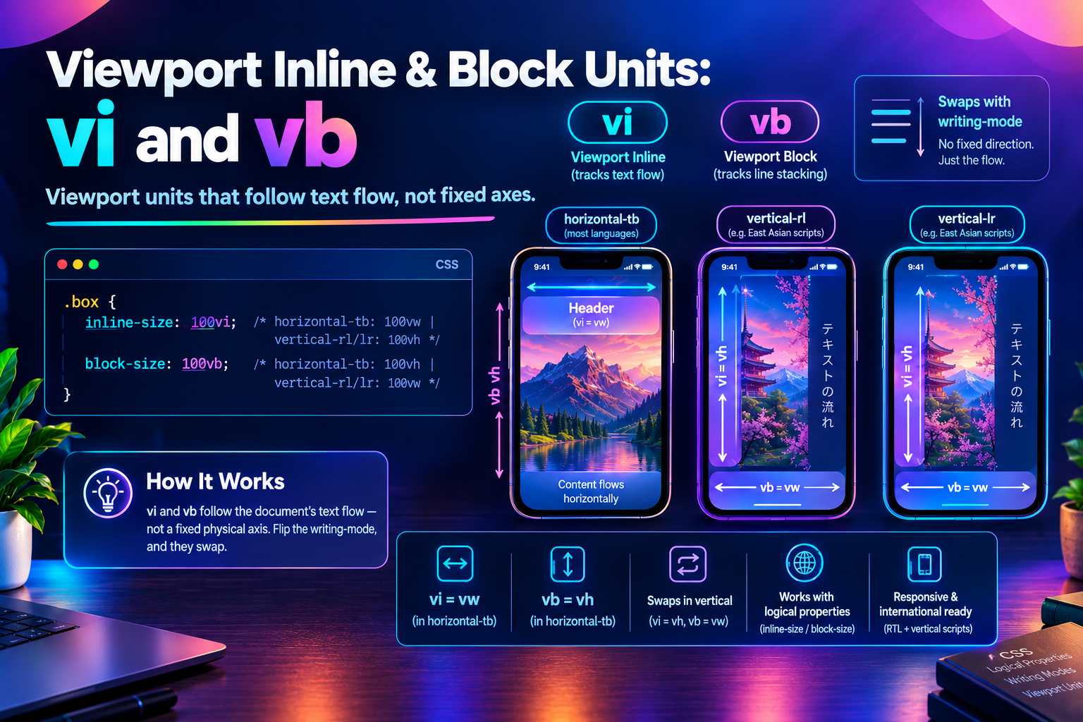
Every unit in this family so far — vh/svh/lvh/dvh and vw/svw/lvw/dvw — is tied to a fixed physical direction: height is always vertical, width is always horizontal, no matter what. vi (viewport inline) and vb (viewport block) break that assumption entirely: they follow whichever axis text actually flows and stacks on, per the current writing-mode — not a fixed screen direction.
In the everyday horizontal-tb writing mode (English, and most Western-script content), vi behaves exactly like vw and vb behaves exactly like vh. Switch to a vertical writing mode — used for traditional Mongolian, or a deliberately vertical design for East Asian scripts — and the two units swap: vi starts tracking the viewport's height, vb starts tracking its width.
The Two Units
.box {
  inline-size: 100vi; /* horizontal-tb: same as 100vw   |   vertical-rl/lr: same as 100vh */
  block-size: 100vb;  /* horizontal-tb: same as 100vh   |   vertical-rl/lr: same as 100vw */
}
Paired here with the logical sizing properties (inline-size/block-size, not width/height) the way CSS Logical Properties already covers for margins, padding, and borders — putting a logical unit on a physical property defeats the point of reaching for one at all.
Try It Live
vi / vb Axis Swap Playground
Toggle the root's writing-mode and watch two bars sized with real vi/vb values swap which physical dimension, width or height, they actually track.
<!DOCTYPE html>
<html lang="en">
  <head>
    <meta charset="UTF-8" />
    <meta name="viewport" content="width=device-width, initial-scale=1.0" />
    <title>vi / vb Axis Swap Playground</title>
  </head>
  <body>
    <main class="playground">
      <header class="playground-header">
        <h1>vi / vb Axis Swap</h1>
        <p>Toggle the root's <code>writing-mode</code> and watch which physical dimension <code>vi</code> and <code>vb</code> track. Everything here stays horizontal and readable on purpose — only the two bars below (sized with real <code>vi</code>/<code>vb</code> CSS) change.</p>
      </header>

      <button class="toggle-btn" id="mode-toggle" type="button">Switch to vertical-rl</button>

      <section class="demo-area" aria-label="vi and vb measurement bars">
        <div class="axis-row">
          <div class="axis-box axis-vi" id="box-vi">vi</div>
        </div>
        <div class="axis-row">
          <div class="axis-box axis-vb" id="box-vb">vb</div>
        </div>
      </section>

      <output id="readout" class="readout" aria-live="polite"></output>
    </main>

    <script src="./index.js"></script>
  </body>
</html>
Starting sandbox…
No console output yet.
Two bars, each sized with a real vi/vb value. Toggle the root's writing-mode and watch which physical dimension each one tracks — the bar governed by vi swaps from matching the viewport's width to matching its height, and the bar governed by vb swaps the other way, while everything else on the page stays perfectly horizontal and readable.
The Root-Only Gotcha
The one detail that trips people up: vi/vb follow the writing-mode of the root element (<html>) — not the element they're declared on, and not that element's nearest ancestor.
html {
  writing-mode: horizontal-tb; /* This is what vi/vb actually check. */
}

.card {
  writing-mode: vertical-rl; /* Changes how .card's OWN children flow — does nothing to vi/vb. */
  inline-size: 50vi;         /* Still resolves against the ROOT's horizontal-tb, i.e. still = 50vw. */
}
This is the opposite of how container query units (cqi/cqb) behave — those deliberately follow the writing-mode of their own query container, not the document root. If a component's local writing-mode needs to affect its own sizing units, cqi/cqb off a queryable ancestor is the right tool for that, not vi/vb; see Fluid Type & Spacing for cqi/cqb used that way.
Where Should You Use This?
- Any component or design system built to support both horizontal and vertical writing modes without maintaining two separate stylesheets
- Sizing that's conceptually "the length of a line" or "the number of lines that fit," rather than "wide" or "tall" specifically —
vi/vbdescribe those correctly regardless of writing mode;vw/vhonly describe them correctly inhorizontal-tb - RTL/vertical-script internationalization work generally, alongside the logical properties (
margin-inline,padding-block, etc.) covered in CSS Logical Properties - Not worth reaching for on a page that will only ever ship
horizontal-tb—vi/vbadd a layer of indirection that plainvw/vhdon't need there
Production Considerations & Edge Cases
vi/vbcheck the root element'swriting-mode, never a locally-scoped one. Settingwriting-modeon a component doesn't change whatvi/vbmean inside it — only changing it on<html>does.- The large/small/dynamic distinction applies here too.
lvi/svi/dviandlvb/svb/dvbexist, and each inherits whichever physical behavior itsvw/vhcounterpart has for the root's current writing mode. Inhorizontal-tb,dvbbehaves likedvh(genuinely live, tracking mobile browser chrome) whiledvibehaves likedvw(rarely diverges from its small/large counterparts) — switch to a vertical writing mode and those roles swap. - Mixing a logical unit with a physical property (or vice versa) works, but reads as a mistake.
width: 100viis valid CSS and does something, but it pairs a "whichever direction is inline" value with a property that's always "sideways" — pairvi/vbwithinline-size/block-sizeso the property and the value agree about which axis they mean. - Browser support matches the rest of this unit family (Chrome/Edge 108+, Firefox 101+, Safari 15.4+ as of this writing) —
vi/vb,lvi/svi/dvi, andlvb/svb/dvball shipped as part of the same viewport-units feature.
Frequently Asked Questions
Key Takeaway
vw and vh describe the screen; vi and vb describe the document's own flow — and only agree with vw/vh by coincidence, in whichever writing mode happens to make horizontal "inline" and vertical "block." For anything meant to keep working correctly if the writing mode ever changes — a design system, an RTL or vertical-script layout — vi/vb are the versions of dvh/svh/lvh and dvw/svw/lvw that don't assume a direction at all.
Changelog
- — Added Frequently Asked Questions section
- — Initial publication.
Share this tutorial
Spotted a mistake or something outdated in this tutorial? Suggest a correction.